[.blog-callout]
TL;DR
- A column chart in Google Sheets is the fastest way to compare values across categories, like monthly revenue or sales by region.
- The built-in chart editor handles a one-off chart in about three minutes: select your data, insert a chart, switch it to a column chart, and customize the titles, style, and series.
- A spreadsheet chart works for a quick visual, but it stays locked inside the file and gives everyone the same all-or-nothing view.
- For a live dashboard your team opens every day, build a dashboard app with chart blocks in Softr on top of your data, with each user getting their own filters and permissions.
- You can build the whole app by describing it to the AI Co-Builder, then connect Softr Databases, Airtable, Google Sheets, or any of 21+ data sources. [.blog-callout]
A column chart in Google Sheets is a visual way to compare values across categories, so trends and outliers jump out at a glance. You might use one to track monthly revenue, compare sales across regions, or see how headcount differs by department. It's one of the most useful charts for everyday reporting because the vertical bars are so easy to read.
In this guide, we'll walk through the two practical ways to make a column chart. First, the built-in Google Sheets chart editor, which is perfect for a quick, one-off visual. Then we'll show how to build a live dashboard with chart blocks in Softr, which is the better fit when the chart needs to be something your team actually uses to make decisions every day.
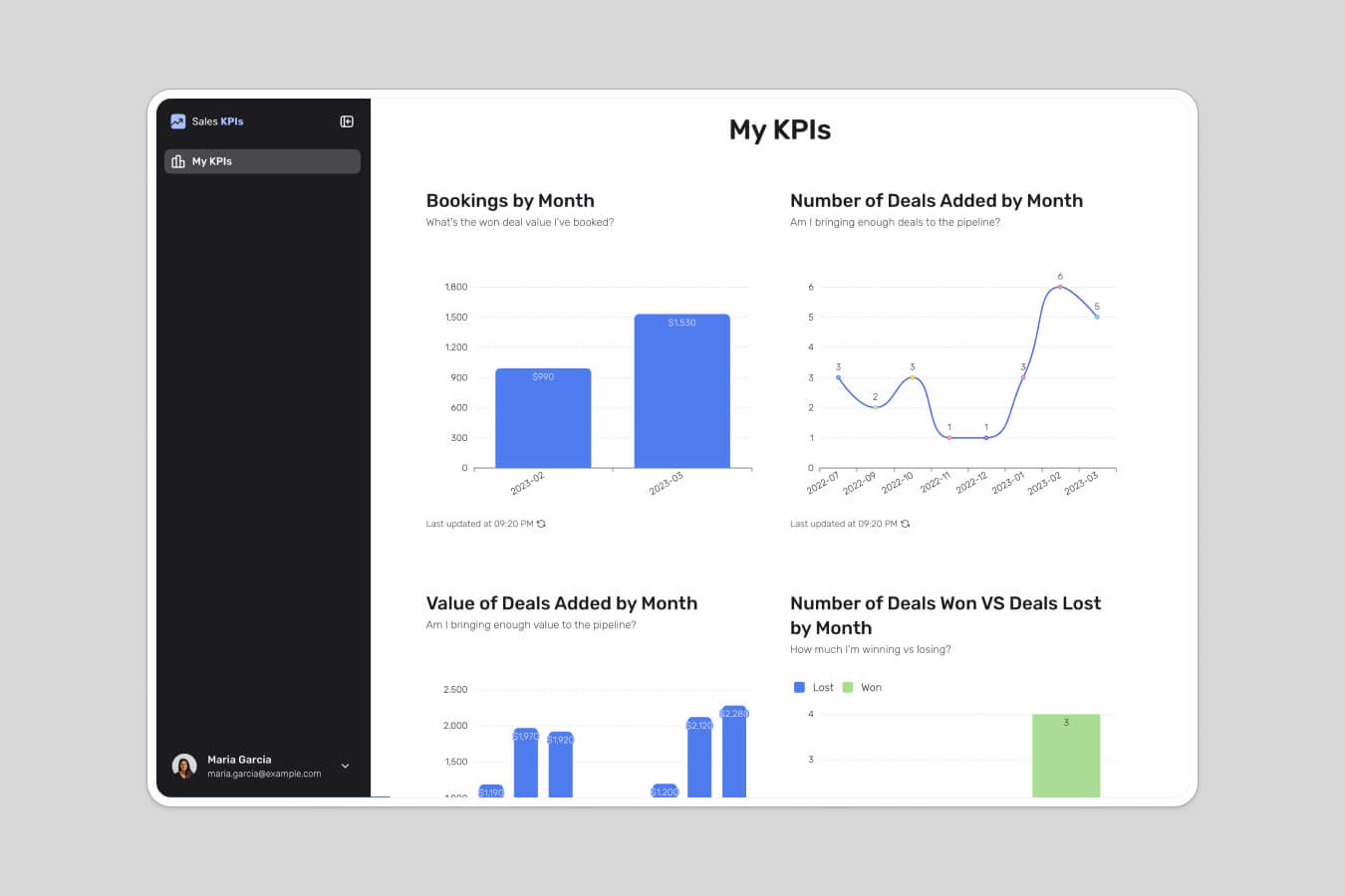
Creating a column chart in Google Sheets using its chart editor
Cost: $0
Time: 3 minutes
With Google Sheets’ chart editor, you can adjust some elements of your column chart, such as its chart title, axis labels, legend, and colors, to meet your needs. This level of control is often necessary to create a clear and concise chart that conveys the message you want to communicate.
Step 1: Select the data range
When you open your Google Sheets spreadsheet, click and drag to select the dataset you want to use for your column chart.

Step 2: Open the chart editor
After selecting your data, go to the "Insert" menu at the top of Google Sheets and click on "Chart." This opens the Chart Editor in a sidebar on the right side of your spreadsheet.

Step 3: Create a column chart
In the Chart Editor, select "Column chart" from the list of options.

Step 4: Move the column chart to its own sheet (optional)
To edit your column chart without any distractions, you can move it to a new sheet. Click on the three vertical dots located at the top right corner of the chart and select “Move to own sheet.”
Google Sheets will automatically generate a new sheet named “Chart 1,” where you can view and edit your column chart without any distractions.

Step 5: Customize the chart
The Chart Editor can be accessed by clicking on “Edit chart” from the column chart’s menu, where you can customize various aspects of your chart.

Step 5.1: Change the chart’s title
To add titles and labels to your chart in the Chart Editor, navigate to the "Chart & axis titles" section. There, you can add a chart title, label the X and Y axes, and choose your preferred font, size, format, and text color. Click on the text boxes and type descriptive titles to make your chart's purpose clear.

Step 5.2: Change chart style
In the Chart Editor, navigate to the Chart Style section. There, you can modify the background color, and font, and add a border to your column chart.

Step 5.3: Edit the series
In the Customize tab of the chart editor, navigate to the Series section and click on the dropdown to edit how each column appears.

Step 6: Share it with your team
If you're finished with the chart, you can easily share it with your team or specific people by clicking on the "Share" button. Alternatively, you can publish the chart or download it as an image.

When a spreadsheet chart isn't enough: build a live dashboard
A Google Sheets column chart is great for a quick look, but it has real limits once a team relies on it. The chart lives inside the file, so anyone who needs it has to open the spreadsheet, and the filters, sorting, and hidden columns are global. When one person changes a view, they change it for everyone. There's also no middle ground on access: you either share the whole file or you don't.
"Managing external partners through emails and spreadsheets is a nightmare. A portal allows you to only surface the information that is relevant to them and make approvals on the fly." - Shiran Brodie, Head of Marketing at Softr
This is where building a real dashboard pays off. Softr is a full-stack no-code platform that gives you the interface builder, native Softr Databases, and Softr Workflows for automation, all in one place. You build a page, drop chart blocks onto it, and connect your data once. The chart then updates automatically, each user gets their own filters, and you control exactly who sees what at the data level. If you want to compare options first, our roundup of dashboard software is a good starting point.
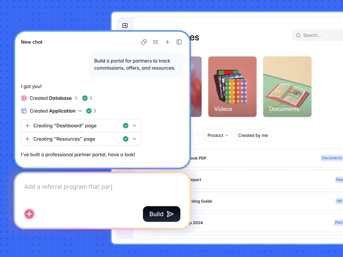
Making a column chart with a dashboard app in Softr
Cost: $0
Time: 3 minutes
Softr was designed with a no-code approach in mind, so you don't need any advanced technical skills to create a column chart. The fastest way to start is to describe what you need to the AI Co-Builder and let it generate a complete app for you, including the pages and data structure. You can also start from a template or build from a blank canvas if you prefer. Either way, you end up with a chart that lives in a sharable dashboard, ready for a client portal, an internal tool, or a reporting hub.
When it comes to your data, you can use Softr Databases for a native, relational backend, or connect Airtable, Google Sheets, and any of 17+ data sources, including a REST API connector. The walkthrough below uses Google Sheets, but the chart steps are the same whichever source you pick.
Step 1: Log in to Softr or create an account
To get started, sign in to your Softr account. If you don’t have an account already, sign up to Softr for free.

Step 2: Choose a template or build from scratch
Once you have successfully logged in or signed up, locate and click on the "New Application" button.

Step 3: Create a blank application
You'll be directed to the template gallery. Select the option for creating a blank application to begin making your column chart. If you'd rather not build manually, you can instead describe the dashboard you want to the AI Co-Builder and it will generate the pages and chart layout for you.

Step 4: Deselect the prebuilt pages you don't want to use
Deselect all the prebuilt pages by clicking each option, except the Home page. Then click the “Create application” button.

Step 5: Connect Softr and Google Sheets
In order to create a column chart in Softr using your Google Sheets data, you must first connect the two products.
Step 5.1: Choose Google Sheets as the data source
First, click on “Google Sheets” and then on “Continue” to allow Softr to access your data for creating a column chart.

Step 5.2: Log in to your Google account
To specify which Google account your Google Sheets file is in, click on the correct option and log in to your account.

Step 5.3: Authorize Softr
Tick the two highlighted boxes in the image below to authorize Softr to make changes in your Google Sheets and Google Drive files. Then click on "Continue."

Step 6: Delete all the pre-built blocks
Before creating your column chart, delete the unnecessary pre-built blocks to start on a blank canvas. Hover on each section and click the delete button.

Step 7: Open the pre-made blocks browser
Click on the “+” sign either at the center or at the top right corner of your screen to open the pre-made blocks browser.

Step 8: Add a chart
When the block browser appears, type “bar chart,” then preview and select it by hovering and clicking. You can also ask the AI Co-Builder to add a column chart block for you by describing what you want, which is handy when you're building several charts on one dashboard.

Step 9: Choose from which Google Sheet file you want to import the data
To connect your data source, go to the Source tab and click on “Connect data source”. Choose the Google Sheets account you want to use, and then select the spreadsheet that contains the data you need. Softr will provide you with a list of your sheets to choose from, and you need to select the one you want to import data from.

Step 10: Customize your chart
In the Features, you can change the appearance of your chart.

Step 10.1: Change your chart title and subtitle
Type the title and subtitle you want into the respective text box.

Step 10.2: Choose the variable for the Y-axis
To ensure the data from your connected Google Sheets displays through the chart, go to the metrics section just below the title and subtitle. There, under the Aggregate function, choose “Sum,” and under Field, select the value you want to be your Y-axis (Organic Traffic, in our case).

Step 10.3: Choose the variable for the X-axis
Under Groupings, select the variable that you want to be used for the X-asis of your chart. In our case, it is the “Year” variable.

Step 10.4: Change the styling
In the Styles tab, you can change the background color and add border lines to the top and bottom of your chart.

Step 10.5: Change the access permissions
In the Visibility tab, you can change the access permissions of your chart. The default setting is “All users,” which means everyone can see the chart when it's published, whether they're logged in or not. If you want only logged-in users to access the data, click the dropdown and select “logged-in users.” This is the kind of control a shared spreadsheet can't give you, and you can take it further with full users and permissions so each person only sees the records that apply to them.

Step 11: Test and publish your dashboard
Click the preview button to see how your chart looks before sharing it. When you're happy, click the “Publish” button to save your changes and make the dashboard live. From here you can add more chart blocks, KPI cards, and tables to turn a single chart into a full reporting hub.

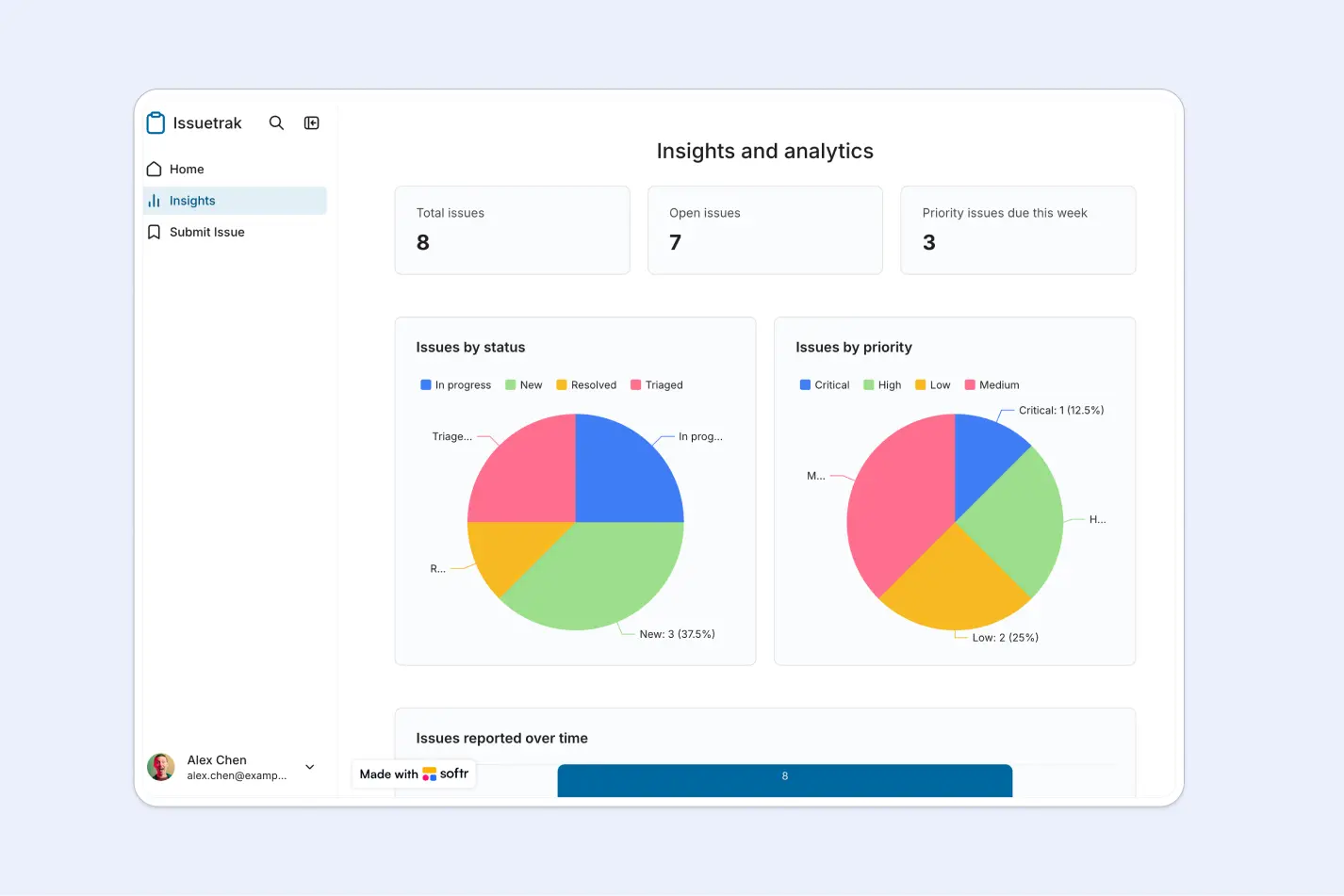
Go from a static chart to a working dashboard
A Google Sheets column chart is the right tool for a quick, one-off comparison, and the chart editor gets you there in a few minutes. The moment that chart becomes something your team checks regularly, build it as a dashboard app instead, so the data stays live, each person gets their own view, and access is controlled at the data level. Describe what you need to the AI Co-Builder, connect your data, and you'll have a working dashboard in about the same time it took to build the spreadsheet version. To go further, see how to build an inventory dashboard or browse no-code dashboard builders.
Frequently asked questions
What type of chart should I use to compare values across categories?
Can I build a live column chart that updates automatically?
Is Softr free to use for building charts and dashboards?
How is a Softr dashboard different from sharing a Google Sheets chart?
Do I need to know how to code to build a chart dashboard in Softr?