

[.blog-callout]
After creating and testing all the most popular custom dashboard software, I found these 6 to be the best overall for business looking to build internally.
[.blog-callout]
The best custom dashboard software depends on whether you simply need a reporting tool or if you need a full app. Softr is the best fit for nontechnical teams that need secure dashboards with editable data, forms, user permissions, and automated workflows. Choose Power BI for advanced data modeling, Data Studio for reporting across Google products, Metabase for self-hosted SQL analytics, and Databox for marketing KPI reporting.
Best custom dashboard software at a glance
| Tool | Best for | Key features | Pricing |
|---|---|---|---|
| Softr | Building fully custom, AI-powered dashboards without coding | AI Co-Builder, Ask AI, role-based dashboards, 21+ data sources, workflow automation | Free plan available; paid plans from $19/month |
| Power BI | Organizations that already use Microsoft 365 and have dedicated data teams | 250+ connectors, DAX modeling, row-level security, Copilot AI | Free desktop plan; paid plans start at $14/user/month |
| Data Studio (formerly Looker Studio) | Google-first teams that want free dashboards with easy setup | 800+ connectors, easy link sharing, deep Google Analytics and Ads integration | Free for individuals; paid plans cost $9/user/month per project and enable department-level reporting |
| Metabase | Developer teams that want direct database access and full infrastructure control | X-ray auto-dashboards, visual query builder, SQL editor, self-hosting option | Free (self-hosted); cloud plans from $100/month |
| Databox | Marketing agencies that need polished client reporting | 130+ marketing integrations, AI summaries, agency mode, unlimited users | Free plan available; paid plans from $159/month |
| Zoho Analytics | SMBs that need a wide range of integrations and simple client sharing | 500+ connectors, Zia AI, drag-and-drop builder, clients don’t need a license | Free plan available; paid plans starting at $48/month |
What is custom dashboard software?
Custom dashboard software lets you pull data from multiple sources into one place and display it however makes sense for your team: charts, tables, filters, live metrics, whatever you need to see. You might use one to track project timelines, flag overdue tasks, or monitor sales goals by region. Some dashboard tools are purely for reporting. Others connect your dashboards to databases, automations, and different views for different users.
Depending on the tool, you’ll typically get:
- Charts, tables, and filters for visualizing data
- Role-based views so different users see different information
- Real-time data sync from connected sources
- Alerts and notifications when metrics hit certain thresholds
- Integrations with the tools your data already lives in
Types of custom dashboard software
- BI and analytics tools: Platforms like Power BI are built for data teams doing serious analytical work. While there’s usually a learning curve, this is the go-to category for most organizations dealing with large datasets, complex reporting, and data modeling.
- Dashboard and reporting tools: Tools like Databox and Zoho Analytics offer prebuilt templates and integrations that get dashboards live quickly without SQL or engineering skills. The tradeoff is that you’re working within the structure the tool provides rather than building custom dashboards that match your needs.
- Developer and open-source tools: For technical teams that want direct database access and full control over their own infrastructure. Tools like Metabase can make sense here, but you’ll need real technical capacity to run them.
- No-code and AI platforms. Rather than just visualizing data, platforms like Softr let your team build dashboards connected to databases, automations, and client-facing portals, all without code. No-code dashboards can collect data, trigger workflows, and serve as the front end of a system that clients and team members can log into.
Reporting dashboards vs. operational dashboards
A reporting dashboard helps users monitor and analyze data. An operational dashboard also lets them act on that data; for example, by updating a project status, approving a request, submitting a form, assigning an owner, or triggering an alert.
Choose a reporting or BI platform when your main goal is data visualization, exploration, or complex modeling. Choose an operational dashboard builder when the dashboard needs to function as an internal tool, client portal, or workflow application.
1. Softr — best for building no-code operational dashboards
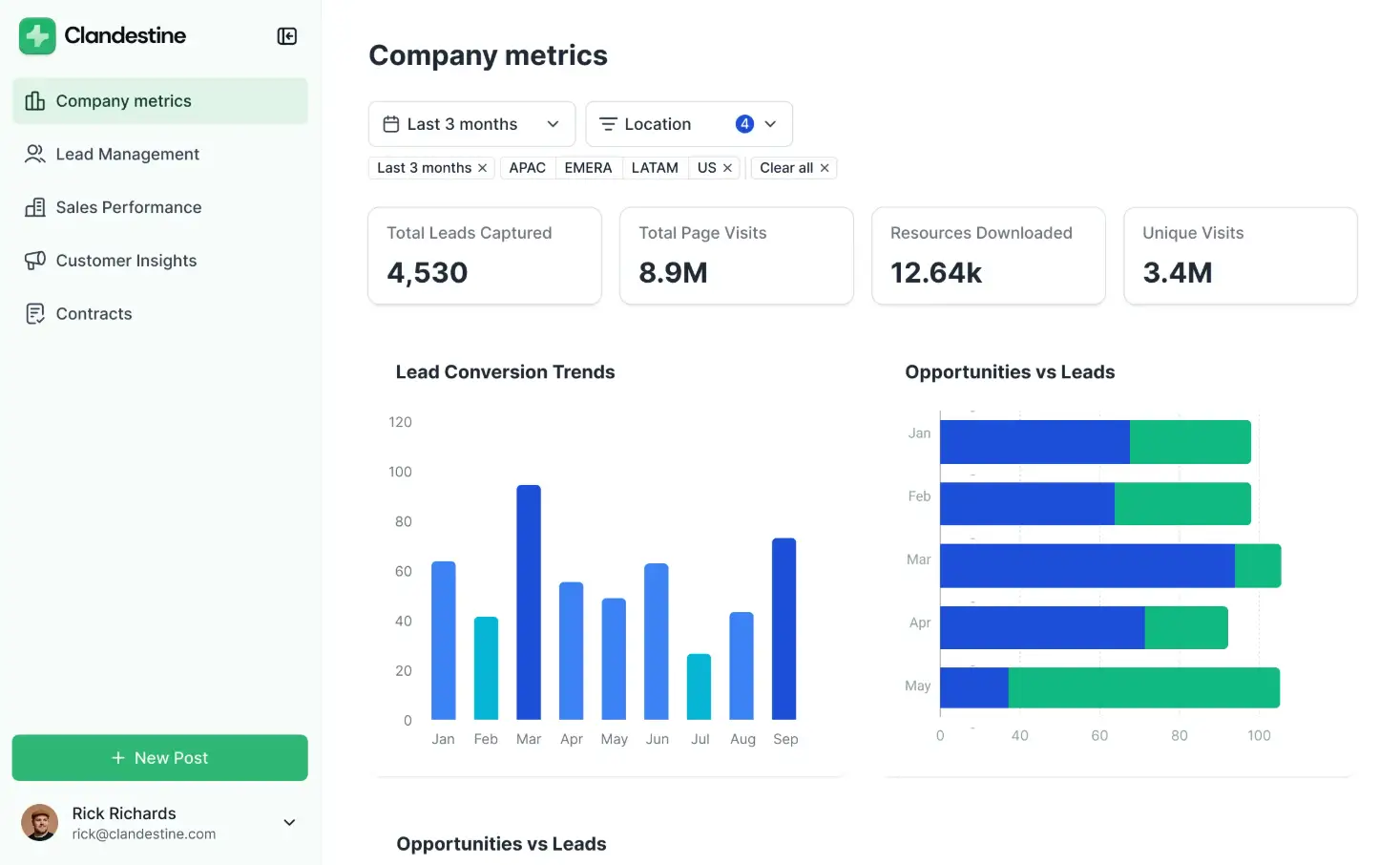
Best for: Operations teams, agencies, and growing businesses that need secure internal or client-facing dashboards without hiring developers.
What it does: Softr turns business data into an interactive dashboard app. Teams can display metrics through charts and tables, collect information through forms, let authenticated users update records, restrict data according to user or role, and connect dashboard activity to automated workflows.
You can manage the underlying data in Softr Databases or build on data stored in sources such as Airtable, Google Sheets, HubSpot, SQL databases, and REST APIs. Different blocks within the same dashboard can connect to different sources, allowing one interface to present information from across the business.
Why Softr stands out: Most dashboard tools are designed primarily for viewing and analyzing information. Softr is better suited to dashboards people actively work from. A client can log in and see only their accounts, a manager can approve a request, or an operations employee can update a record without leaving the dashboard.
Softr’s AI Co-Builder can generate the initial application structure from a prompt, while its visual editor lets teams adjust pages, data displays, permissions, and actions without writing code. As one user put it: "[Clients] don’t know it’s stitched together from no-code tools. They just know they have a dashboard with their logo that shows their metrics."
Limitations: Softr is not intended to replace analyst-focused BI platforms for complex data modeling, advanced SQL exploration, or highly specialized statistical visualization.
Bottom line: Choose Softr when your dashboard also needs to operate as an internal tool, client portal, or workflow app. Choose a dedicated BI platform when deep analytical modeling is more important than data entry, permissions, and operational actions.
Pricing
- Free: Unlimited apps, with access to Softr Workflows and Softr Databases, 5 app users, 5,000 Softr Database records, 5 AI credits
- Basic: $19/month (billed annually), unlimited apps with 42+ integrations, Team: 5 + Client: 5 app users, 50,000 records, 10 AI credits
- Pro: $99/month, unlimited apps with 45+ integrations and custom code, Team: 10 + Client: 50 app users, 500,000 records, 50 AI credits
- Business: $329/month, unlimited apps with 52+ integrations, Team: 30 + Client: 100 app users, 1M records, 100 AI credits
- Enterprise (custom pricing, contact sales): Custom, includes SSO, SOC2 reporting, advanced security, dedicated support
Start with a free plan to build your first dashboard, or browse dashboard templates to launch in minutes.
2. Power BI — best for advanced analytics
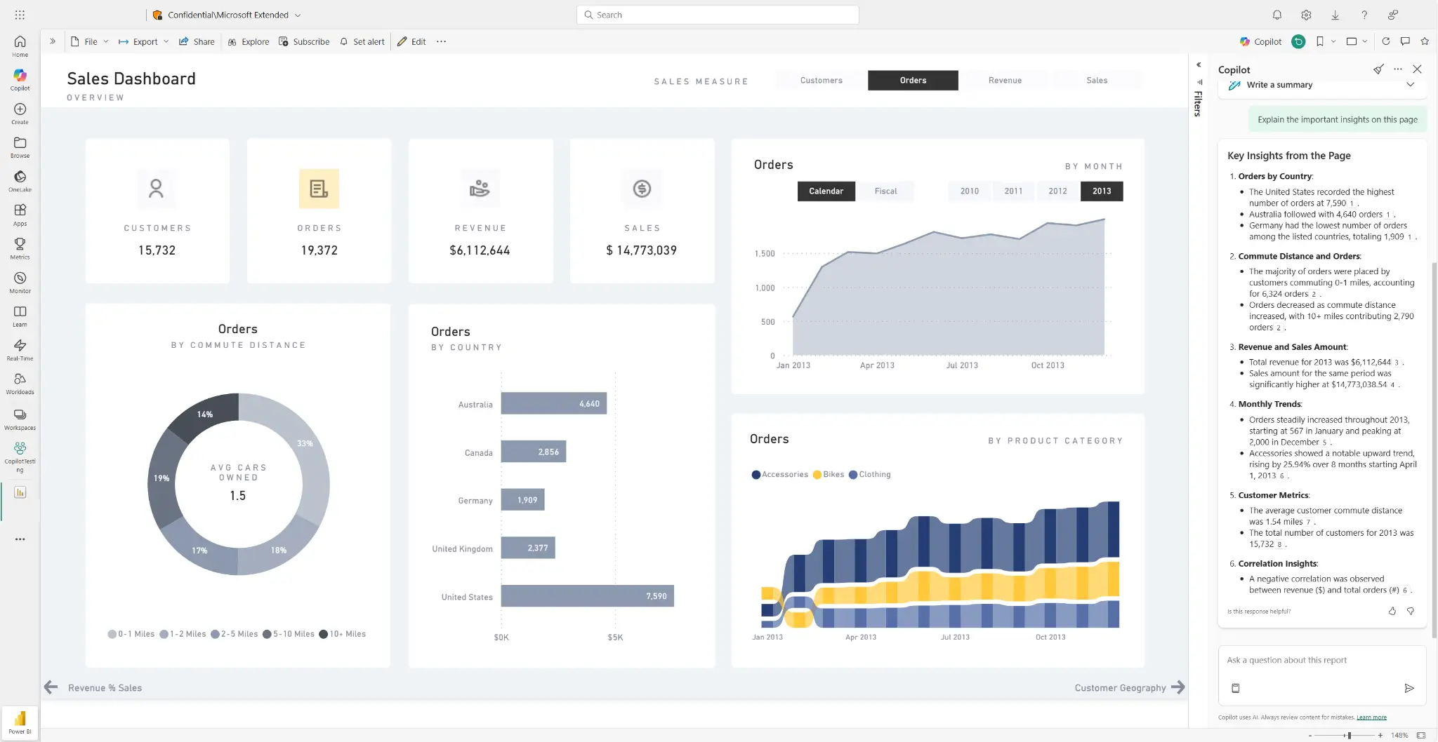
Power BI is Microsoft’s enterprise business intelligence platform. It’s built for organizations with dedicated data teams who need complex modeling, large datasets, and deep Microsoft 365 integration. The desktop app is free; sharing and collaboration require a Pro license at $14/user/month. It covers 250+ native data connectors, Power Query for data transformation, DAX formulas for custom calculations, and row-level security for controlling what each user sees. Copilot AI, available on premium tiers, lets users ask questions about their data and generate visualizations.
Power BI pros and cons
Pros:
- DAX formulas and Power Query support complex calculations
- Power BI Pro is included in Microsoft 365 E5 at no extra cost
- Copilot AI lets you interact dynamically with your data and generate visualizations
- Row-level security and audit logs meet most compliance requirements
Cons:
- Per-user licensing gets expensive if you need to share data widely
- DAX and Power Query require analyst-level skills for anything beyond basic reporting
- Not designed for client-facing portals or connecting dashboards to operational workflows
- Less visual design flexibility than dedicated no-code builders
Power BI best features
- 250+ data connectors: Connect to Salesforce, Google Analytics, Azure, SQL Server, SAP, and hundreds more, with Power Query handling cleaning and transformation before data reaches your dashboard.
- DAX formula language: Write custom calculations and KPIs for financial modeling, rolling averages, and other complex metrics.
- Row-level security: Control which users see which rows of data within a shared report. For example, a regional manager might see only their region’s numbers.
- Microsoft 365 integration: Publish reports directly to Teams, embed in SharePoint, and connect to Excel.
- Copilot AI: Users ask questions and Copilot generates visualizations and summaries automatically.
Pricing
- Free: Create and view reports locally; can’t share reports
- Power BI Pro: $14/user/month (billed annually); required to publish, share, and collaborate
- Power BI Premium Per User: $24/user/month, larger datasets, 48 daily refreshes, advanced AI features
- Power BI Embedded: Starts at $735/month (A1 node); create customer-facing reports and dashboards without per-viewer licenses
3. Data Studio (formerly Looker Studio) — best for free Google-native dashboards
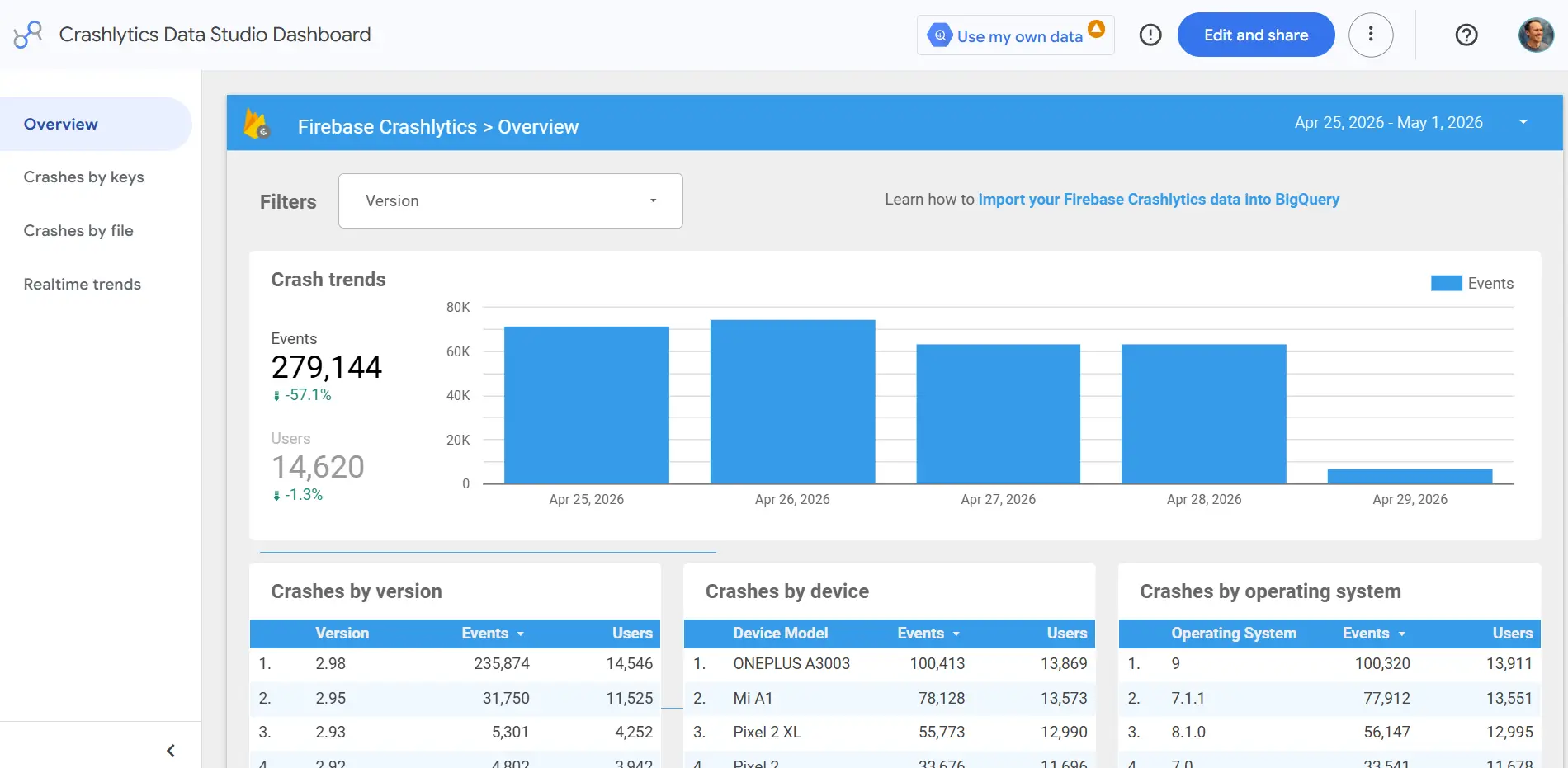
Google’s dashboard tool was originally called Data Studio before rebranding to Looker Studio. After a few years under the new name, it recently switched back to calling itself Data Studio. Whatever name you use, it remains a useful free reporting tool, and it’s hard to argue against starting here if your data lives in Google. Data Studio connects natively to Google Analytics, Google Ads, Search Console, YouTube, Sheets, and BigQuery at no cost. Sharing is simple: it’s easy to send a link or schedule a PDF delivery, and recipients don’t need an account to see your reports.
Data Studio pros and cons
Pros:
- Free for core features with no user limits
- Native Google integrations and link-based sharing
- Recipients don’t need an account to view live reports
- Large library of community templates for common marketing and analytics use cases
Cons:
- No row-level security; every viewer sees identical data
- Non-Google connectors (like Meta or HubSpot) require additional costs
- Performance can slow down with complex or multi-source dashboards
Data Studio best features
- 800+ connectors: Connect to Google Analytics, Ads, Sheets, BigQuery, and hundreds more, with all native Google connectors included at no cost.
- Link-based sharing: Share live dashboards via URL or schedule automated PDF email delivery with no recipient account required.
- Community templates: Hundreds of pre-built report templates for marketing performance, SEO, and executive KPI summaries.
- Real-time Google data: Changes in GA4, Google Ads, or Search Console surface in dashboards automatically without manual refreshes.
- Collaborative editing: Multiple team members can edit the same report simultaneously in a browser.
Pricing
- Data Studio: Free for unlimited users and unlimited reports
- Data Studio Pro: $9/user/month per project for shared team workspaces and organization-owned assets
4. Metabase — best open-source dashboard tool

Metabase is an open-source BI tool offering a more affordable alternative to enterprise BI platforms. You can self-host the open source edition for free, and since it includes both the visual query builder and a full SQL editor, technical and non-technical users can work from the same platform. There’s also a slick feature (called “X-ray”) that automatically generates dashboards and charts after you connect your data sources. Just keep in mind that self-hosting typically runs $18K to $20K per year once you factor in server costs and engineering time. Cloud plans start at $100/month, with SSO, row-level permissions, and white-labeling available on the Pro plan at $575/month.
Metabase pros and cons
Pros:
- Free to self-host with no per-user licensing costs
- Automatically generates dashboards and charts when you connect a data source
- Visual query builder and full SQL editor mean technical and non-technical users can work from the same platform
Cons:
- Self-hosting isn’t really free; server and engineering costs typically run thousands of dollars per year
- Single sign-on, row-level permissions, and white-labeling all require the $575/month Pro plan
- No workflow automation, portal building, or form capabilities
- Anything complex requires SQL skills, so it’s not a great fit for non-technical teams
Metabase best features
- Auto-generated dashboards: Connect a data source and Metabase automatically builds charts, metrics, and a summary dashboard for you without any manual setup.
- Visual query builder: Non-technical users can filter and explore data with a click-based interface, while analysts switch to a full SQL editor for more precise work.
- 20+ database connectors: Connect directly to PostgreSQL, MySQL, BigQuery, Snowflake, MongoDB, and more without any extra setup.
- Self-hosting option: Deploy on your own servers for full data ownership; useful for teams with strict compliance or data privacy requirements.
- Embeddable dashboards: Embed Metabase dashboards inside other web apps or internal tools.
Pricing
- Open Source: Free, self-hosted; infrastructure costs apply
- Starter: $100/month base (5 users included), +$6/user/month for additional users; cloud-hosted and managed by Metabase
- Pro: $575/month base (10 users included), +$12/user/month, cloud or self-hosted; adds SSO, row-level permissions, white-label, and interactive embedding
- Enterprise: Starts at $20,000/year; includes dedicated support engineer, faster support response times, and advanced security options
5. Databox — best for marketing agencies

Databox is a plug-and-play dashboard and reporting platform built for marketing teams and agencies (as one agency user said, "[it] looks impressive to clients and is easy to set up,” which are certainly among the top agency concerns). Non-technical users can connect marketing platforms, build a polished dashboard, and share it with clients without touching SQL or worrying about infrastructure. With 130+ pre-built integrations covering SEMrush, Google Ads, GA4, Meta Ads, LinkedIn, and HubSpot, most teams can pull everything into one view without any manual work. All paid plans give you unlimited users, which is a real advantage for agencies managing multiple clients.
Databox pros and cons
Pros:
- 130+ pre-built marketing integrations make multi-channel reporting fast to set up
- Unlimited users on all paid plans; you pay for data sources, not team size
- Agency mode lets you manage multiple client accounts from one place
Cons:
- Most paid plans only include 3 data sources
- No workflow automation, portal building, or form functionality
- White-labeling requires the $799/month Premium plan
Databox best features
- 130+ marketing platform integrations: Connect SEMrush, Google Ads, GA4, Meta Ads, LinkedIn, HubSpot, Shopify, and more. Everything pulls in automatically.
- Agency mode: Manage multiple client accounts from one workspace with a performance overview across all accounts.
- AI performance summaries: Automatically adds descriptions to your reports so it’s easier for clients to make sense of the numbers (Growth+ plans).
- AI Analyst: Ask questions about your dashboard data and get answers without building a separate report (Pro plans and above).
- Unlimited users: Every paid plan includes unlimited team members regardless of how many accounts need access.
Pricing
- Free: 3 data sources, 1 dashboard, 3 users, data updated daily
- Pro: $159/month (billed annually), 3 data sources included (+$5.60/month per additional), unlimited users and dashboards, AI analyst
- Growth: $399/month, adds forecast modeling, data prep, and anomaly detection
- Premium: $799/month for 50 data sources, OKRs, white-labeling, and 15-minute sync
Agency plans start at $79/month for 5 client accounts or $159/month for unlimited clients and dashboards.
6. Zoho Analytics — best for SMB reporting
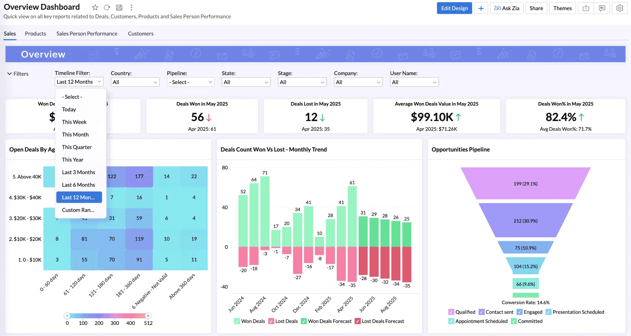
Zoho Analytics is a reporting platform aimed at small and mid-size businesses, particularly teams already in the Zoho ecosystem. With 500+ integrations spanning marketing, finance, CRM, and the complete Zoho suite, there’s no shortage of pathways to get data into your dashboard. A drag-and-drop report builder handles the non-technical side, while a full SQL editor is there when analysts need it, so mixed teams can work from the same platform. And as fans of Zoho are quick to point out, a big win for consultants and agencies is the fact that your clients don’t need a license to access your dashboards.
Zoho Analytics pros and cons
Pros:
- 500+ integrations including the full Zoho ecosystem
- Clients can view shared dashboards without a paid license
- Non-technical users get a drag-and-drop builder; analysts get a full SQL editor
Cons:
- Free plan limited to 2 users and 10,000 rows
- Not much dashboard design flexibility
- Teams outside the Zoho ecosystem may have more of a learning curve
Zoho Analytics best features
- 500+ data integrations: Connect to Salesforce, HubSpot, Google Ads, Stripe, MySQL, BigQuery, and the full Zoho suite.
- Client sharing without extra licenses: Share live dashboards with clients, regardless of whether they have a Zoho account.
- Zia AI: Ask questions about your data, get automatic alerts when something looks off, and get AI-generated summaries.
- Works for technical and non-technical teams: Non-technical users can build dashboards with drag-and-drop while analysts write SQL for deeper work, both from the same platform.
- Map charts: Built-in map support for sales territory reporting, regional performance tracking, and logistics teams.
Pricing
- Free: 2 users, 10,000 rows, 5 workspaces, unlimited reports and dashboards
- Standard: $48/month (billed annually), 5 users, 1M rows, 50+ business app connectors, unlimited reports and dashboards
- Premium: $115/month (billed annually), 15 users, 5M rows, Zia AI Agent, activity logs
- Enterprise: $455/month (billed annually), 50 users, 50M rows, premium ERP connectors, analytics portal
You can add extra users to any plan for $6.40/user/month. Zoho One is also worth a look if you need more than just analytics: it bundles Zoho Analytics with 50+ Zoho apps including accounting, CRM, and customer support tools for $37/user/month.
How to choose the right dashboard software
If you’re not quite sure which tool makes sense for you, here are some final thoughts.
For free reporting and easy setup, start with Data Studio if your data lives in Google, or Zoho Analytics if you need more integrations. Both let you share reports with clients without requiring an account or a paid license.
For organizations with dedicated data teams, Power BI is a strong option, especially if Microsoft 365 is already in your stack. For technical teams that want to dig into their own databases directly or keep data on their own servers for security reasons, Metabase is a better fit.
For marketing agencies, Databox offers polished client reporting across multiple platforms. Just keep in mind that only three data sources are included on most plans. (You can buy more a la carte.)
For custom dashboards built around the needs of your business, Softr is the best option. You can build exactly what you need, with your database, app, and workflows all connected from the start, without a developer.
Find the best dashboard software for your team
Most of the tools on this list are useful within the narrow parameters they’re designed for. If your data lives in Google, Data Studio gets reports live in minutes. If you have a dedicated data team, Power BI handles the heavy lifting. If you need open-source flexibility or self-hosting, Metabase is built for that. But each of these tools has a ceiling, because in the end, they’re all designed specifically for reports and dashboards.
Softr is different. It’s not a reporting tool with extra features bolted on. Instead, it’s a platform where the dashboard, the database, and the automations are all connected from the start, and you can build exactly what your business needs without a developer.
Try Softr for free to build your first dashboard, or explore dashboard templates to see what’s possible.
Frequently asked questions
What’s the best free custom dashboard software?
What's the real difference between a free and a paid dashboard tool?
Can I build a client-facing dashboard for free?
Do free dashboard tools support real-time data syncing?
Can I switch to a paid plan later without rebuilding my dashboard?