Your team already tracks the numbers that matter: revenue, projects, inventory, client activity, pipeline performance. Metrics live in spreadsheets, CRMs, and a handful of SaaS tools.
When someone needs an update, teammates pull data from several places, build a quick chart, and send it in Slack or email. It works for a while, but the process doesn’t scale.
If this sounds at all familiar, it’s worth considering a no-code dashboard builder. They bring your data into one place and turn it into clear visual insights your team can act on. But not all tools handle your operational data the same way.
In this blog, we break down what a no-code dashboard builder is, what features matter, and which tools are actually worth considering.
What is a no-code dashboard builder?
A no-code dashboard builder is a tool that lets teams create data dashboards without writing code — in other words, they do what it says on the tin. Instead of relying on analytics software, users connect to their data sources and build custom dashboards using visual components like charts, tables, and filters.
These platforms turn messy, raw operational data into real-time insights that teams can monitor and share across the organization. Businesses use them to track performance metrics and build internal reporting tools, client dashboards, and operational control panels.
Unlike a dedicated analytics app (think Google Analytics or Salesforce), no-code dashboard builders are data-agnostic. They don’t care where your data comes from—whether that's a spreadsheet, a database, an API, or a bunch of different tools—and they don’t prescribe what you should measure.
What to look for in no-code dashboard builder tools
Here’s what to evaluate when choosing the right no-code dashboard builder for your team.
- Ease of setup and use: The tool should let non-technical teams build dashboards quickly without complex configuration or engineering support.
- Data integrations: Look for platforms that connect easily to the systems where your data already lives — databases, spreadsheets, CRMs, and APIs.
- Performance with large datasets: Dashboards should load quickly and remain responsive even as your data grows.
- User permissions and access control: Strong permission settings ensure the right people see the right data. This is especially important when dashboards are shared with clients or external partners.
- Customization and layout flexibility: Your team should be able to structure dashboards around how they actually want to track and review data — and not be limited to fixed templates or layouts.
- Interactive filters and controls: Good dashboards let users explore data themselves by filtering metrics, time ranges, or categories.
- Collaboration and sharing: Look for tools that make it easy to share dashboards with teammates, stakeholders, or clients without exporting reports manually.
- Automation and data refresh: Dashboards should update automatically so teams always work with current data instead of outdated reports.
- Pricing that scales reasonably: Some platforms become prohibitively expensive as more users access dashboards, so choose one that makes it clear how costs increase over time.
Best no-code dashboard builder software at a glance
1. Softr — best for building AI-powered, operational dashboards without code
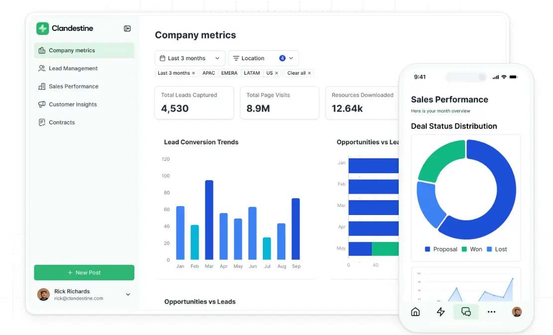
Softr is an AI-powered, no-code platform that lets teams build rich operational dashboards on top of their business data. Many companies still track projects, customers, and performance across spreadsheets, emails, and disconnected apps. The result is manual reporting, duplicated work, and systems that break as the business scales.
Softr brings each of those workflows into one place. You can manage your data in Softr’s built-in relational database and connect it to a live custom dashboard. Or, you can sync with external data sources like Airtable, Google Sheets, HubSpot, or SQL databases with real-time updates.
You also get flexibility in how you visualize metrics: turn your data into dashboards, charts, tables, text summaries, and more. Softr makes it simple to track what’s happening across sales, operations, finance, or individual projects. And with the Vibe Coding block, you can just describe the dashboard you need, and Softr’s AI will generate it with your data already connected.
And if you need to share dashboard access to external clients, you can build a secure portal and configure role-based access so users see only the data you want them to.
Softr pros and cons
Pros:
- Easy to set up and maintain: Non-technical teams can build and launch dashboards in minutes with AI, templates, and a no-code visual editor.
- Granular permissions: Role-based access control ensures visitors (external or internal) see only the dashboards, docs, or info relevant to them.
- Real-time data sync: Changes in your database update instantly on the dashboard, so customers or employees always see accurate, reliable information.
- AI agents and native workflow automation: Use Database AI Agents to enrich records, surface insights, search the web, and trigger actions when data is added or updated.
- Performance visibility without manual reporting: Track goals, KPIs, and results through live dashboards instead of collecting updates from multiple tools.
- AI-assisted dashboard creation: The Vibe Coding block allows users to describe the dashboard they want, and Softr generates it automatically with the relevant data included.
- Scales with your operations: Add new processes, teams, or dashboards as your business grows without rebuilding your system or hitting sudden pricing barriers.
Cons:
- Advanced analytics may still depend on integrations with external tools (e.g. Rest API)
- Not intended for teams that need full control over backend code
Softr best features
- Build dashboards on top of your data: You shouldn’t copy data between tools. Instead, store and manage information in Softr's native database, or connect to other data sources with real-time, two-way sync.
- Customizable dashboard views: Build dashboards in different layouts and widgets—like charts, tables, and summary blocks—across multiple pages.
- AI-powered search & interactive filters: Let users explore dashboard data using advanced filters or Ask AI. Teams can quickly find specific records, metrics, or datasets without manually digging through tables.
- Export and sharing options: Share dashboards via secure links or export reports as PDFs and CSV files.
- Enterprise-grade performance and security: Handle large datasets with infrastructure designed for scale while supporting compliance standards like GDPR and SOC 2.
- Pre-built templates with sample data: With Softr, there’s no need to build from scratch or have technical coding knowledge. You can start building dashboards and apps on top of your data with the help of a library of 90+ app templates.
- Works on any device: Softr-made apps are fully responsive by default, and can be turned into downloadable mobile apps using Softr’s PWA feature.
Softr pricing
Softr has predictable pricing tiers and a generous free plan so you can try before signing up.
- Free: 10 users, unlimited apps, 5 AI credits, 5,000 database records, and 500 workflow actions
- Basic: $49/month for 20 users, 10 AI credits, 50K records, 2.5K workflow actions
- Professional: $139/month for 100 users, 50 AI credits, 500K records, and 10K workflow actions
- Business: $269/month for 500 users, 100 AI credits, 1M records, and 25K workflow actions
- Enterprise: Custom pricing
2. Glide – best for turning spreadsheet data into simple operational dashboards

Glide is a no-code platform that turns spreadsheet data into apps and dashboards without writing code. Teams typically connect to a tool like Google Sheets or Excel, then use Glide’s visual builder to create screens with tables, charts, KPI cards, and forms. This allows users to build lightweight dashboards that track metrics like sales performance, inventory, project status, or team activity. Glide is especially popular with small teams that already manage reporting in spreadsheets and want an internal tool to visualize their data.
Compared with platforms like Softr, Glide tends to favor a spreadsheet-driven architecture and quick app generation. But it can become restrictive when teams need more complex relational data structures, deeper interface customization, and dashboards built on larger datasets.
{{cta-1}}
Glide pros and cons
Pros:
- Simple visual interface builder: Non-technical teams can assemble dashboards using drag-and-drop components like charts, lists, and KPI cards.
- Built-in data transformations: Glide includes computed columns and logic tools that allow teams to calculate metrics and prepare data without external processing.
- Dashboards paired with workflows: Dashboards can live alongside workflows, letting users view metrics, update records, and trigger actions in the same interface.
- Flexible user access controls: Apps can be shared with internal teams or external users with role-based access to different data views.
Cons:
- Data can become difficult to manage as apps grow beyond simple spreadsheet structures
- Performance limits can create friction when dashboards rely on large datasets
- Design flexibility and interface customization are limited
Glide best features
- Spreadsheet-driven app generation: Glide can generate a functional interface from data sources like Glide Tables, Google Sheets, or Excel.
- Chart and visualization components: Built-in charts allow teams to display operational metrics, trends, and KPIs directly inside dashboard views.
- Real-time data sync and updates: Dashboards automatically reflect changes in the underlying data, helping teams monitor operations without manual refreshes.
- Multi-page app structure: Teams can organize dashboards alongside tables, forms, and workflows within a single app, creating a more complete internal tool.
- Reusable components and layouts: Glide allows teams to reuse design patterns and components across screens, helping maintain consistency as apps grow.
Glide pricing
Prices shown reflect annual billing.
- Free: For creating basic apps with limited usage and up to 25k spreadsheet rows (no published apps on the free plan)
- Business: $199/month for up to 30 users
- Enterprise: Custom pricing
3. Airtable Interface Designer — best for simple internal dashboards inside Airtable workflows
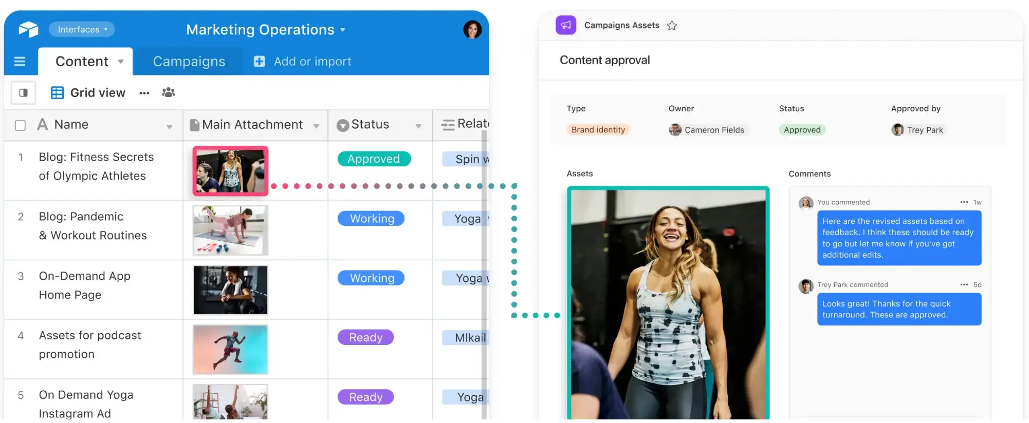
Airtable Interface Designer is a visual interface builder that lets teams create dashboards and basic internal tools on top of the data stored in Airtable. Instead of working directly inside tables, collaborators interact with structured data through simplified pages specific to their role. Teams can use Airtable Interface Designer to monitor pipelines, track projects, review metrics, or update records without navigating the full back-end database structure. Because interfaces connect directly to the underlying base, dashboards update automatically and users can take actions—such as editing records or updating statuses—directly from the interface.
Airtable Interface Designer pros and cons
Pros:
- Native dashboards built on live Airtable data: Interfaces connect directly to Airtable tables, so dashboards automatically update as records change without needing a separate analytics tool.
- Role-specific views for different teams: Builders can create pages that show only the data and actions relevant to specific users, helping teams interact with complex datasets more easily.
- Interactive dashboards, not just reporting: Users can add or update records, change statuses, and complete workflow actions directly from the interface.
- Fast to build for existing Airtable workflows: Teams already using Airtable can quickly add dashboards and operational pages without integrating another platform.
- Visual layout builder: Interfaces are created with drag-and-drop components such as charts, record lists, filters, and summary metrics.
Cons:
- Limited dashboard customization and design flexibility compared with dedicated dashboard builders
- External sharing and client-facing dashboards can be limited because access is tied to Airtable collaborators and workspace permissions
- Performance limitations with large datasets and high record volumes
Airtable Interface Designer best features
- Dashboard layouts: Dedicated dashboard pages allow teams to display charts, metrics, and record summaries to track performance across projects or pipelines.
- Multiple visualization types: Interfaces support charts, grids, calendars, kanban views, galleries, and forms to present data in different formats.
- Custom page layouts: Builders can combine components like lists, charts, summaries, and filters to create structured workflow or reporting pages.
- Record-level filtering and personalization: Interfaces can be configured to show specific records based on filters or user context, helping teams focus only on relevant data within large datasets.
Airtable Interface Designer pricing
Prices shown below reflect annual billing.
- Free: For up to 5 editors 1,000 records per base
- Team: $20/user/month
- Business: $45/user/month.
- Enterprise Scale: Custom pricing for large organizations.
[.blog-callout]
💡 Softr lets you build client portals, CRMs, and dashboards on top of your Airtable data with real-time sync, granular permissions, and branded, full-stack experiences.
[.blog-callout]
4. Retool — best for developer-led teams building internal dashboards
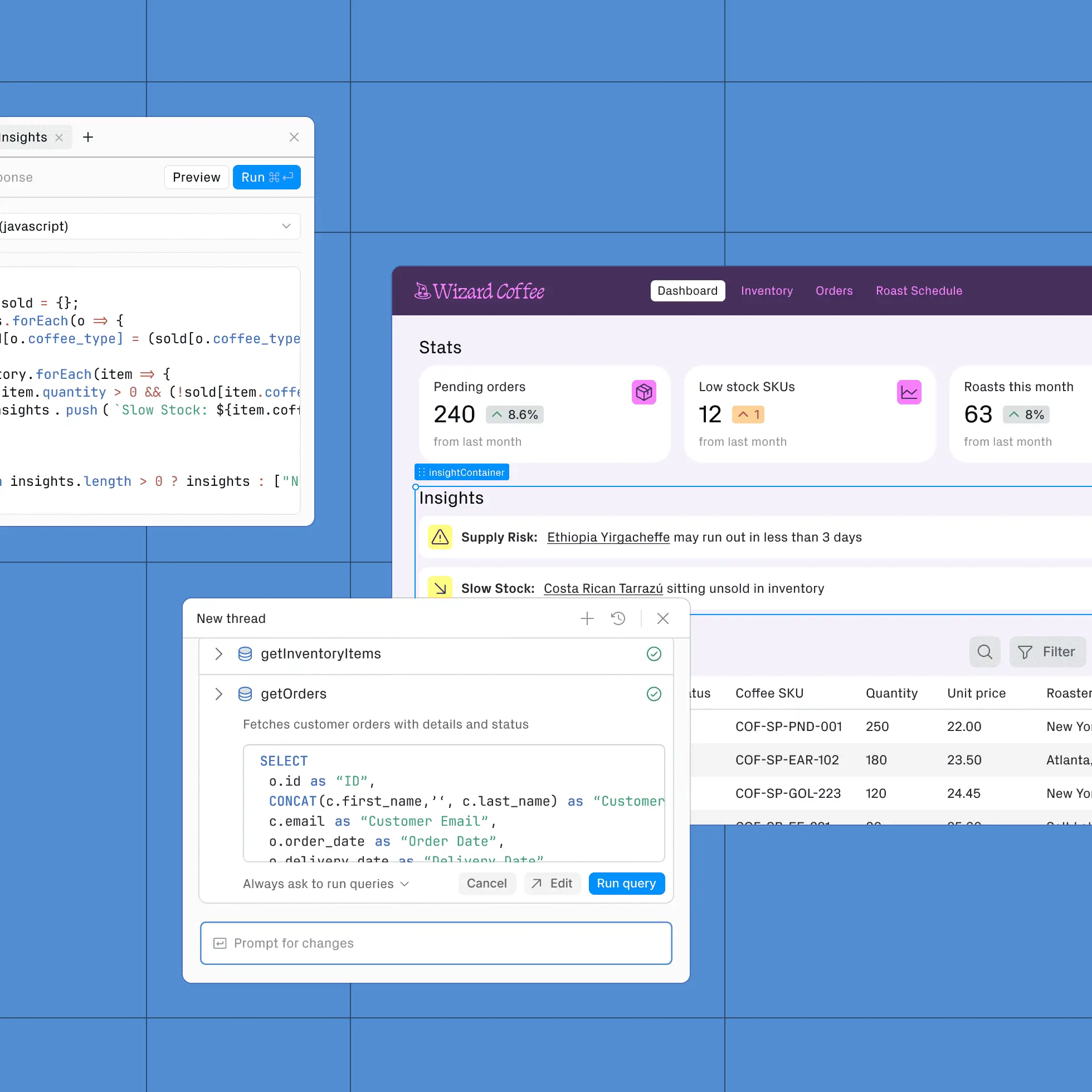
Retool is a low-code platform for building internal tools like dashboards, admin panels, and workflow automation engines. Teams assemble dashboards using prebuilt components like tables, charts, forms, and filters, then connect them directly to databases or APIs. The platform is designed primarily for technical teams who want to build internal software while still being able to write SQL or JavaScript when needed. Retool can be used to create reporting dashboards that let teams not only view data but also update records, trigger workflows, and manage business processes from a single interface.
Retool pros and cons
Pros:
- Direct connections to databases and APIs: Dashboards can pull live data directly from SQL databases, APIs, and third-party tools without building a separate backend layer.
- Fast internal tool development: Prebuilt UI components allow teams to assemble working dashboards and admin interfaces much faster than building them from scratch.
- Interactive dashboards: Users can edit records, trigger workflows, and run actions directly from the dashboard instead of only viewing reports.
- Flexible customization with code: Developers can extend dashboards using SQL queries and JavaScript when more complex logic or workflows are required.
- Strong integration ecosystem: The platform supports many data sources and services, allowing dashboards to act as a unified interface across multiple systems.
Cons:
- Requires technical knowledge in SQL or JavaScript for many dashboards
- UI customization and design flexibility can feel limited compared to fully custom front-end dashboards
- Pricing can scale quickly as more builders or internal users need access
Retool best features
- Visual dashboard builder: Drag-and-drop components such as tables, charts, filters, and forms to create operational dashboards without building UI code from scratch.
- Query-driven data layer: Builders can run SQL queries or API requests to power dashboard components and automate backend logic.
- Reusable data resources: Shared connections and queries can be reused across multiple dashboards and internal tools.
- Permissions and access controls: Role-based permissions help teams control who can view, edit, or manage dashboard data.
Retool pricing
Pricing shown reflects annual billing for the cloud version.
- Free: Includes unlimited apps
- Team: $10/month/builder + $5/month/internal user
- Business: $50/month/builder + $15/month/internal user
- Enterprise: Custom pricing
5. WeWeb – best for building product-grade dashboards on top of external back-ends
WeWeb is a visual front-end builder used to create data-driven web applications such as SaaS dashboards, client portals, and admin interfaces. Instead of storing data itself, the platform connects to external back-ends like databases or services such as Supabase and Xano. Teams design responsive interfaces with a drag-and-drop editor, bind UI components to live data, and deploy dashboards as web apps. This architecture makes WeWeb particularly useful when dashboards need to be part of a larger application rather than just a reporting page.
WeWeb pros and cons
Pros:
- Front-end-first architecture: WeWeb focuses on building the UI layer of web apps, allowing teams to design dashboards while connecting to external data sources.
- Flexible back-end integrations: The platform connects to REST APIs, GraphQL APIs, and databases, making it possible to power dashboards with almost any backend system.
- Highly customizable UI builder: Drag-and-drop layout controls, reusable components, and responsive design tools allow teams to build fleshed-out dashboard interfaces.
- Interactive data experiences: Dashboards can include filters, dynamic data rendering, and actions that trigger workflows or API calls.
- Web app deployment: Users can deploy full web apps rather than simple dashboard pages.
Cons:
- Requires an external back-end, which can add significant setup complexity
- Learning curve can be higher than other no-code builders because it exposes concepts like APIs, state, and data bindings
WeWeb best features
- Back-end-agnostic data connections: Dashboards can connect to APIs, databases, and back-end platforms, enabling flexible data architectures.
- Dynamic data binding: UI components can display and update live data, making dashboards interactive rather than static reports.
- User authentication and permissions: Role-based access controls allow different users to see different dashboards or data views.
- Custom logic and workflows: Actions and event triggers enable dashboards to run API calls, update records, or automate processes.
- Code export and extensibility: Developers can extend the app with custom code when deeper customization is required.
- Responsive design system: Built-in layout tools ensure dashboards work across desktop and mobile without rebuilding the interface.
WeWeb pricing
Seat pricing for builders and hosting plans are separate. Prices shown reflect monthly billing.
Seat plans
- Free: Includes 1 developer seat
- Essential: $20/month/developer seat
- Pro: $50/month/seat (unlimited seats)
- Partner: $79/month/seat for agencies and freelancers
Hosting plans
- Free: $0/month (WeWeb subdomain, limited sessions)
- Launch: $13/month
- Grow: $25/month
- Scale: $100/month
Find a no-code dashboard builder that fits your needs
No-code dashboard builders make it easier to turn scattered data into insights your team can actually use. But with so many tools available, picking the right dashboard builder will depend o your particular workflows and data setup. Ask yourself:
- Where does your data currently live: spreadsheets, databases, or SaaS tools?
- Do you need dashboards only for reporting — or also for running operational workflows?
- Will dashboards be used internally, or shared with clients and partners?
- Do non-technical team members need to build or maintain them?
- How important are role-based permissions and secure data access?
Once you know how dashboards fit into your operations, choose a platform that matches how your team manages data. If you need custom dashboards connected directly to operational workflows and internal tools, try building one with Softr using a pre-made template.