[.blog-callout]
TL;DR
- Google Sheets can build a basic org chart in minutes using its built-in chart editor. List each role and the role it reports to, then insert an "Organizational Chart."
- The downside is upkeep. A spreadsheet chart is static, lives behind file-level access, and goes stale the moment someone is hired, promoted, or moved.
- For a living team directory your whole company can search and browse, you can build a real app on top of your data with Softr's interface builder, native databases, and granular permissions.
- The fastest way to start is to describe what you need to the AI Co-Builder, use the free Employee Directory Template, or build from scratch. [.blog-callout]
An organizational chart visually represents the hierarchy within an organization and shows the relationships between its employees. You can create one in Google Sheets and share it with everyone in your company so that people understand their roles and who they report to. It's a quick, free way to map your team, and for a small group it's often all you need.
The harder part is keeping it current. The moment someone joins, gets promoted, or changes teams, the chart needs editing, and a stale org chart loses trust fast. Below, you'll learn the two-minute way to build a chart in Google Sheets, and then how to turn that same data into a living directory your whole team can browse. If you'd rather skip the manual build, you can grab the free Employee Directory Template and connect your existing data.

Making an organizational chart in Google Sheets, using its chart editor
Cost: $0
Time: 4 minutes
Making an organizational chart in Google Sheets, using the built-in chart editor, gives you a variety of customization options, including layout, design, and color. You can also share the chart easily, so any changes you make are visible to your team in real time.
Step 1: Select the data
Select the data you want to use to create an org chart by clicking and dragging over the cells in your sheet in Google Sheets.

Step 2: Open the chart editor
In the menu bar, click on the Insert option and select Chart to open the chart editor panel.

Step 3: Select the org chart type
In the setup menu of the chart editor panel, click on the dropdown arrow to find Organizational Chart. Out of all the chart types listed, select the org chart.

Step 4: Set up the organizational chart
By now you already have a chart in your Google Sheet, but you can still improve it. On the right side, in the chart editor panel, you have two checkboxes:
- Switch rows/columns: This transposes the data in the chart, so rows become columns and columns become rows. It's useful if you want to change the orientation of the chart or switch the hierarchical relationship of the data.
- Use row 1 as headers: This uses the first row of your data as the header row for the chart. It's useful when the first row contains your column names, which is our case here: "Position" and "Reports to."

Step 5: Customize your organizational chart
To customize your org chart, click on Customize in the chart editor. Then click on Org to display the editing options. There, you can change the size of the chart and the color of the nodes.

Step 6: Save your organizational chart
You can choose one of several methods to save the org chart you made in Google Sheets. To see all the available options, click on the three dots in the top right corner of your chart.

Step 7: You've made an org chart in Google Sheets
Congratulations! By following all of the steps above, you've made an organizational chart in Google Sheets.

Why a spreadsheet org chart is hard to maintain
A Google Sheets org chart is great for a quick snapshot, but it runs into limits the moment your team starts changing. The chart is static, so it only reflects reality until the next hire, promotion, or reorg, and then someone has to remember to edit the cells. Access is also all-or-nothing: to let a colleague view the chart, you share the whole spreadsheet, which often exposes data you'd rather keep private.
There's a deeper data problem too. Spreadsheets fake relationships by matching text, so if a manager's name changes from "Acme Inc." to "Acme Corp," every reference to it can break at once.
"VLOOKUP and XLOOKUP simulate relationships by matching text strings. If the string changes, every lookup breaks at once. Relational databases store links by unique record identities, so renames propagate automatically without breaking any reference." - Softr, on moving beyond the VLOOKUP
The fix is to keep your org data in one source of truth and put a real interface on top of it. That's where a tool like Softr comes in.
Building a living team directory with your data, using Softr
Time: 5 minutes
Cost: $0
You can also use Softr to turn your org data into a real app. Softr is a full-stack platform: you get an interface builder for the front end, native databases for your data, and Softr Workflows to automate the logic, all in one place. The result isn't a static picture but a searchable directory and org chart your whole team can browse from any device, with the underlying data staying in Softr's own database, Airtable, Google Sheets, or any of 21+ data sources.
This matters once a team outgrows tabs and shared files. Arizona State University moved a curriculum and team hub off Airtable and Google Sheets, where they hit problems with standardization, clunky data entry, and a lack of role-based permissions. After rebuilding it as a Softr app, more than 1,200 unique users accessed the platform in the first month, with over 90% adoption among the people whose work depended on it.
"We can now standardize how courses and programs are described and organized in a machine-readable format and visualize those connections for end-users." - Arizona State University

Step 1: Create your app
There are three ways to start a new app in Softr, and the fastest is to let AI do the heavy lifting. Describe what you want (for example, "a searchable employee directory with an org chart, grouped by department"), and the AI Co-Builder generates a complete app for you. If you'd rather start from a proven structure, use the free Employee Directory Template, or build from a blank canvas if you want full manual control.
After you log in to Softr or sign up for free, you'll land on your dashboard where you can start any of these paths.
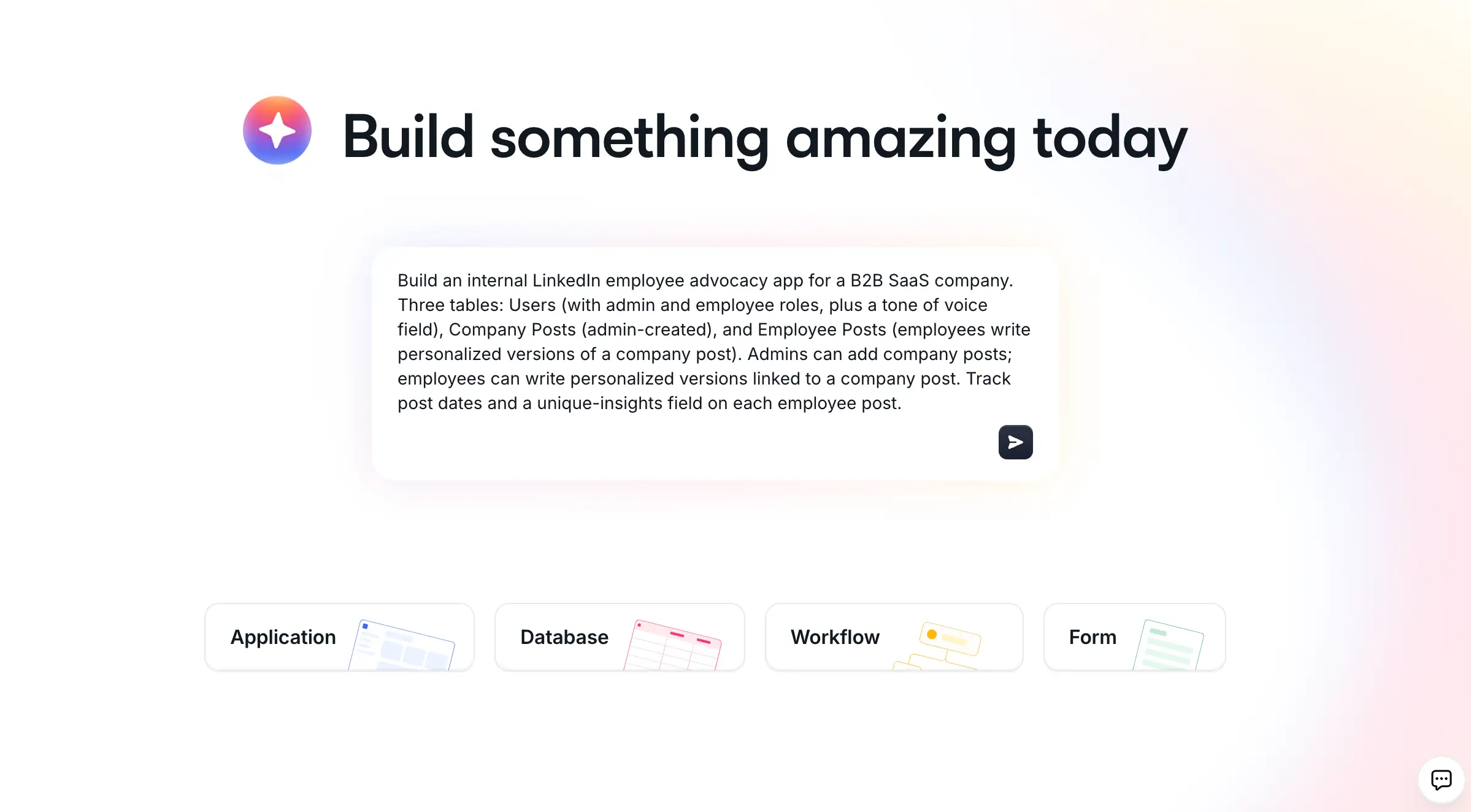
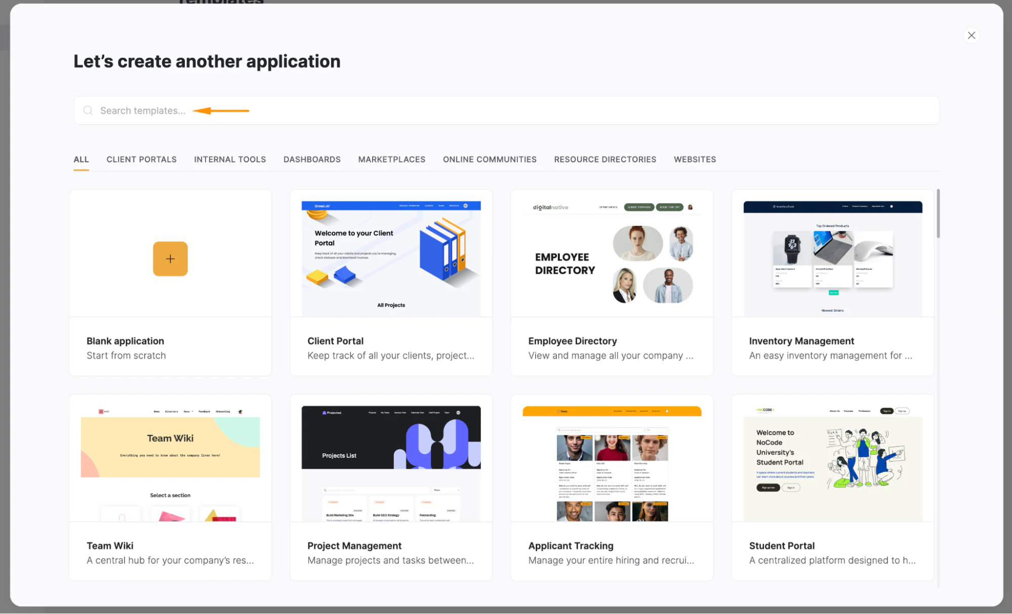
If you prefer to start from a template, click New Application on your dashboard, then search for and select the Employee Directory Template, which includes a built-in organizational chart.
Step 2: Connect your data source
Next, you'll be prompted to choose a data source. For the most durable setup, Softr Databases is the best option, since it's relational by design and lives inside the same platform as your app. You can also connect Airtable, Google Sheets, or any of Softr's 17+ supported sources, including a REST API connector. Because you may already keep your org data in a spreadsheet, you can select Google Sheets here and keep using it.
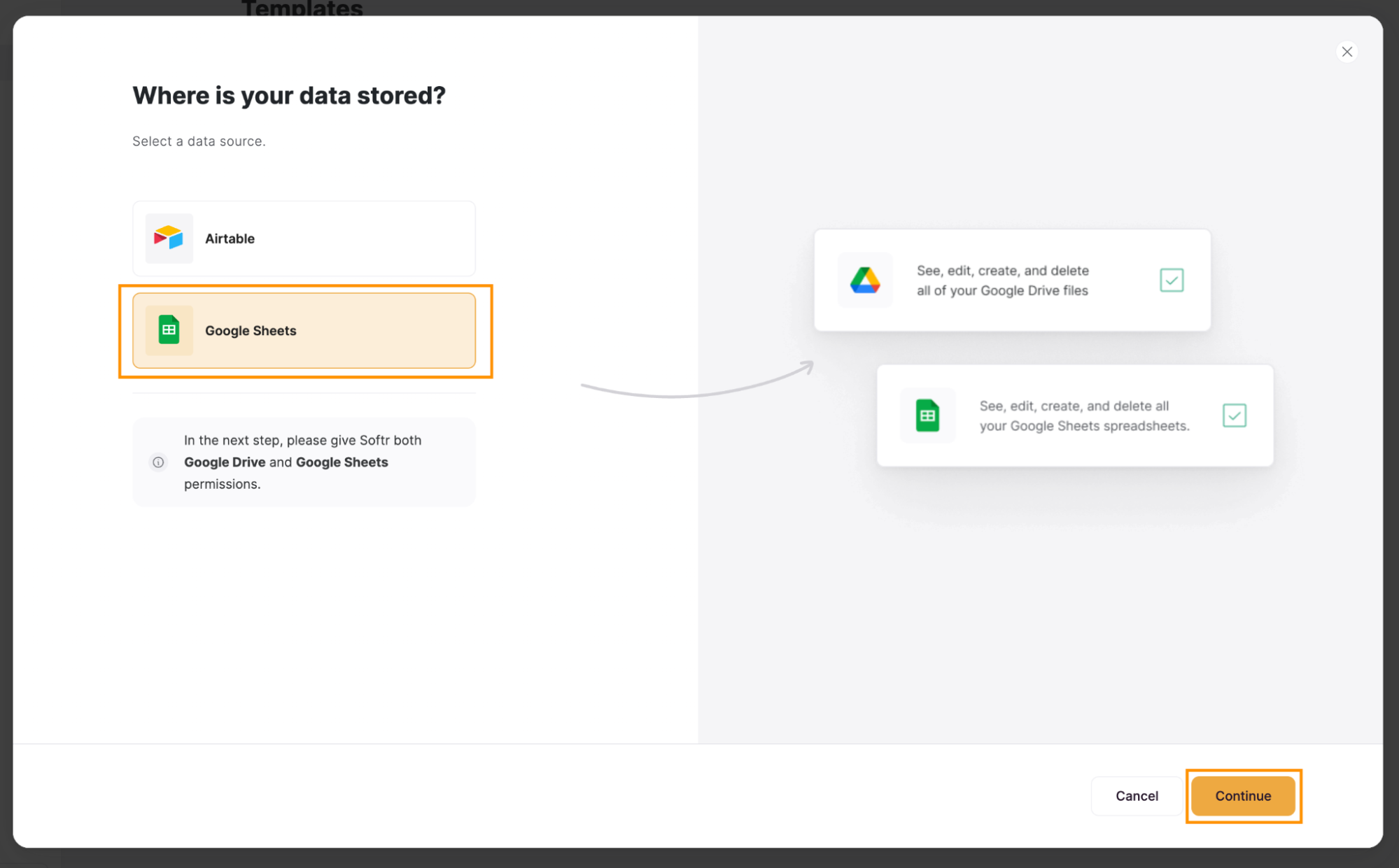
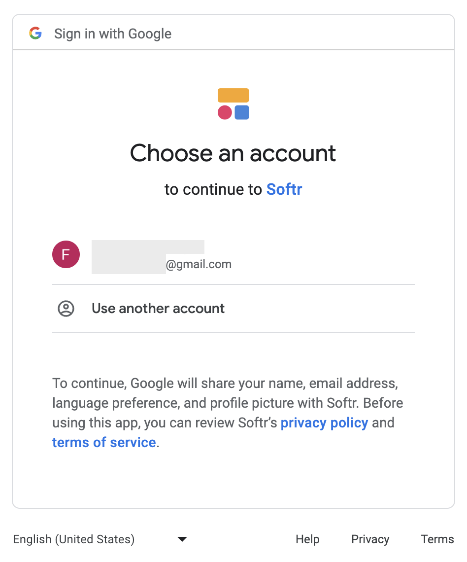
If you choose Google Sheets, a new tab opens for you to select your Google account and grant Softr access. Click Select all, then Continue, and once connected, click Go to application.
Step 3: Access the organizational chart
You now have a complete directory app that includes an organizational chart. To open it, click Pages on the left sidebar, then click Organizational Chart.

Step 4: Connect the chart to your data
For the chart to display your org data, you need to tell it where that data lives. Click on the organizational chart to open a sidebar on the right, then select your spreadsheet and sheet under the Document and Sheet options. If you'd rather not click through every setting, you can also describe what you want to the AI Co-Builder and let it configure the block for you.

Step 5: Map the fields and style the chart
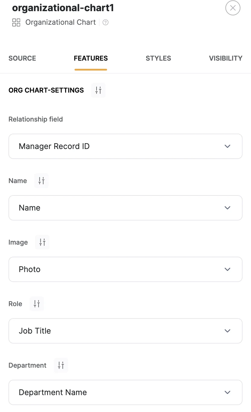
In the Features tab, under Org Chart Settings, map each data field to the right piece of information so the chart knows which column is the person, which is their role, and which is their manager. You can also set the title and subtitle here, then move to the Styles tab to adjust padding, margins, background color, and borders to match your brand.
Step 6: Set access permissions
This is where an app pulls clearly ahead of a spreadsheet. In Google Sheets, sharing the chart means sharing the whole file. In Softr, you control access at the data layer in the Visibility tab: show the chart to everyone, to logged-in users only, or to specific user groups. With users and permissions, you can even hide sensitive fields from certain groups and filter records by who's viewing.
"Spreadsheets only offer all-or-nothing file access. Real business apps enforce permissions at the database level with row-level rules. Because security lives in the data layer, users can't access unauthorized data even if a page layout is misconfigured." - Softr, on what spreadsheets can't do

Step 7: Publish and share with your team
Once your chart is configured, click Publish in the top right corner to make it live and accessible to your team. From here it behaves like a real app, with a searchable directory, profile pages, and an org chart that all read from the same live data.

You've built a living org chart and directory
Using your existing data and Softr, you've gone from a static spreadsheet picture to a customizable org chart and directory your team can actually use. The big difference is upkeep: update one record in your database and every view that reads it, the chart, the directory, the profile pages, updates automatically.
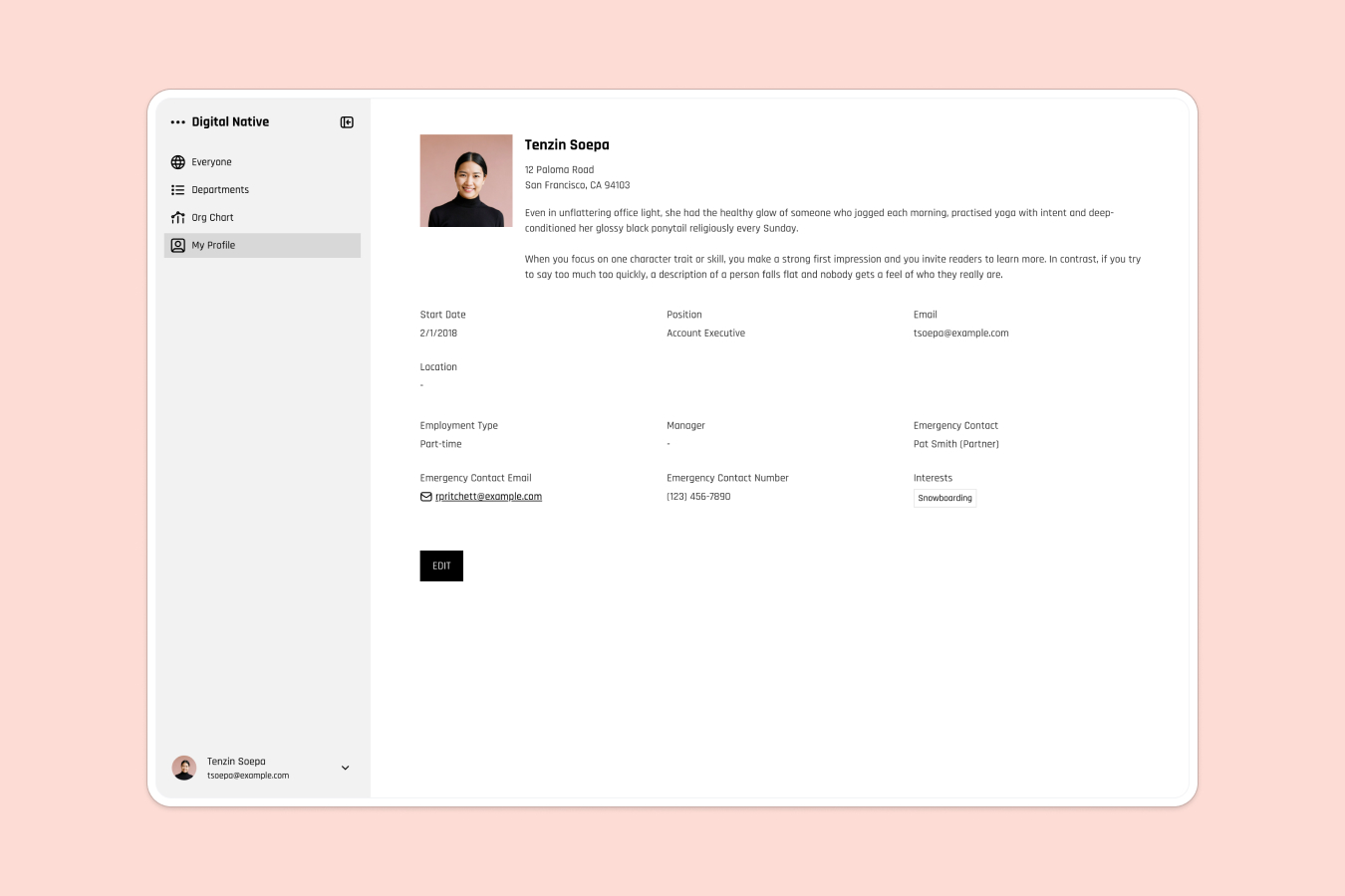
If a spreadsheet chart has been getting stale faster than you can fix it, that's your signal to build the real thing. Start with the free Employee Directory Template, or compare your options in our roundup of the best org chart software for 2026.
Frequently asked questions
Can Google Sheets make an org chart automatically?
What's the difference between an org chart and a team directory?
How do I keep an org chart up to date without redoing it every time?
Is Softr free to build an org chart or team directory?
Can I control who sees the org chart or directory?