

A dashboard transforms complex data from various sources into visually appealing charts, graphs, and tables. Google Sheets dashboards provide a snapshot of key metrics, helping you quickly identify actionable insights and make informed decisions.
In this article, I'll walk you through three ways to create a dashboard in 10 minutes or less.
[.blog-callout]
TL;DR: How to create a dashboard in Google Sheets
There are three main ways to create a dashboard in Google Sheets:
- Use one of the built-in dashboard templates in Google Sheets.
- Use a no-code app builder like Softr to turn your sheet into an interactive, shareable dashboard.
- Build a dashboard from scratch with pivot tables, slicers, and charts. [.blog-callout]
How to create a Google Sheets dashboard using templates
Cost: $0
Time: 5 minutes
Templates provide pre-designed layouts and formatting, saving you a lot of time compared to starting from scratch. This is especially useful when you need to create dashboards quickly.
Here's how to create a dashboard in 9 easy steps:
Step 1: Go to sheets.google.com

Type “sheets.google.com” on the address bar of your preferred internet browser.
Step 2: Open the Google Sheets template gallery

Click “Template gallery” at the top right corner of the dashboard to open the Google Sheets template gallery.
Step 3: Search for dashboard templates under “Work”

Scroll down to find a small list of work-related templates. Choose one of the two options that suit your needs:
- Website traffic dashboard.
- Analytics dashboard.
Step 4: Click on the template to preview it

Click to preview to see the template, then decide if it aligns with your needs. In our example, we selected the Website traffic dashboard template.
Step 5: Add the add-on to your spreadsheet

Most dashboard templates, including this one, can’t work without an add-on. For this example, you can:
- Integrate with Supermetrics, the creators of the template, or,
- Manually copy and paste data from your analytics software into the blue cells in the "Raw Data" tab.
To integrate your analytics software with Google Sheets, click “ADD TO SHEETS” in the Welcome sidebar at the right of your screen. If you don’t see the sidebar, follow the “Option 2” instructions in the “Instructions” sheet.
Step 6: Click on “Install”

After clicking “ADD TO SHEETS,” a popup asks you to install Supermetrics. Click “Install” to start the process.
Step 7: Connect your Google Account to Supermetrics

The previous step will redirect you to a Google sign-in screen where you select your account and accept permissions to connect your Google account with Supermetrics.
Step 8: Click on the “Use” button on the right side of the screen

After the installation is complete, you can start using the template by clicking on “Use.” This will prompt you to select one of the following options:
- Launch sidebar: opens your data source (Google Analytics, in this case);
- Refresh all: updates your data on all sheets;
- Refresh active sheet: reloads the data on the sheet you’re currently on;
- Manage queries: lets you modify your queries;
- Schedule refresh & emailing: lets you refresh at a time you choose;
- Duplicate this file: allows you to create a copy of the spreadsheet;
- Template Gallery: this option takes you back to the template gallery;
- Google Analytics query migration: lets you migrate to GA4.
Select the option that aligns with what you want to perform. You can also manually modify the raw data on your own if you already have it in another sheet, by copying and pasting it to the raw data sheet.
Step 9: Generate a dashboard
Once you’ve gone through all the previous steps, your dashboard should look like this:

Once you’ve gone through all the steps, you should have a dashboard like the one above.
How to create a dashboard in Google Sheets with Softr
Cost: $0
Time: 3 minutes
Google Sheets offers fewer chart types, layout options, and sharing controls than a dedicated app builder. Once your data outgrows a single spreadsheet view, or you need different people to see different slices of it, a spreadsheet dashboard starts to show its limits.
That's where Softr comes in. Describe the dashboard you need and the AI Co-Builder generates a complete, working app (pages, blocks, and permissions already set up) in minutes. You can also start from a template or build manually with dozens of pre-built, drag-and-drop blocks: lists, tables, Kanban boards, calendars, charts, and more.
Here's how to create a dashboard with Softr in 6 easy steps:
Step 1: Create a new app
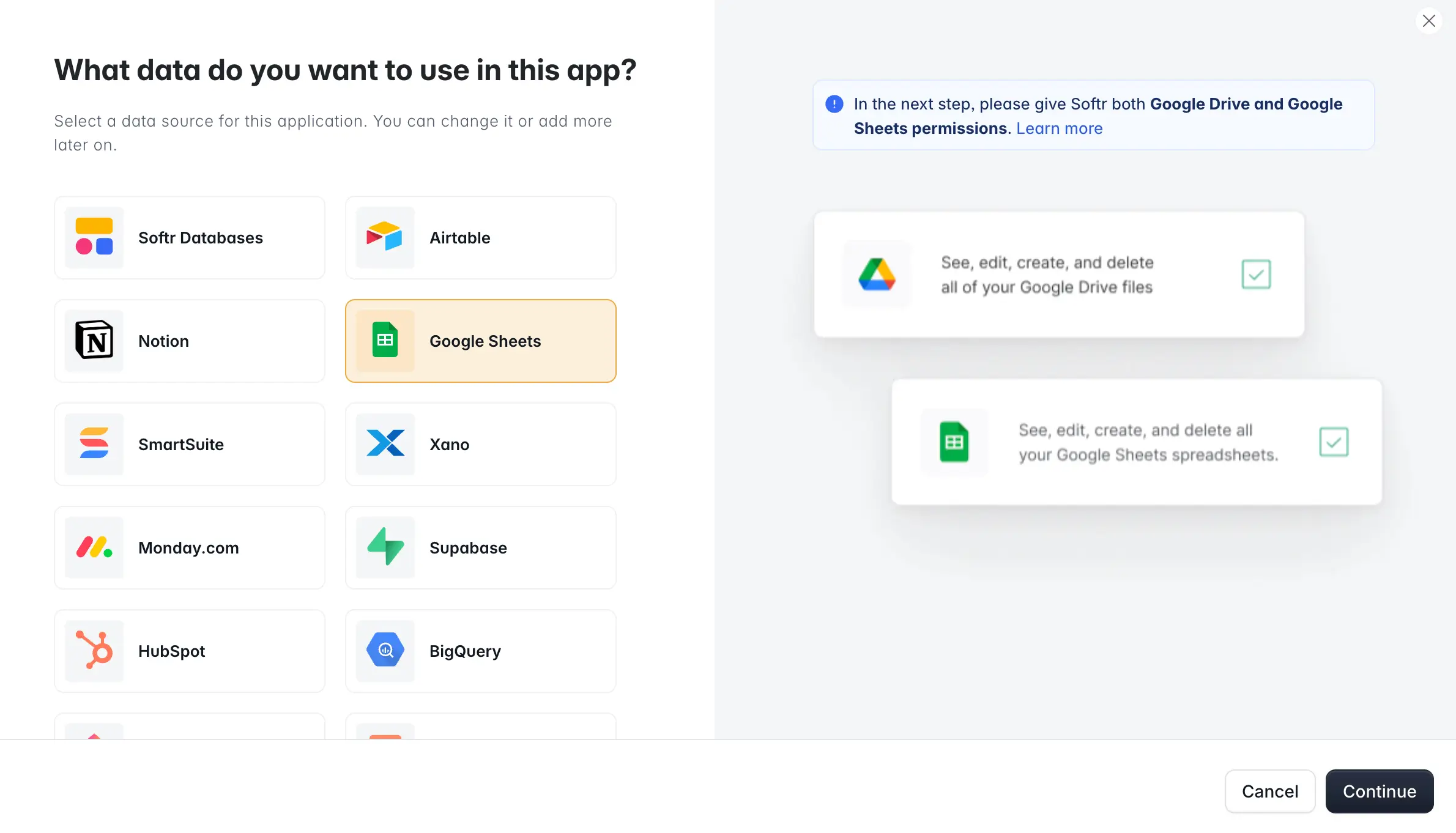
First, you'll need to log in to Softr. If you don’t have an account, you can sign up to Softr for free.
You’ll see three ways to start: generate an app with AI by describing what you need, start from a template (including a ready-made dashboard template), or build from scratch manually.

In this example, we’ll show you how to build a dashboard from scratch so you can see exactly how each piece comes together. Click the “Start from scratch” button to create an application.
Now, uncheck all the pre-built pages except the Home page and click “Create Application."

Step 2: Add a hero section

Let’s start building your dashboard by adding a hero section.
Because your goal is to build a dashboard with the data you have stored in Google Sheets, you can delete the default blocks by clicking on the trash bin icon you see when hovering over each block with your mouse.
Add the "Hero with a call to action" block

To add a block, click on the “Add your first block” button,” which will open a sidebar where you can select all the premade blocks. There, use the search bar to type “hero” and choose the block called hero with a call to action. Or, describe the section you want to the AI Co-Builder and let it add and configure the block for you.
Personalize your hero section

Use the sidebar to add a title or subtitle, change or delete the default image, and more.
Here’s an example of what your dashboard hero could look like:

Step 3: Choose a chart

Use the sidebar to find a chart that suits your needs, then choose:
- A data source from the chart editor.
- The name of the spreadsheet.
- The specific sheet to use.
Here’s a quick video so you can see it in action:
When you sign up for Pro, you can choose from even more customizable chart options:
- Bar chart.
- Line chart.
- Area chart.
- Scatter chart.
- Pie chart.
- Donut chart.
- Rose chart.
Step 4: Add filters

Click on the “conditional filters” option to adjust what's displayed dynamically based on user role, company, or more variables. This is what lets you build one dashboard that shows different data to different users, instead of duplicating pages for each team or client.
Step 5: Customize your dashboard

Go to the features bar and customize your dashboard:
- Name your dashboard.
- Change the title.
- Add subtitles.
- Change your chart type.
- Use the styles tab to change colors and overall appearance.
With Softr, you can easily build dashboards with custom charts, KPIs, text blocks, directories, and even entire apps!
Step 6: Test your dashboard and share


Click the “preview” button to test your dashboard. Softr's preview mode lets you impersonate any user group, so you can check what each type of user sees before you publish.
When you're ready, publish and share it with coworkers, team leaders, key stakeholders, or clients.
This is the same approach FUGA, a music distribution marketing agency, used to replace static PDF reports with live dashboards for over 800 client users. What used to take two people half a day a week to compile manually now updates itself, and clients only see the data relevant to them thanks to Softr's user-specific permissions.
With your data connected, you can build more than dashboards. Client portals, internal tools, CRMs, and full intranets all work the same way: connect your data, add the blocks you need, and set permissions for who sees what.
How to create a dashboard in Google Sheets from scratch
Cost: $0
Time: 10 minutes
Building your Google Sheets dashboard from scratch gives you control over the design, layout, and functionality. You can adapt your Google Sheets dashboard as your data or requirements change without being locked into a predefined structure.
Here's how to make a dashboard from scratch in 10 easy steps:
Step 1: Identify the data sources to include

First, create a new spreadsheet or open an existing one where you want to build your dashboard. Then, determine the data sources you want to import from. These can be other Google Sheets documents, external websites, or APIs.
Step 2: Use import functions to retrieve data from various sources

After determining the data sources, import functions pull the dataset from different sources into your Google Sheets dashboard.
In the example above, we chose to import data from the spreadsheet we created for other examples into a new one using the “IMPORTRANGE” function.
Some useful import functions include:
- IMPORTRANGE: imports data from another Google Sheets file.
- IMPORTXML: imports data from an XML-based source, such as a sitemap file.
- IMPORTJSON: imports JSON data, such as that of an API.
- IMPORTDATA: imports data from a CSV or a TSV file.
- QUERY: imports data within a specified range using a SQL-like syntax.
Step 3: Set data validation rules
Next, you need to define a data validation rule to set up one of the features of your Google Sheets dashboard.
1. Open the data validation rules panel

At the top menu, click "Data" and select "Data validation" from the dropdown menu to open the data validation rules panel.
2. Add data validation rules

Click Add rule in the data validation rules panel to add definitions.
In the Data validation rules panel, click on “+ Add Rule."
3. Configure validation criteria

In the data validation rules menu, select the “Criteria” dropdown and choose a suitable option:
- Drop-down / Drop-down (from a range): Use when you want users to choose from a predefined list of options or when the options may change but are still limited;
- Text-related data validation: Enforce specific text conditions, such as keywords, length, or patterns.
- Date: Ensure consistency in date formatting or limit the date range;
- Number: Restrict numeric data to valid numbers.
- The custom formula is: Use this formula when you have specific criteria that doesn’t fit the other predefined criteria. For example, you can create a formula to validate the sum of multiple input cells.
- Check box: Use when you want users to make binary choices, like marking tasks as done or not.
In this case, we used the drop-down (from a specific range) option for the year column to ensure users select from a specific list of years, such as 2023 to 2026.
Step 4: Use conditional formulas to calculate and display data
After selecting the cell where you want to display the result of your conditional formula, type the appropriate formula in the selected cell based on your condition.
Some helpful conditional formulas include:
1. IF

The IF formula returns one value if a condition is true or high, and another if it's false or low. Use the IF formula when you want to make a decision based on a condition. It returns one value if the condition is true and another value if it's false. Use it to categorize data, show specific messages, or apply simple logic.
2. SUMIF

The SUMIF formula calculates the sum of values that meet a specific condition.
3. AVERAGEIF

The AVERAGEIF formula calculates the average of values that meet a specific condition.
4. COUNTIF

The COUNTIF formula counts the number of cells that meet a specific condition.
Step 5: Set up conditional format rules

Use conditional formatting to dynamically change cells' appearance based on their values or those of other cells in your dashboard.
Highlight the cells or range of cells to which you want to apply conditional formatting. Then, go to the "Format" menu at the top of the Google Sheets interface and select "Conditional formatting".
1. Add a conditional format rule
In the Conditional format rules panel, define various formatting rules based on conditions.

In the Conditional format rules panel, define the formatting rules based on your conditions.
2. Choose a formatting style
Select the formatting style that should be applied when the conditions are met, such as the background color, font color, or fill color.

Select the formatting style that should be applied when the conditions are met, such as the background color, font color, or fill color.
Step 6: Create a pivot table

Next, let’s create a pivot table that will be part of your Google Sheets dashboard.
1. Select the range of data
Choose the specific range of Google Sheets data you want to use, go to the top menu, click Insert, then select Pivot Table.
2. Confirm the data range

A dialog box will open after selecting the pivot table option in the dropdown menu. Verify that the correct data range is selected, and choose whether you want the pivot table in a new or existing sheet. Then click on the “Create” button.
3. Set up the rows and columns

In the pivot table editor, click on “Add” next to “Rows,” “Columns,” and “Values.” Then, you can choose the rows, columns, or values. In our example, we used "Year" for the rows and "Organic Traffic" for the values.
You can use "Calculated Fields" to create custom metrics, perform calculations, or combine data from different columns.
Step 7: Add a slicer

Next, let’s add a data slicer to your Google Sheets dashboard.
1. Open the slicer editor
After creating your pivot table and choosing your data range, go to the top of the menu, click “Data,” and then “Add a slicer.”
2. Choose a column from the “Data” section of the Slicer editor

You have to choose a column for the Slicer feature to work. So, in the slicer panel on the right side of your screen, click on the “Column” button to choose the Google Sheets data you want to use.
3. Customize and share the slicer (optional)

Change the slicer's title, font, color, and format using the Customize tab in the slicer editor.
Step 8: Add a chart

Now, let’s visually represent your spreadsheet data by adding a chart to your Google Sheets dashboard. After highlighting the validated data you want to visualize, click on “Insert” on the top menu and choose “Chart."
1. Move the chart to its own sheet

Moving the chart to its own sheet allows you to focus on customizing it without distractions or clutter. To do this, click on the three dots on the right side of the chart image and then select “Move to own sheet."
2. Open the chart editor again

Click the “edit chart” option on the menu to start editing your chart.
3. Click on the Customize tab of the chart editor

To change the appearance of your chart, click the Customize tab in the chart editor. There, you will see different ways to improve your chart’s appearance (many of which are optional):
- Chart style: Change the chart’s overall look and feel to match your Google Sheets dashboard's theme.
- Chart and axis titles: Provide clear context to viewers by labeling the chart and axes with meaningful titles.
- Series: Highlight specific data points or differentiate between different data series.
- Legend: Make it easy for viewers to understand the data in the chart.
- Horizontal/Vertical axis: Adjust axis labels, scales, and intervals to present the data clearly and accurately.
- Gridlines and ticks: Guide viewers in reading the chart and making accurate data comparisons.
Step 9: Add the sparkline formula

Select a cell where you want to insert a sparkline chart, then enter the SPARKLINE formula with the appropriate parameters. The formula includes data range, chart type, and optional settings.
After inserting the formula, hit enter. The result will be a sparkline based on the kind of chart you chose. As the Google Sheets data changes, the sparkline charts will automatically update to reflect the updated trends. If you want to apply the formula to multiple cells, copy the cell with the formula and paste it into the cells where you want the sparklines to appear.
Step 10: Create a new sheet to set up the dashboard

To set up the Google Sheets dashboard, create a new sheet and copy and paste the elements you want to use to visualize your progress.
From spreadsheet to shareable dashboard
Templates get you a dashboard fast, but they're capped by what Google Sheets can display and who you can safely share the file with. Building from scratch gives you full control over the logic, at the cost of time spent wiring up formulas and pivot tables by hand.
If you want something in between (a dashboard that looks polished, updates live, and can be shared with clients or teams without exposing your raw spreadsheet), connect your Google Sheet to Softr. Start with the AI Co-Builder, a template, or a blank canvas, and you'll have a working, permission-controlled dashboard before you'd have finished formatting the pivot table.
{{cta-1}}
Frequently asked questions
- What is a dynamic dashboard in Google Sheets?
- What is Softr?
- Do I need to take care of hosting and domain setup for my dashboard app?
- What data sources can I use to build a dashboard in Softr?
- How do I control what different users see on a dashboard?