[.blog-callout]
TL;DR
- An XY graph (scatter plot) plots two numerical variables against each other so you can spot correlations, clusters, and outliers in your data.
- Google Sheets' native chart editor is free and works well for quick, one-off scatter plots you only need to view or share as a static file.
- For a scatter chart that lives inside a real business app, with custom styling, restricted access, and live data, connect your Google Sheets (or a native Softr Database) to Softr and use the scatter chart block. [.blog-callout]
An XY graph in Google Sheets, also known as a scatter plot, is a type of chart that displays data points on a cartesian coordinate system. With this type of graph, you can easily visualize and analyze the relationships between two sets of numerical data, represented by the horizontal (X) axis and the vertical (Y) axis values.
In this article, we'll show you how to identify relationships in your data sets by exploring two ways to create an XY graph in Google Sheets. You'll learn how to:
- Create an XY graph in Google Sheets using its native chart editor.
- Build a customizable, shareable XY graph on top of your Google Sheets data using Softr.
If you'd rather see live data update automatically instead of exporting static charts, the second method is worth the extra few minutes it takes to set up.
Create an XY graph in Google Sheets, using its chart editor
Cost: $0
Time: 3 minutes
Creating an XY graph in Google Sheets manually, rather than using tools, allows you to have full control over how your data is presented. To do so, follow the below steps:
Step 1: Select your dataset
Click and drag your mouse to select the range of data you want to use for your XY graph. You need to have two columns of data: one for the X-axis values; and another for the Y-axis values.

Step 2: Open the chart editor panel
Go to the "Insert" menu at the top of your Google Sheet and then select “Chart” to open the chart editor panel.

Step 3: Create a scatter chart
In the chart editor panel that appears on the right side of your screen, click on “Setup.” Under "Chart type," scroll down and select “Scatter."

Step 4: Customize your XY graph
Now that you have an XY graph in your spreadsheet in Google Sheets, you can customize various aspects of it, including the title, axis labels, and data series. To do so, click on “Customize” on the chart editor panel and follow the next steps.

Step 4.1: Customize the style
Under the “Customize” option, select “Chart style.”. In the unfolded menu, you can change the background color, the font, and the color of the chart’s border.
Once you are satisfied with your changes, click on “Reset layout” to save them.

Step 4.2: Customize the chart and axis title
Under the “Customize” option, select “Chart & axis titles.” In the unfolded menu, click on the first drop-down arrow to select which title you want to customize. You can choose from changing the chart’s title or subtitle, or even the horizontal or the vertical axis titles.
Once you’ve decided which title you want to change, you can field under “Title text” to type a new title. You can also change the title’s font, size, format, and color.

Step 4.3: Customize the series
Under the “Customize” option, select “Series.” There, you can change the appearance of any of the series that your XY graph is based on. In our example, we chose a series called “Exam points.”
In the Format section, you can then change the appearance of the points in the graph by changing their color, opacity, size, and shape. Making these changes will result in real-time changes in your XY graph.

Step 4.4: Customize the axis
Under the “Customize” option, select either “Horizontal axis” or “Vertical axis.” There, you can customize the axis label’s font, size, format, and color.
Additionally, you can check the “Reverse axis” checkbox to reverse the order of the information in the axis, so that the first data appears on the right or top of the XY graph. You can also use the “Slant labels” option to customize the appearance of data by slanting it to the desired angle.

Step 4.5: Customize the gridelines and ticks
Under the “Customize” option, scroll down and select “Gridlines and ticks. Then click on the drop-down arrow to select the axis you want to customize. In this example, we’ll select the vertical axis.
Next, customize the input fields named "Major spacing type," "Major step," "Minor spacing type," and "Minor count." Here’s what these terms mean:
- Major spacing type and Minor spacing type: The type of spacing used for the gridlines and tick marks on the vertical axis. They offer a choice between "Step" and "Count.”
- Major count and Minor count: The distance between the gridlines and tick marks on the axis. You can either choose “Auto,” “None,” or any number between 1 and 10.
In our example, we selected major and minor spacing as “Count” and choose 6 as the major count and 2 as the minor count.

Step 5: Save your XY graph
To save your XY graph, click on it, then click on the three dots that appear in the top right corner. Here, you’ll find several ways you can save your graph. Let’s explore each one in the following steps.

Step 5.1: Download your XY graph
In the drop-down menu that appears, select the “Download chart” option, then choose either PNG, PDF or SVG format to save your graph on your computer.

Step 5.2 Publish your XY graph
To publish your XY graph to the web, click on “Publish chart” in the drop-down menu that appears after clicking the three dots in the graph. You will then be asked if you’d like to publish your graph as a link or to embed it.

Step 5.3: Copy your XY graph
If you’d like to copy your XY graph into another document, click on “Copy chart” in the drop-down menu that appears after clicking the three dots in the graph. On the document where you want to save your graph, just use the right-click to paste it.

Step 5.4: Move your XY graph to its own sheet
In the drop-down menu that appears after clicking the three dots in your XY graph, you can click on “Move to own sheet.” This will result in your XY graph being moved to another sheet in the same Google Sheets file.

Create an XY graph with your data in Google Sheets, using Softr
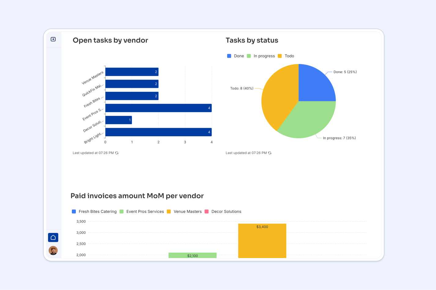
You can also use Softr to turn your Google Sheets data into an XY graph that lives inside a real business app, with colors, fonts, and other visual elements you fully control. Softr connects to Google Sheets and 21+ other data sources, but if you're starting fresh, building on a native Softr Database gives you the fastest, most reliable option since your data and interface run on the same platform.
Step 1: Log in to Softr or create an account
First, you will need to log in to Softr. If you don't have an account, you can sign up for Softr for free.

Step 2: Create a new Application
With your Softr account set up, it's time to create a new application where your graph will be housed. On your Softr dashboard, locate and click on the "New Application" button.
You have three ways to start: describe your app to the AI Co-Builder and let it generate the database, pages, and blocks for you, start from a pre-built template, or build from scratch manually. For a single scatter chart, building from scratch takes just a couple of minutes, but if you're planning a full reporting app around this data, the AI Co-Builder is worth trying first.

Step 3: Select Blank application
Click on "Blank application" in the pop-up window that appears.

Step 4: Click on "Create application"
On the new page, click on "Create application".

Step 5: Open the blocks sidebar
Click on the + button on the top right corner of your screen to open the blocks sidebar.

Step 6: Add an XY graph
In the blocks sidebar, use the search bar to search for "scatter chart." You can also skip the search entirely and ask the AI Co-Builder to "add a scatter chart block" in plain language, and it will drop it onto the page for you.

Step 7: Connect your data source
In the new sidebar on the right side of your screen, click on "Add another data source."

Step 8: Select your data storage
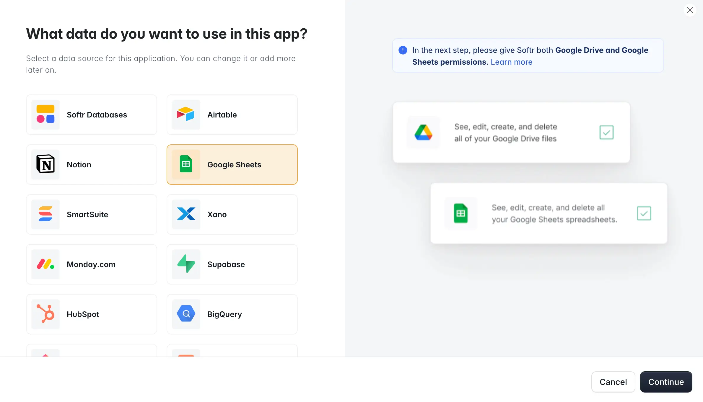
Next, you'll be prompted to choose a data source. If you're starting a new app, a native Softr Database is the simplest option since it's built into the platform and doesn't require a live connection. Since your data already lives in Google Sheets, select "Google Sheets" from the available options, and click on "Continue."
Step 9: Connect to Google Sheets
Now, you have to connect your Softr app with your Google Account. To do so, follow the next steps.
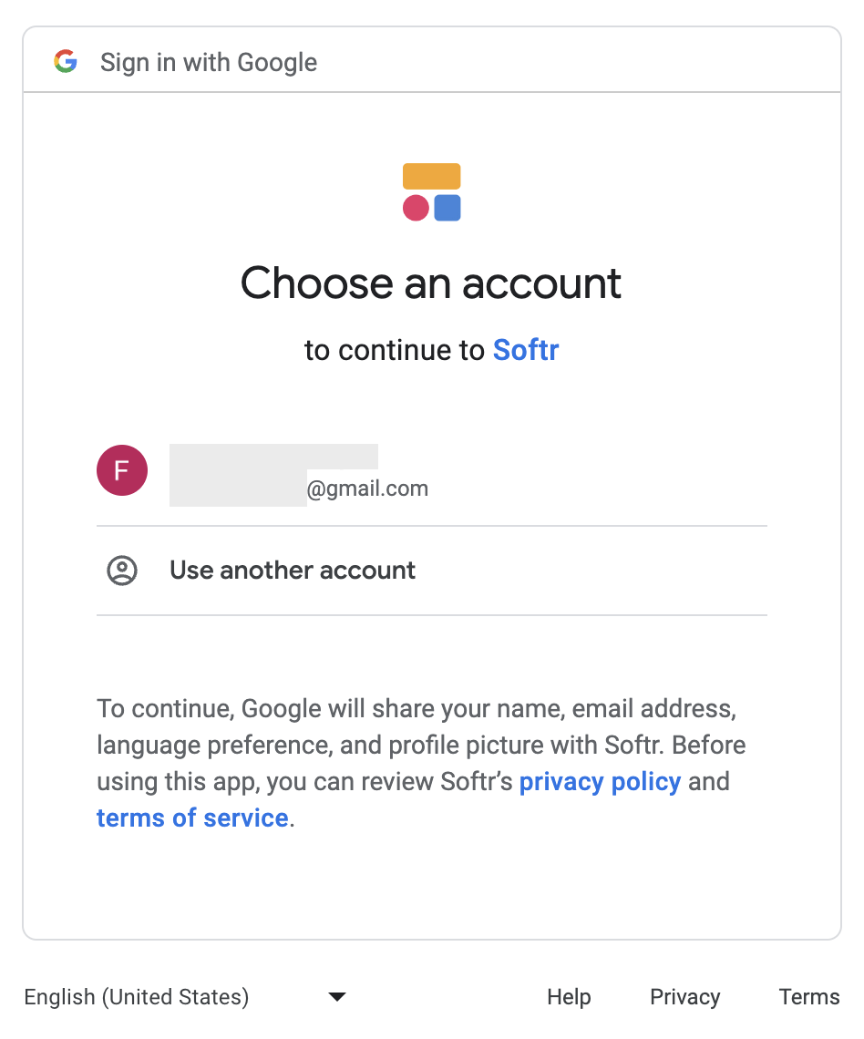
Step 9.1: Select a Google account
A new window or tab will open asking you to log in to or select your Google account.
Step 9.2: Grant additional access
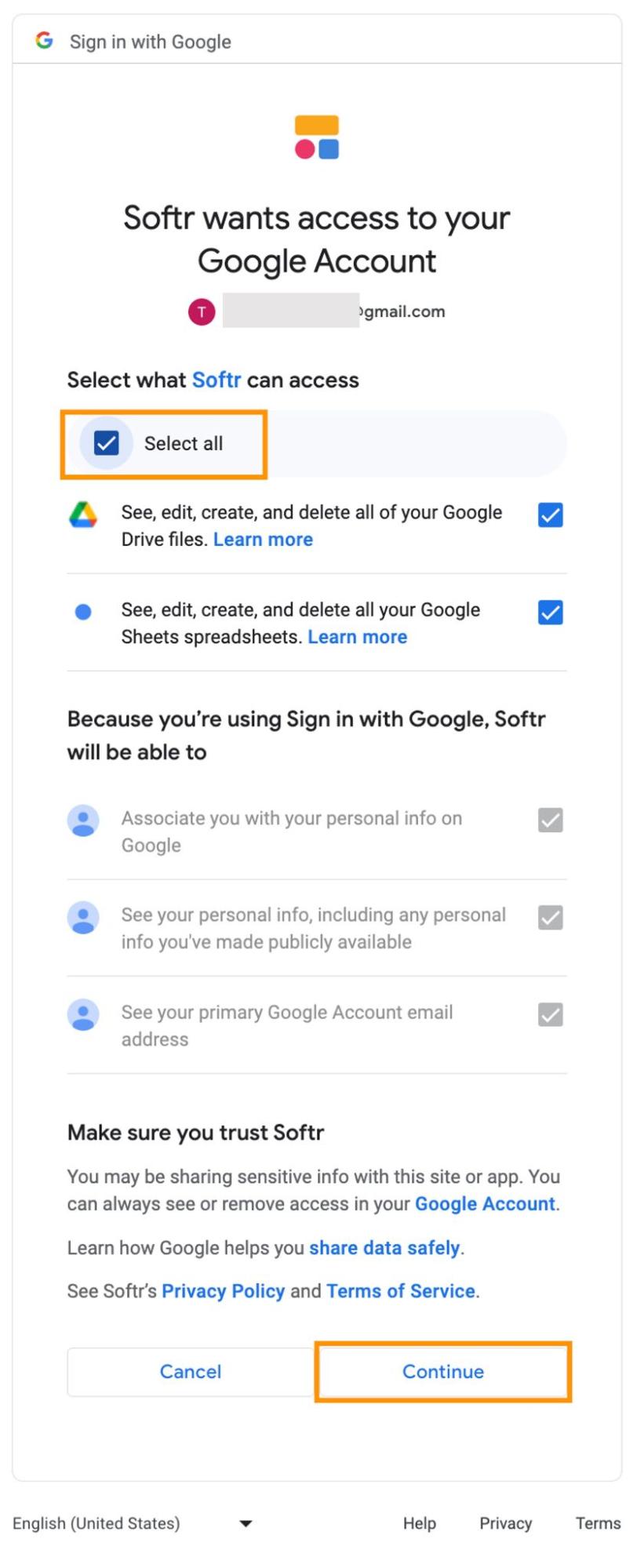
In this step, you'll need to grant Softr access to a set of features. Click on "Select all" and then hit "Continue." Because Softr's Google Sheets connector is an officially approved app, you're simply authorizing a trusted integration rather than exposing any credentials.
Step 10: Select your data
You can have multiple data sources in one Softr app, such as multiple Google Sheets files, so you need to select the particular Google Sheets file that has the data you want to use to create an XY graph.
Step 10.1: Select a data source
On the right side of the screen, Softr will show you all the block settings. In the "SOURCE" tab, click on the "Source" dropdown and choose your data source. This will be the Google account where your data is stored.

Step 10.2: Select the Google Sheets file
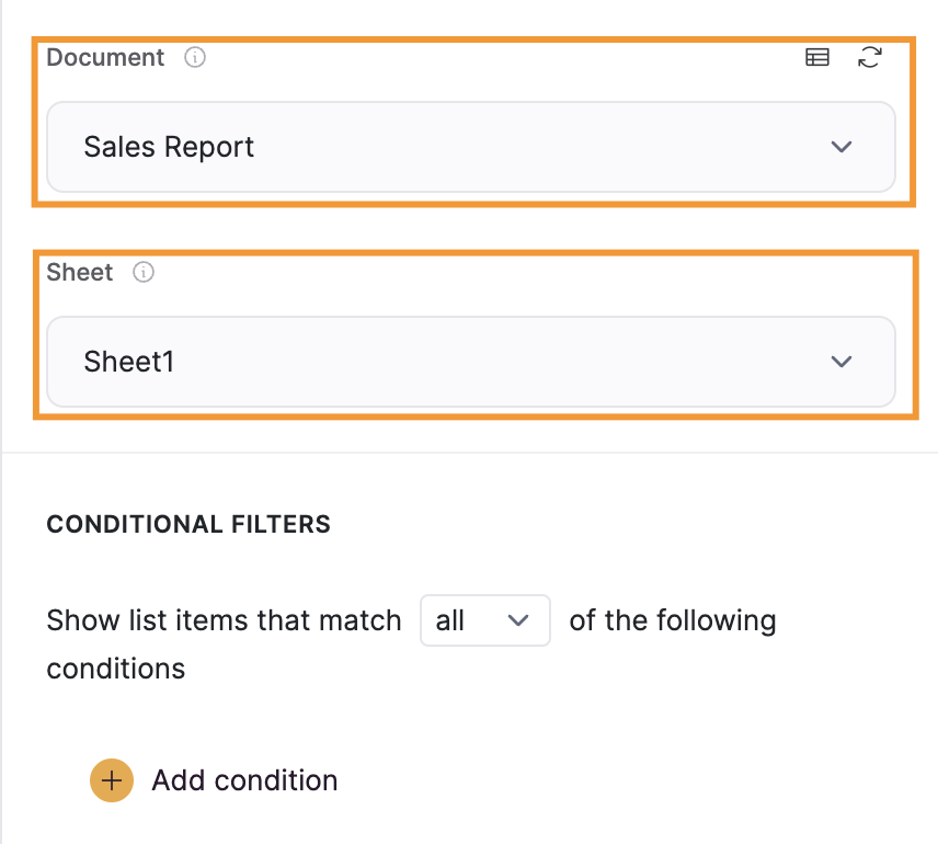
Now, you will need to select the spreadsheet and the sheet where your data is by clicking on the "Document" and "Sheet" options.
Step 11: Customize your XY graph
Unlike Google Sheets, Softr offers many ways to personalize your XY graph so it matches the rest of your app. Let's look at a few examples. You can also describe the changes you want (for example, "change the chart title to Sales by Region and round the corners") to the AI Co-Builder instead of clicking through each tab manually.
Step 11.1: Change title and subtitle
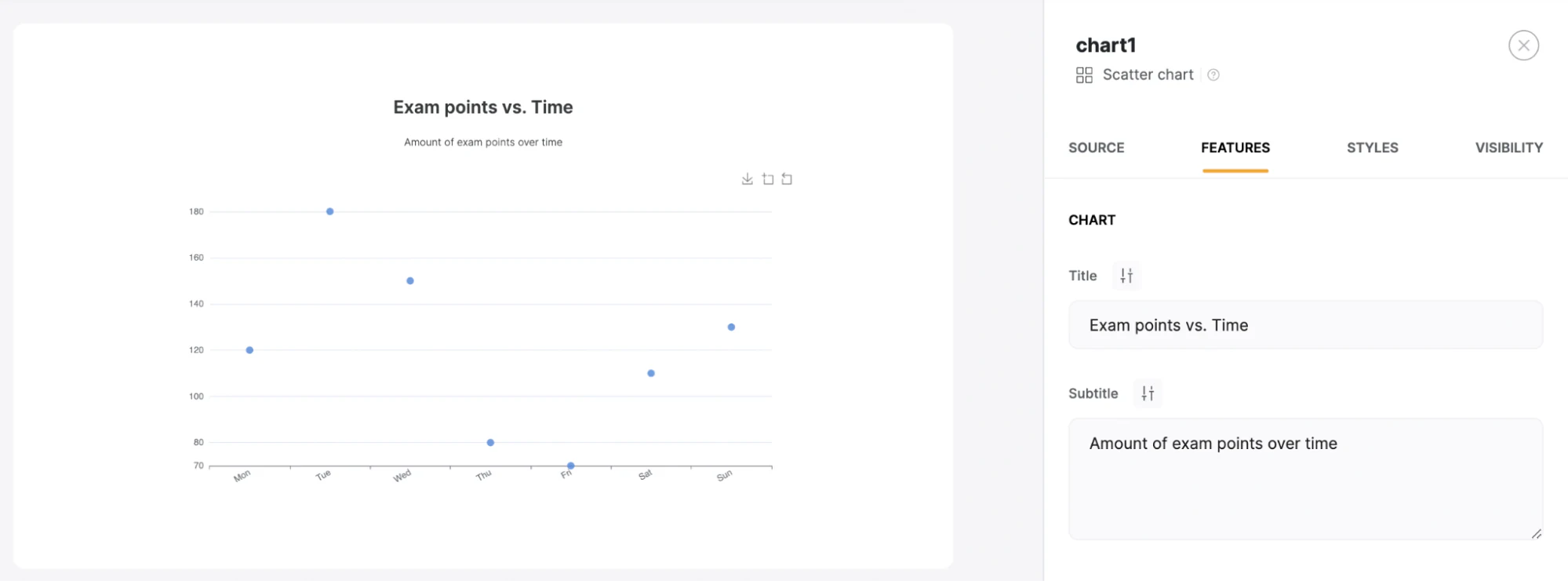
In the FEATURES tab, you can change the title and subtitle of your XY graph.
Step 11.2: Customize the style
In the STYLES tab, you can customize the padding to suit your preference.

Step 11.3: Customize borders
Still under the STYLES tab, you can also customize your graph's background color and borders.

Step 12: Share your XY graph
Unlike Google Sheets, Softr allows you to deeply control who can access your graph through user groups and permissions:
- All users: Gives access to this graph to everyone, regardless of whether they're logged in.
- Logged-in users: Restricts access to users who have created an account and logged in to your web application.
- Non-logged-in users: Makes the graph visible only to visitors who haven't logged in.
This is especially useful if your XY graph shows sensitive figures (like revenue or payroll data) that only specific teams or clients should see.

Step 13: Publish your graph
Once you've made all the changes to your graph, you can save it by clicking "Publish."

Step 14: You've created an XY graph using your Google Sheets data
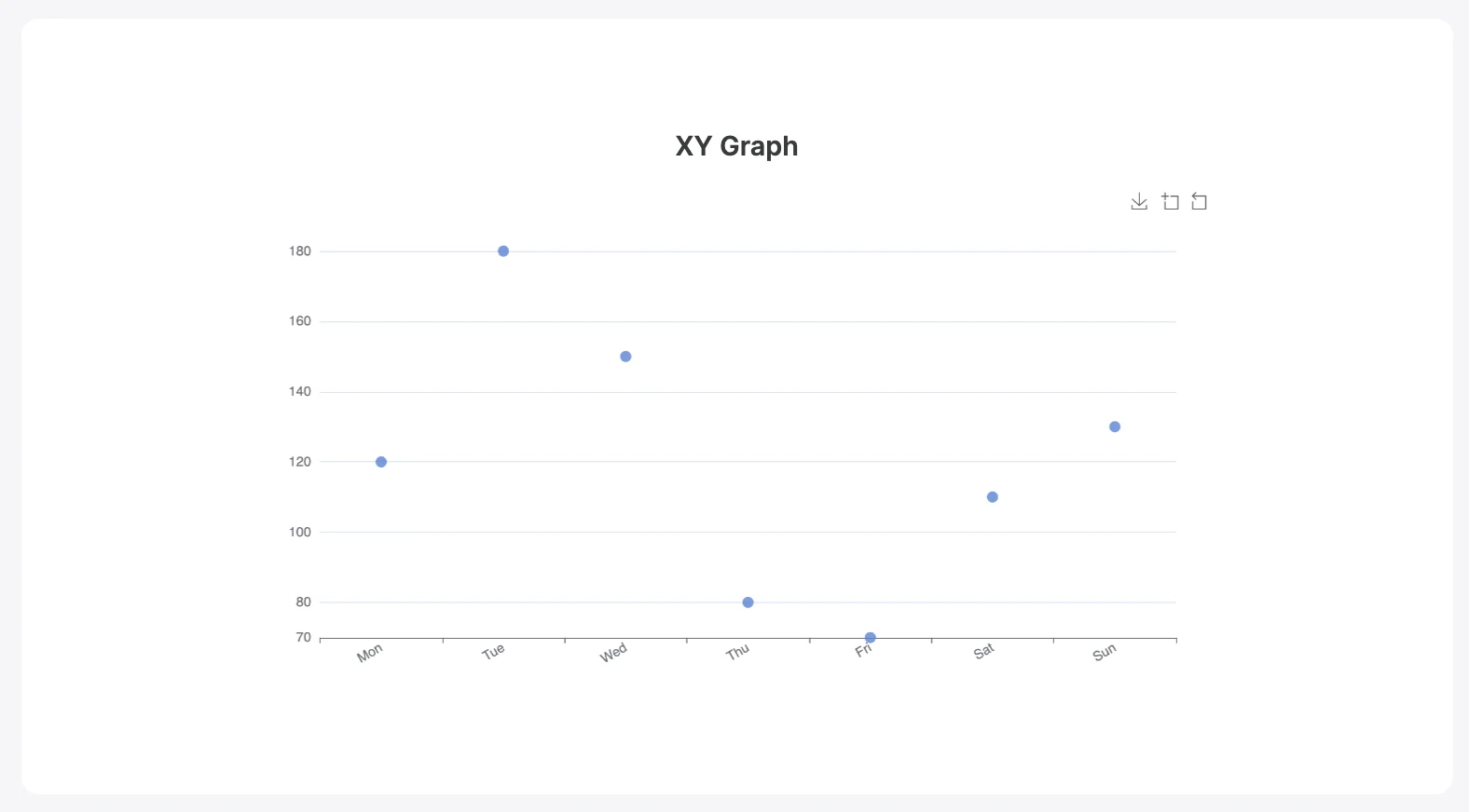
Using Softr, you've created a customized XY graph powered by your Google Sheets data. You can now share this graph with whomever you want, according to the access settings you defined in the previous step, and keep building on top of it (adding more charts, tables, or workflows) as your reporting needs grow.
Turning a one-off chart into a full reporting dashboard
A single XY graph is often just the starting point. Once your data lives in Softr, whether pulled from Google Sheets or stored natively as a Softr Database, you can add more chart blocks, tables, and filters to build a full dashboard that different teams check daily instead of digging through spreadsheet tabs. Marketing agency Strupek, for example, consolidated scattered client reporting into a single Softr dashboard and cut operational costs by 58% while saving 8 to 10 hours a week previously spent generating reports manually.
If you eventually outgrow a single spreadsheet as your source of truth, moving that data into a native Softr Database keeps everything (charts, tables, permissions) running on one platform instead of juggling a live Google Sheets connection.
Frequently asked questions
What is an XY graph used for?
Can I make an XY graph in Google Sheets for free?
What's the difference between a scatter chart in Google Sheets and one built with Softr?
Do I need to know how to code to build a scatter chart app with Softr?
Can I restrict who sees my XY graph in Softr?