

[.blog-callout]
TL;DR
- Google Sheets' built-in chart editor makes a free pie chart in about 3 minutes, ideal for a one-off chart you'll only look at yourself.
- For a pie chart you want to share as a live, secured app (with permissions, branding, and a page others can visit), build it in Softr instead by connecting your Google Sheets data or using a native Softr Database.
- You can start your Softr app by describing what you want to the AI Co-Builder, picking a template, or building from a blank canvas. [.blog-callout]
There are two ways to make a pie chart from your Google Sheets data:
- Using the built-in chart editor, for a quick, static chart inside the spreadsheet itself.
- Using Softr, when you want that chart to live in a shareable, secured app instead of a spreadsheet tab.
Making a pie chart in Google Sheets using the chart editor
Cost: $0
Time: 3 minutes
The chart editor is a solid choice when your data has a handful of distinct categories and you want to show how much each one contributes to the whole.
Step 1: Open the sheet
First, open the sheet of the Google Sheets file that contains the data you want to represent with a pie chart.

Step 2: Select the dataset
Click and drag to select the dataset that you want to include in your pie chart. Make sure to select both the categories and the values.

Step 3: Open the chart editor
Once you've selected the data you want to include in the chart, click Insert at the top of the screen. In the drop-down menu, choose Chart to open Google Sheets' chart editor, which appears as a sidebar on the right side of your screen.

Step 4: Choose to create a pie chart
In the Chart Editor, select Pie chart from the list of chart types. This lets you customize your chart as desired, including adding labels and a title.

Step 5: Move the pie chart to its own sheet (optional)
If you want to edit your pie chart without distractions, move it to its own sheet. Click the three vertical dots at the top right of the chart and select Move to own sheet. Google Sheets automatically creates a new sheet called "Chart 1," where you can view and edit your pie chart.

Step 6: Customize the chart
The Chart Editor lets you customize various aspects of your pie chart. Access it by clicking Edit chart in the pie chart's menu.

Step 6.1: Change the chart's title
In the chart editor, under "Chart & axis titles," select Chart Title from the dropdown list. Type a new title and choose your preferred font, size, format, and text color to make your chart more visually appealing.

Step 6.2: Change each pie slice's appearance
Still in the Chart Editor, under "Pie slice," you can change the appearance of each individual slice. For example, to draw attention to one slice, give it a more distinct color and increase its distance from the center of the chart.

Step 6.3: Include data labels
To add labels to your pie chart slices, go to the "Pie chart" section of the chart editor. There, you can display category names, percentages, or both, and adjust the font size and style.

Step 7: Preview your changes, then share
To preview your customized pie chart, close the chart editor and your chart appears in full screen. If you're satisfied with it, share it using the Share button, publish the chart, or download it as an image.

How to make a pie chart in Google Sheets using Softr
Cost: Free to start (chart block requires a paid plan or the 30-day trial)
Time: 5-10 minutes
The chart editor works fine for a chart only you will see. But the moment you want to share that pie chart as a live page, restrict who can see which data, or match your own branding, a spreadsheet chart starts to show its limits. That's where building it as a Softr app comes in.
You don't need to be technical to do this. You can describe the chart you want to the AI Co-Builder and have it build the page for you, or configure it manually if you prefer full control. Either way, Softr Databases is the fastest native option if you're not tied to Google Sheets already, but connecting your existing Google Sheets data works just as well.
Step 1: Log in to Softr or create an account
First, log in to Softr. If you don't have an account yet, sign up to Softr for free.

Step 2: Start a new app
From your dashboard, click New Application. You'll be prompted to describe what you want to build. Since a pie chart is a simple case, you can either describe it directly to the AI Co-Builder (for example, "a dashboard page with a pie chart of my sales by category") and let it scaffold the page for you, or click through to start from a template or a blank canvas if you'd rather build it step by step.

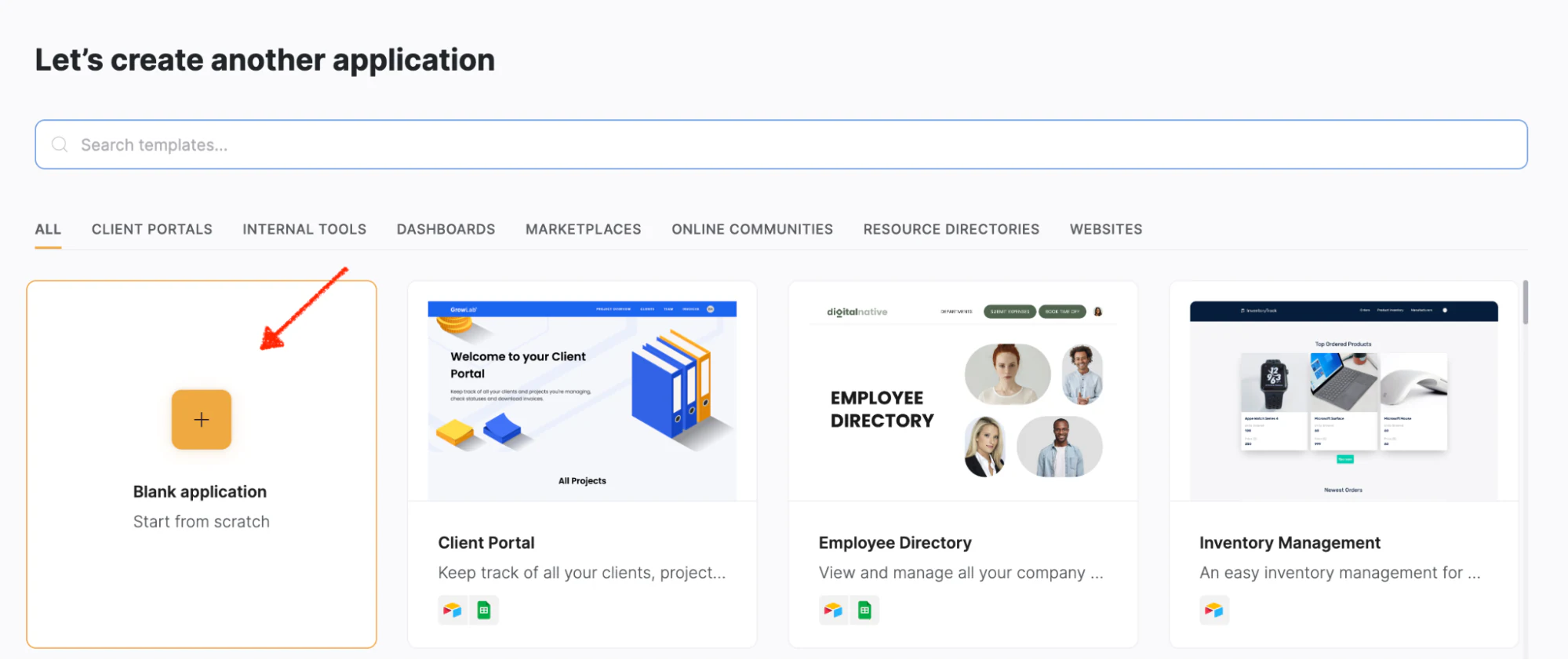
Step 3: Create a blank application
For this walkthrough, we'll build it manually so you can see exactly how the chart block works. Click the button to create a blank application.
Step 4: Select prebuilt pages
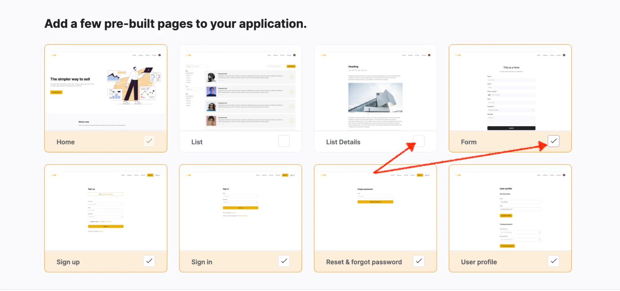
Because all you need is a page to hold your pie chart, deselect all pages except Home. Then click Create application.
Step 5: Connect Softr and Google Sheets
To build your pie chart from your Google Sheets data, connect the two products. If you'd rather not depend on an external spreadsheet at all, you can skip this and use a Softr Database instead, populated by importing your sheet directly.
Step 5.1: Choose Google Sheets as the data source
Click Google Sheets, then Continue, to let Softr access the data you want to chart.

Step 5.2: Log in to your Google account
Specify which Google account your Google Sheets file lives in by logging in to that account.

Step 5.3: Authorize Softr
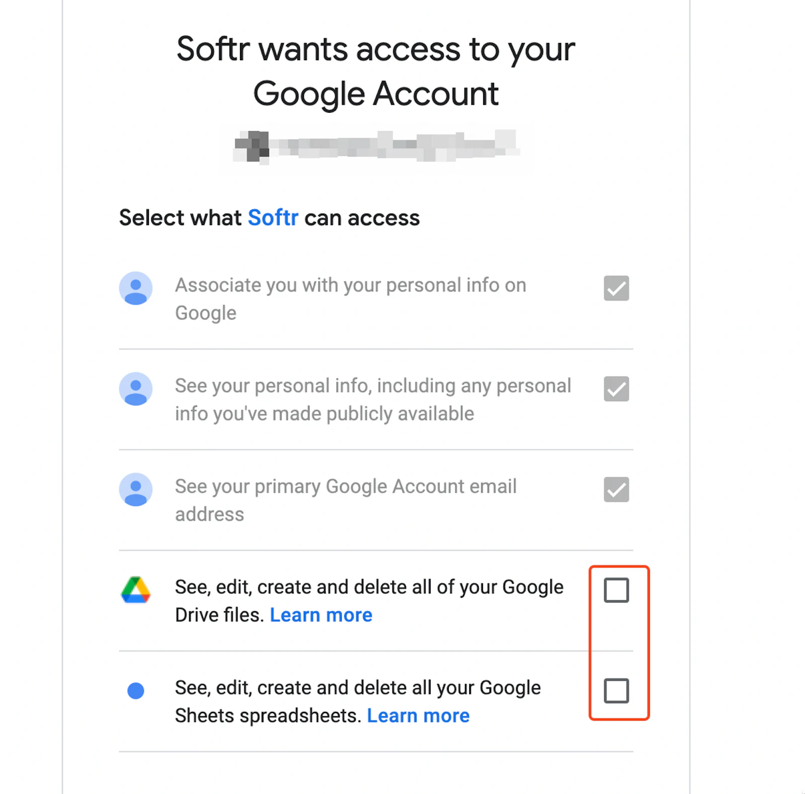
Authorize Softr to access your Google Sheets and Google Drive files by ticking the two boxes shown below, then click Continue.
Step 6: Delete all blocks
Before you build your pie chart, hover over each prebuilt block and delete it, so you end up with a blank canvas to work from.

Step 7: Access the list of premade blocks
Softr offers a wide range of premade blocks, including pie charts. Click the + sign at the top right corner of your screen, or the Add your first block button, to see the full list. You can also ask the AI Co-Builder to add the chart block for you by describing what you need.

Step 8: Choose to create a pie chart
Once the block menu slides in, type "pie chart" and click the block to select it.
The chart block isn't available on the free plan, but you can activate the 30-day trial to use it. You won't be charged until after the 30 days, so you can cancel anytime before then.

Step 9: Choose which data to import
Go to the Source tab and click Connect data source. Choose your connected Google Sheets account, pick the file with the data you need, then select the specific sheet you want to import from.

Step 10: Customize your pie chart
Click the Features tab to make your desired changes.

Step 10.1: Change the title and subtitle
Type the title and subtitle you want into the text box under the respective heading.

Step 10.2: Update metrics
To display your connected Google Sheets data correctly, go to the metrics section just below the title and subtitle.
In the chart block settings, choose the aggregate function "Sum," then select your main value field (Organic Traffic, in our example). Under Groupings, select the field you want your metric grouped by (Year, in our example).

Step 10.3: Change the styling
Change the background color and add border lines to the top and bottom of your chart using the "Styles" bar.

Step 10.4: Change the access permissions
Go to the Visibility tab to update access permissions. The default setting is "All users," meaning everyone can see the chart once published, whether logged in or not.
If you want only logged-in users to see the data, select Logged-in users. If you want the opposite, select Non-logged-in users. This is the kind of control a raw spreadsheet chart can't give you: you decide exactly who sees the chart, without duplicating sheets or manually redacting rows.

Step 11: Test and optimize
Click Preview to see how the pie chart looks before sharing it with others.

Step 12: Share your pie chart
Once you're happy with the result, click Publish to save your changes and share the chart with others.
Choosing the right tool for your pie chart
If you just need a quick visual for your own reference, the Google Sheets chart editor gets you there in three minutes for free. But once that chart needs to be seen by clients, teammates, or anyone outside your spreadsheet, with control over who sees what, building it in Softr turns a static image into a page you can actually manage and grow.
Frequently asked questions
Can I make a pie chart in Google Sheets for free?
Why does my Google Sheets pie chart look wrong or show too many slices?
What's the difference between using the Google Sheets chart editor and building a chart in Softr?
Does the pie chart update automatically if my Google Sheets data changes?
When should I stop using a spreadsheet chart and build a proper dashboard instead?