

[.blog-callout]
TL;DR
- Google Sheets' built-in "Insert Chart" feature is the fastest way to turn a dataset into a graph, and it's free to use with any spreadsheet you already have.
- Follow 5 steps: prepare and format your data, select the range, insert a chart, choose a chart type, and customize the style, titles, and legend.
- If you need to share that same data as a real dashboard with your team or clients, Softr connects directly to your Google Sheets file and turns it into a live chart block, with permissions and no manual updating.
A chart is a broad term for any visual representation of data, while a graph is a specific type of chart that plots numerical data and the relationships between data points. Graphs are particularly useful for depicting trends over a period of time, such as line graphs, or for showing relationships between variables, like scatter plots. In practice, most people (including Google Sheets itself) use the two words interchangeably.
In this guide, we'll cover two ways to visualize your data:
- Make a graph in Google Sheets, using its built-in features.
- Make a graph with your data stored in Google Sheets, using Softr, so you can turn it into a shareable dashboard instead of a static chart.
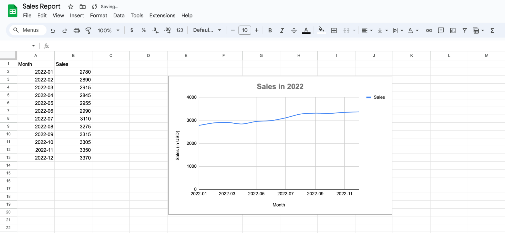
As an example, we'll use sample data to visualize sales evolution over a period of 12 months.
Making a graph in Google Sheets, using its built-in features
Google Sheets is a versatile tool for data visualization. It's user-friendly and offers a variety of options to create graphs that suit your needs. Whether you're looking to plot sales data, track your personal expenses, present research findings, or something else, Google Sheets has got you covered.
Step 1: Prepare your data
Before diving into creating a graph, it's crucial to have your data properly organized. The next steps will guide you through the process of properly setting up your data in Google Sheets to create a graph.
Step 1.1: Label the headers
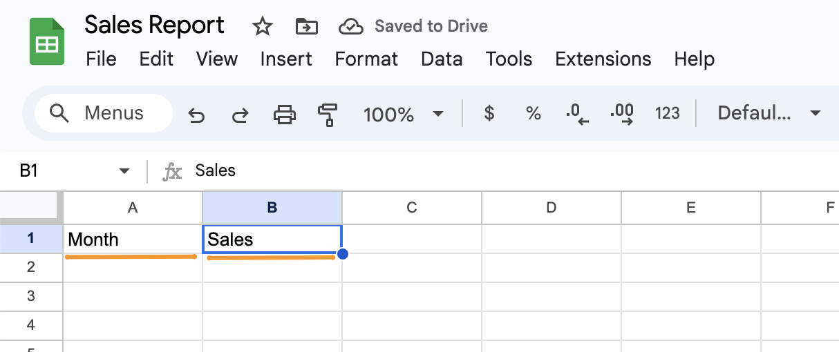
In the first row of your dataset, you should identify what each column is about. To follow our sales evolution example, type "Month" on the top-left cell (A1), and "Sales" on the next cell (A2).
Step 1.2: Add your data
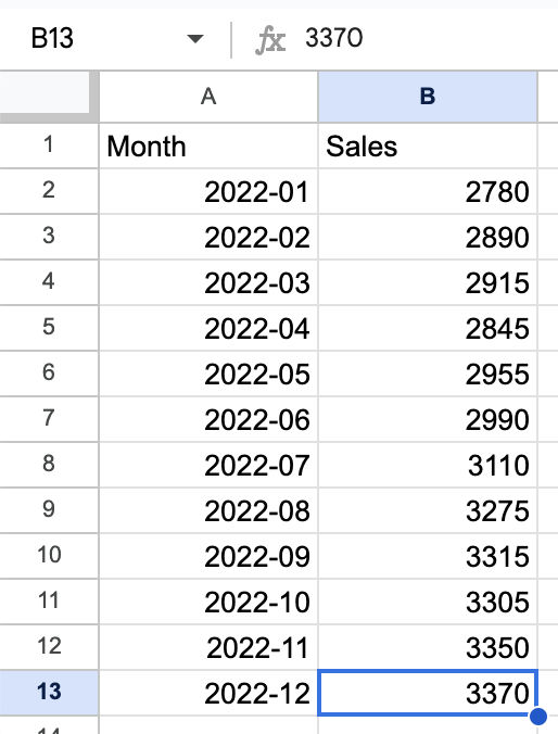
Now that your headers are set, it's time to populate the data. In our example, we added each month of the year and the amount of sales obtained in each of these periods.
Step 1.3 Verify data format
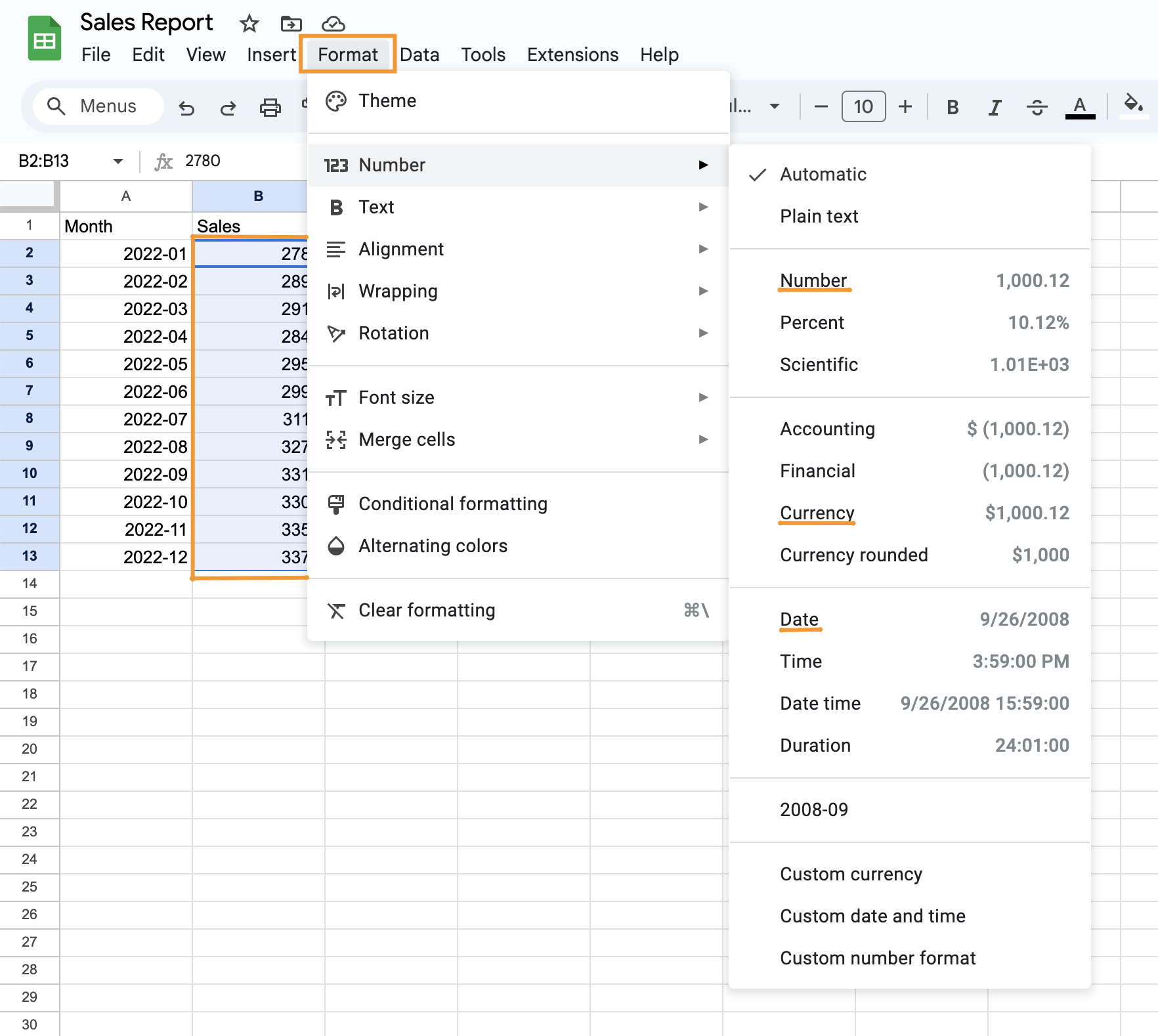
Ensure that the data in the "Month" column is recognized as a date (or other that applies to your case). If not, you can change the format by selecting the column, choosing "Format" from the menu above and selecting the desired option.
Similarly, ensure that the data in the "Sales" column is recognized as numbers or as currency. If not, follow the same instructions as above to change the format.
Step 2: Select the data for your graph
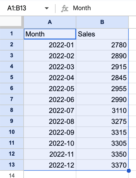
Once your data is well-organized and formatted, the next step is to select the specific data you want to visualize. This is a crucial step as it determines what your graph will display.
To do so, click on the first cell of your dataset and drag your mouse until you’ve selected all of it.
Step 3: Choose and insert a graph
Now that you've selected your data, it's time to decide which type of graph will best represent your information. Google Sheets offers a variety of graph types, each with its own advantages for displaying certain kinds of data.
Step 3.1: Insert a chart
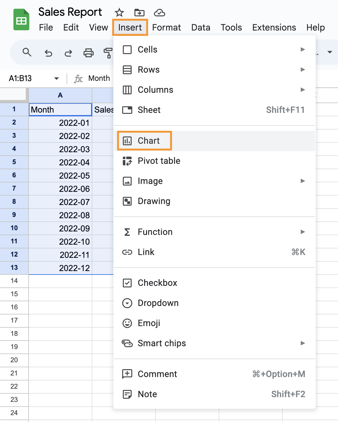
Go to the top menu bar in your Google Sheets, and click on "Insert." From the dropdown menu, select "Chart."
Step 3.2: Choose a graph type
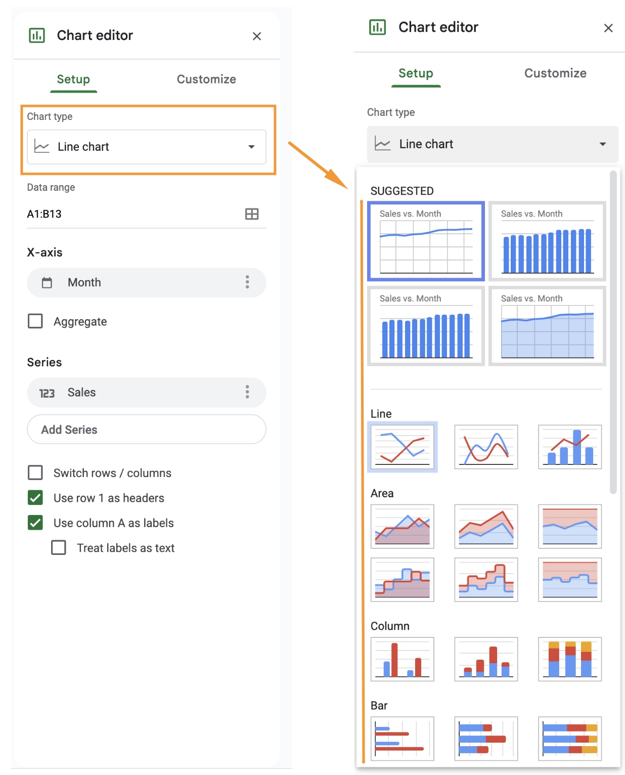
A default chart will appear, along with the chart editor on the right side of your screen.
In the chart editor, under the "Setup" tab, click on the "Chart type" dropdown menu, so that you can see different types of graphs.
Select the graph type that best suits your data. For sales data over time, a line graph or a column graph is often effective. In this tutorial, we are using the "Smooth line chart" type.
Step 3.3: Adjust the position of your graph
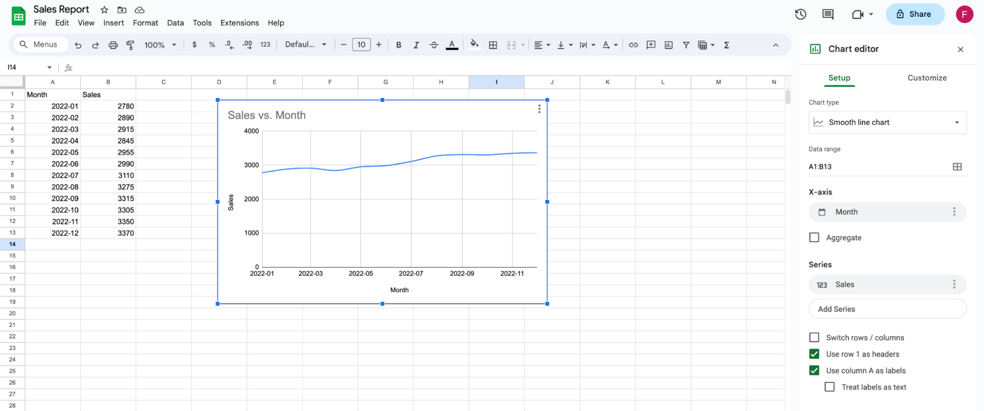
Click and hold your graph to move it to the position you want it to be.
Step 4: Customize your graph
After inserting the graph and choosing the right type, the next step is to customize it, so that it clearly and accurately represents your data. Google Sheets offers a variety of customization options to do so.
Step 4.1: Open the chart editor
If the Chart editor is not already open, double-click on your graph. The Chart editor will appear on the right side of your Google Sheet.
Step 4.2: Navigate to the customization tab
In the chart editor, at the top of the panel, click on the "Customize" tab. It will list a variety of customization options.

Step 4.3: Customize chart style
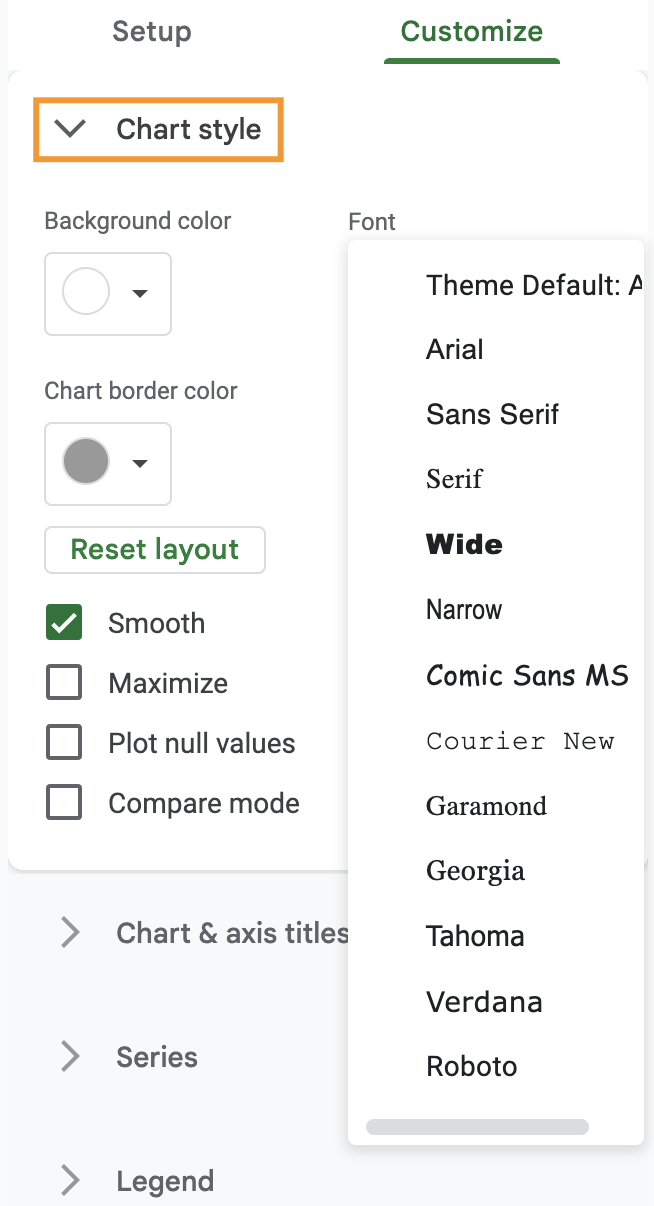
Under the "Customize" tab of the chart editor, you'll find an option for "Chart style." Click on it to expand the menu.
Here, you can change the chart background color, font, and border color. Among other options, you can also opt for smooth lines if it suits your data or choose to maximize your graph.
Step 4.4: Customize chart and axis titles
Still under the "Customize" tab, find the option for "Chart & axis titles." Click on it to expand the menu.
Here you can add chart titles, and subtitles, or change the font for both.
Step 4.5: Customize legend
Locate the "Legend" option under the "Customize" tab in the chart editor. Click on it to expand the menu. There, you can change the legend's position, font color, size, and format.
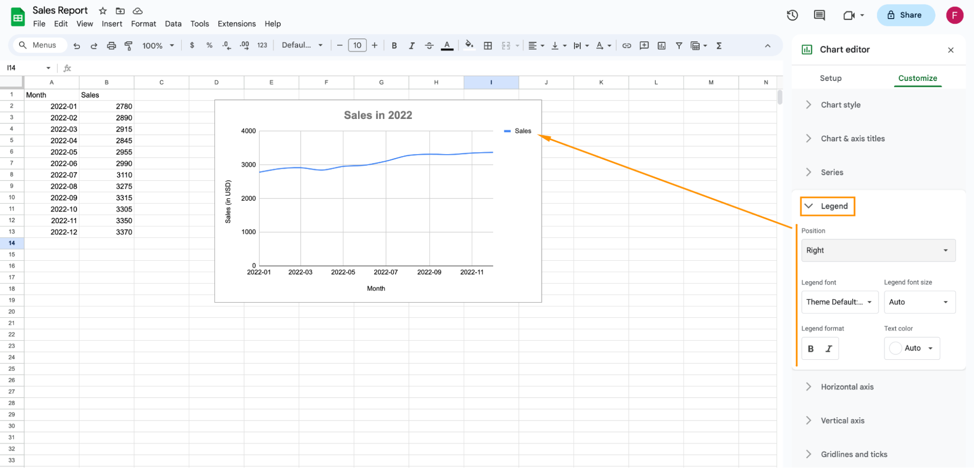
Step 5: You made a graph in Google Sheets!
By following these steps, you made a graph in Google Sheets. You can use it to help yourself or others to visualize and understand your data.
Making a graph with your data stored in Google Sheets, using Softr
Google Sheets' built-in charts work well for personal analysis, but they're harder to share with a team, and impossible to restrict by role: anyone with the file can see every number. Softr is an AI app builder that connects directly to your Google Sheets data and turns it into a real business app, with an interface, permissions, and native charts that update automatically as your sheet changes.
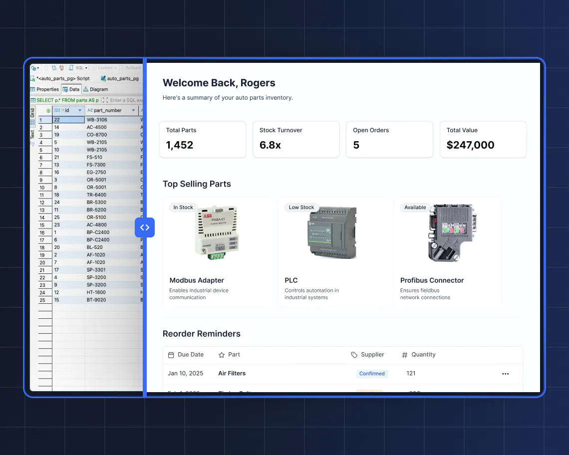
Beyond charts, this matters most once the graph needs to leave your own screen. As Shiran Brodie, Head of Marketing at Softr, puts it: "Managing external partners through emails and spreadsheets is a nightmare. A portal allows you to only surface the information that is relevant to them and make approvals on the fly." The same logic applies to internal reporting: a dashboard built on Softr Databases, or connected to your existing Google Sheets, gives each user their own view instead of one shared, unprotected file.
Step 1: Sign in or register to Softr
First, you will need to log in to Softr. If you don’t have an account, you can sign up to Softr for free.

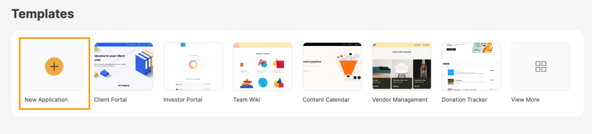
Step 2: Click on "New Application"
With your Softr account set up, it's time to create a new application where your graph will be housed. Softr gives you three ways to start: describe your app to the AI Co-Builder and let it generate the database, pages, and blocks for you; start from a pre-built template; or build from a blank canvas manually. For this tutorial, we'll start from a template built for tracking and visualizing data.
On your Softr dashboard, locate and click on the "New Application" button.
Step 3: Search for a template
Softr offers a wide variety of templates that can simplify the process of making a graph with your data in Google Sheets. For this purpose, I recommend the Sales CRM template. Locate and select it in the list to proceed.

Step 4: Click on "Use Template"
You can now learn more about the Sales CRM template, including its features and functionalities. Once you’re ready, click on the "Use Template" button.
Step 5: Select Google Sheets as the data source
Once you've selected your template, you'll be prompted to choose a data source. Softr's own native database is usually the recommended option for new apps, since it's faster and doesn't depend on a third-party API, but because you already have your data in Google Sheets, select "Google Sheets" from the available options and click on "Continue."
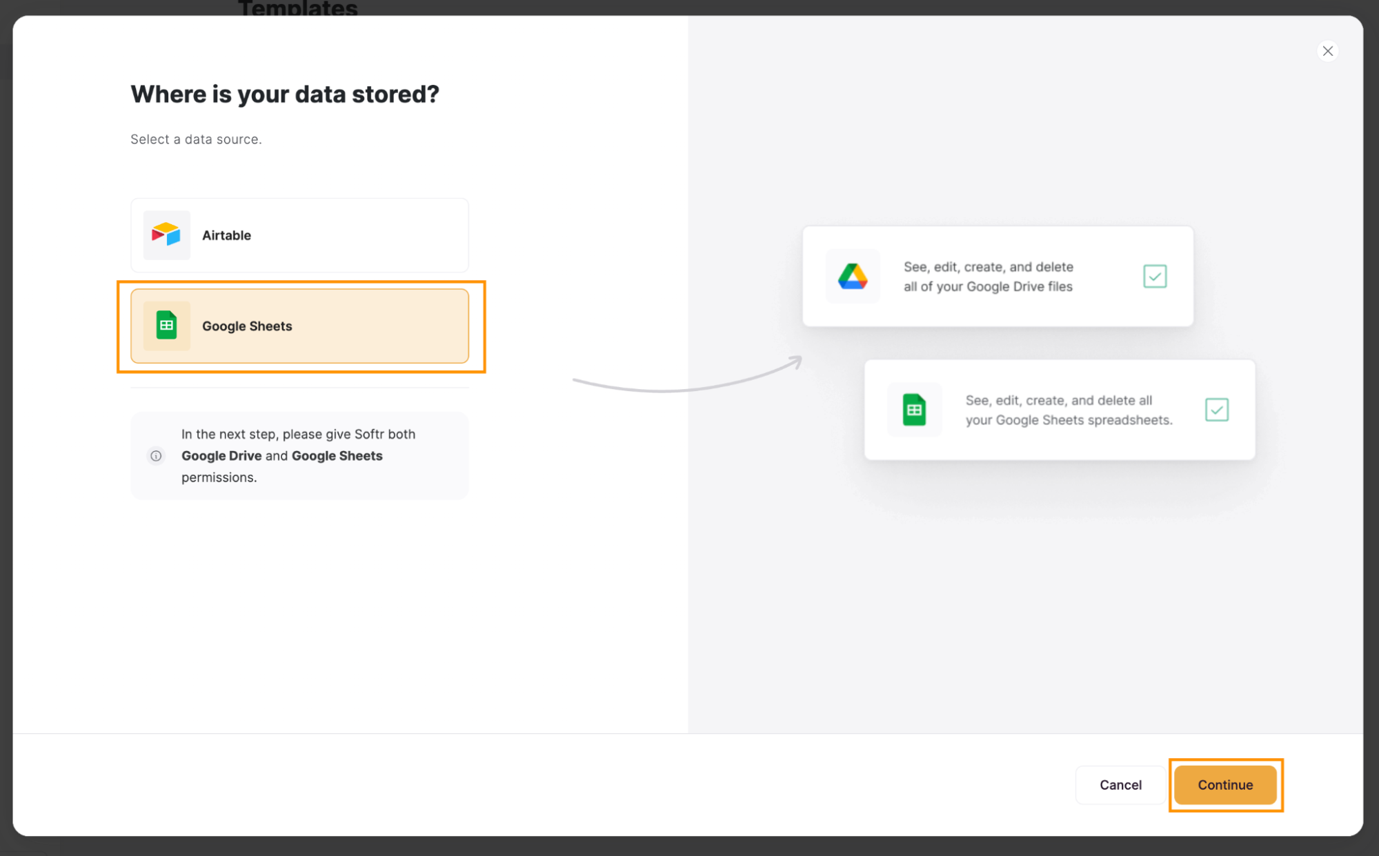
Step 6: Connect to Google Sheets
Now, you have to connect your Softr app with your Google Account. To do so, follow the next steps.
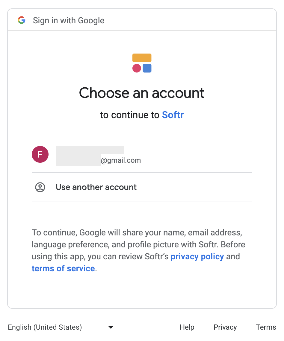
Step 6.1: Select a Google Account
A new window or tab will open for you to log in to or select your Google Account.
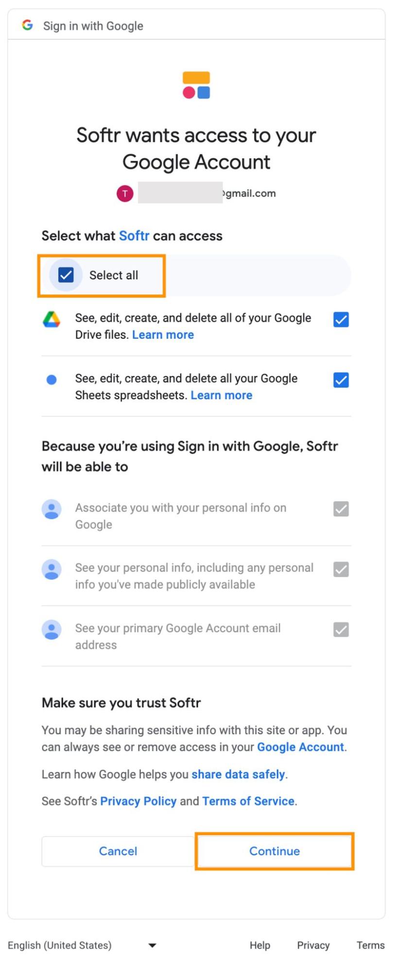
Step 6.2 Grant additional access
In this step, you’ll need to grant Softr access to a set of features. Click on "Select all" and then hit “Continue."
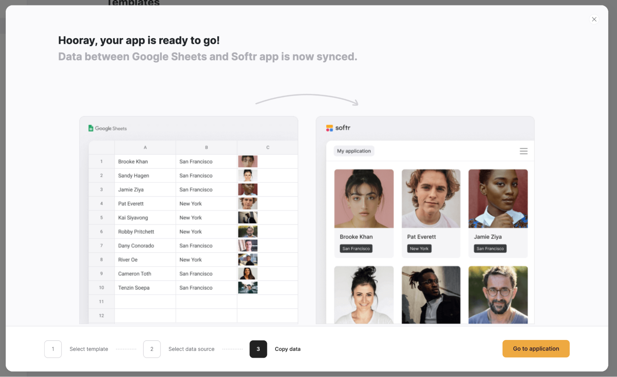
Step 6.3: Go to your app
Now that your Google account is connected with Softr, click on “Go to application.”
Step 7: Add a new graph block
Softr lets you easily place pre-made blocks into pages, including graphs.
Step 7.1 Add a block
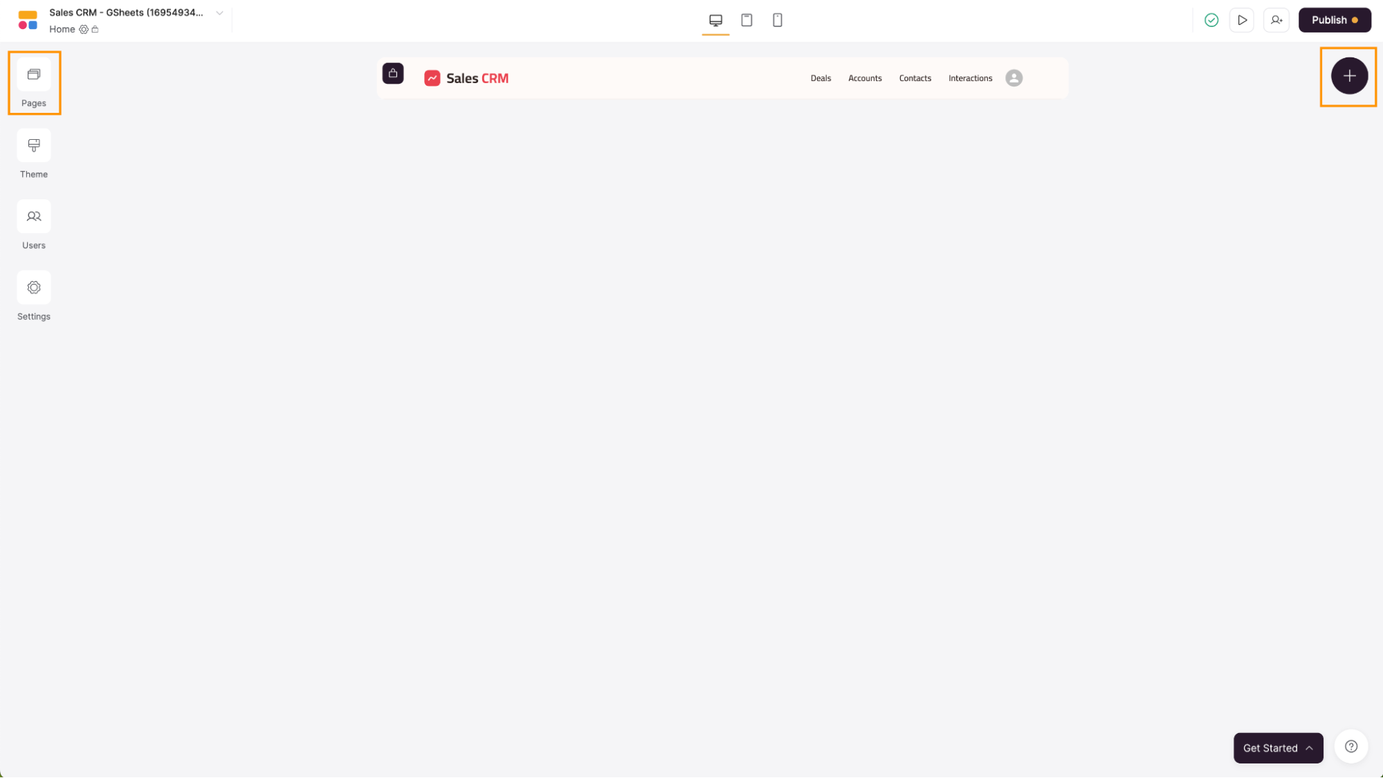
Navigate to the page you need to have your graph block, by using the button on the left sidebar. Then, click on the "+" icon on the top-right corner of the screen.
Step 7.2 Choose the right block
A new popup will appear. On the search bar write "chart" or scroll down and click on "Chart" to open a list of chart blocks.
Click on the chart you want to use. For this example, we will be using the "Line chart." If you'd rather skip the manual clicks, you can also ask the AI Co-Builder to add it for you, for example by typing "add a line chart showing monthly sales."

Step 8: Select your data
You can have multiple data sources in one Softr app, such as multiple Google Sheets files, so you need to define which is the Google Sheets file that has the data you want to use to create a graph.
Step 8.1 Select a data source
On the right side of the screen, Softr will show you all the block settings. In the tab "SOURCE," click on the "Source" dropdown and choose your data source. This will be the Google account where your data is stored.

Step 8.2 Select the Google Sheets file
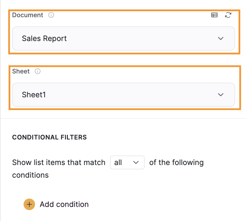
Now, you will need to select the spreadsheet and the sheet where your data is by clicking on the "Document" and "Sheet" options.
Step 9: Adjust the graph setting
In the "FEATURES" tab, you can define a variety of settings, making your graph match your needs. Let’s check some of these settings.
Step 9.1 Adjust chart options
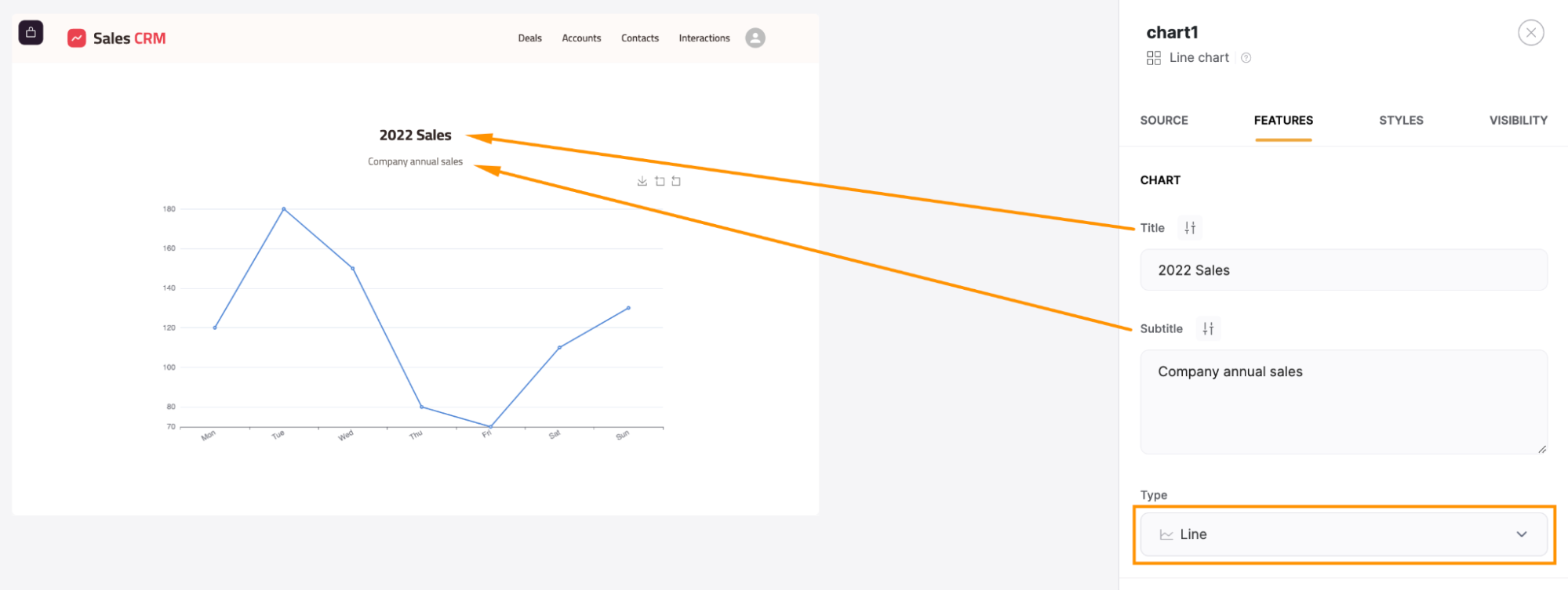
The first set of options in this tab is the "CHART" option. Here, you can type a new title and a subtitle or redefine the type of graph you’ll see.
Step 9.2 Adjust metrics options
By scrolling in the “FEATURES” tab, you can find a section called “METRICS.” Here, you can further personalize your chart.
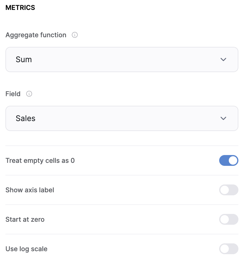
The "Aggregate function" allows you to perform a specific calculation on your data. Here are the options:
- Sum calculates the sum of all the values for a given category;
- Average calculates the average of all the values for a given category;
- Min picks the smallest value of all the values of the category;
- Max picks the biggest value of all the values of the category;
- Count distinct values, which you can use to add up the number of records that contain a unique value;
- Count All adds up the number of records present in a given grouping category.
For example, if you have multiple records for the same month and you want to display the sum of these sales for each month, you would choose "Sum" as your Aggregate Function.
Other options in this section are:
- Field: This is where you select which column from your data source will be used for the "Aggregate function." In our example, the amounts are stored in the "Sales" field in Google Sheets, so you would select "Sales" here;
- Show axis label: This option allows you to display or hide the label for the axis on your graph. Enabling this makes your graph more informative;
- Start at 0: When enabled, this setting ensures that the graph's y-axis starts at zero, providing a more standardized view of your data.
Step 9.3 Adjust grouping options
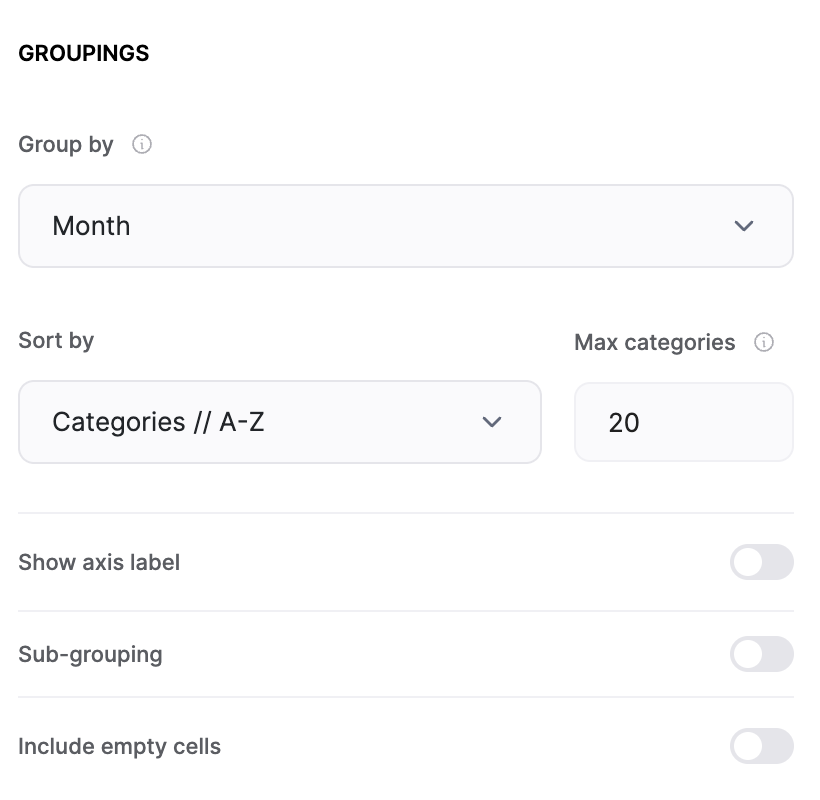
Still in the “FEATURES” tab, under the heading "GROUPINGS," you will find the options that will allow you to define how your data will be grouped and displayed on the X-axis of your chart. Let's delve into each setting:
- Group By Field: This is the field by which your metric will be grouped. For example, if you're displaying the sum of incomes and expenses for each month, you would select the "Month" field here, as defined in our example.
- Sort By: This dropdown gives you several options for sorting your data:
- Categories // A-Z sorts by the Category field values in alphabetical order;
- Categories // Z-A Sorts by the Category field values in reverse alphabetical order;
- Values // A-Z sorts by the Value field values in alphabetical order;
- Values // Z-A sorts by the Value field values in reverse alphabetical order.
For instance, if your "Group By" field is "Date" and you select "Categories // A-Z," your data will be sorted from January to December;
- Max Categories: This setting allows you to limit the number of categories (i.e., chart bars) displayed on your chart. For example, setting this to 2 would only show the first two months on your chart;
- Show Axis Label: This toggle lets you display or hide the axis label, which can make your chart more informative;
- Sub-grouping: Enabling this toggle allows you to split the chart into subcategories. For instance, if you have a subtype field indicating the exact type of each income or expense, you can segment your data by this field;
- Include Empty Cells: This toggle allows you to include or exclude empty cells in the category field. For example, if you've removed one of the values in the "Month" field, enabling this option will still include that date in the chart.
Step 9.4: Adjust other options
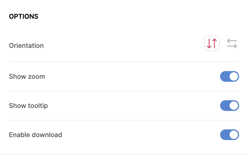
In the last section of the “FEATURES” tab, Softr provides additional settings to further customize your graph. Let's explore each one:
- Orientation: This setting allows you to change the orientation of your graph. You can switch between horizontal and vertical orientations to better suit your data presentation needs;
- Show zoom: Enabling this option allows users to zoom into specific areas of the graph for a closer look. A "Zoom out" feature is also available to revert the zoom-in action, offering a flexible way to explore complex data;
- Show tooltip: When this feature is enabled, hovering over each bar or data point on the graph will display a tooltip. This tooltip contains detailed information about that specific bar, providing additional context to the viewer;
- Enable download: This option allows you and your users to download the graph directly to their device in .png format. This is particularly useful for sharing or including the chart in presentations and digital reports.
[.blog-callout] Pro tip: if the built-in chart types don't cover what you need (a funnel chart, a gauge, or a fully custom design), you can generate one with the Vibe Coding block by describing what you want. It inherits your app's theme and connects directly to your Google Sheets data, so it looks and behaves like a native chart. [.blog-callout]
Once you have more than one chart on a page, it's worth adding a few database numbers or a table alongside them. That combination, a handful of graphs plus supporting metrics, is what turns a single chart into an actual dashboard your team can check daily instead of a one-off report.
Step 10: Publish your graph
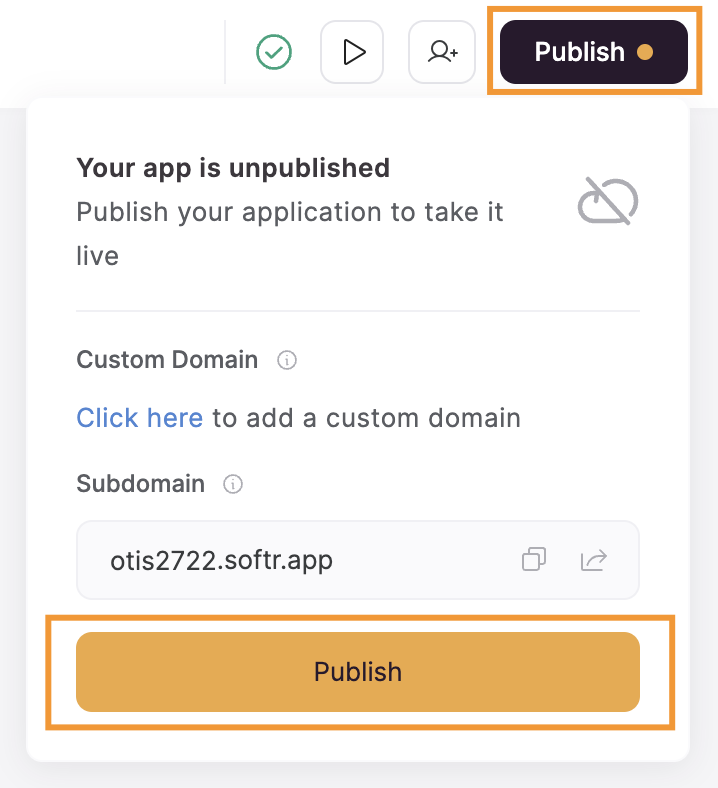
Now that you have a graph in your Softr app with data retrieved from your Google Sheets spreadsheet, you just need to click on the “Publish” button located on the top-right corner of the page. A small popup will appear, just hit “Publish.”
Step 11: Your graph is now live!
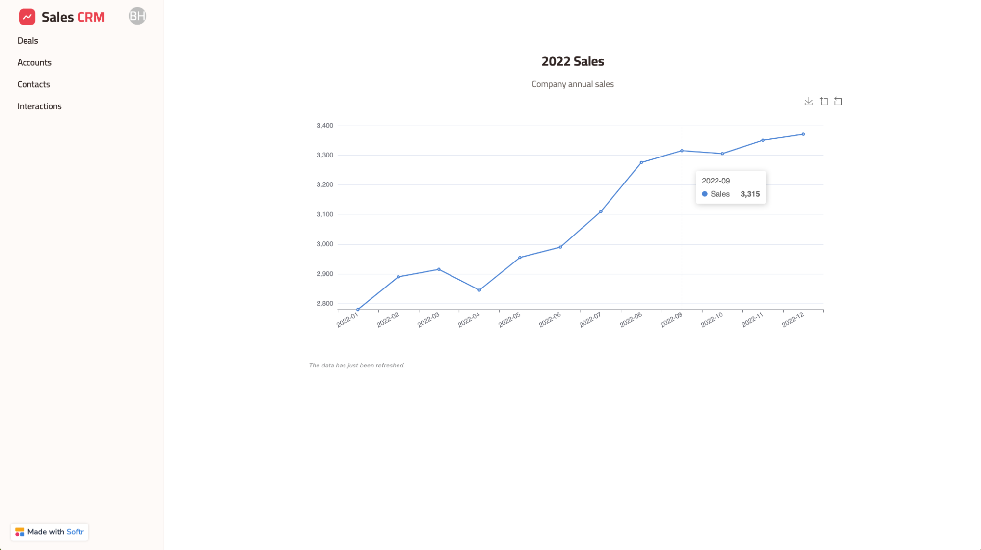
You have created a graph based on the data stored in your Google Sheets file, and it's connected to a real app you can share, restrict by user group, and keep building on.
From a single chart to a full dashboard
A graph is only useful if the right people can see it when they need to. Google Sheets' native charts are a good starting point for a quick look at your own data, but the moment you need to share results with a team, a client, or anyone outside your spreadsheet, a dashboard built on top of that same data does more work for you: it updates on its own, restricts access by role, and can grow into a full reporting dashboard with tables, filters, and KPI numbers alongside your charts.
If you're already comfortable with the steps above, the next move is to add a second or third chart to the same page, or to try connecting Softr to your own Google Sheets data instead of the sample dataset used here.
Frequently asked questions
What's the difference between a chart and a graph in Google Sheets?
Can I make a graph in Google Sheets on my phone?
Why would I build a graph outside of Google Sheets instead of using its built-in charts?
Do graphs built with Softr update automatically when my Google Sheets data changes?
Can I combine multiple graphs from Google Sheets into one dashboard?