
With combo charts in Google Sheets, you can blend chart types, such as columns, lines, and scatter plots, into one visualization. This is useful for showing complex relationships in your data: trends over time, comparisons between categories, or how two metrics on different scales move together.
In this article, we'll cover two ways to build and customize combo charts in Google Sheets:
- Using the built-in chart editor.
- Using Google Apps Script.
We'll also look at when a static combo chart stops being enough, and how to turn your Google Sheets data into a live, shareable dashboard instead.
Make a combo chart in Google Sheets, using its chart editor
Cost: $0
Time: 5 minutes
The chart editor is the fastest way to build a combo chart, with a real-time preview and enough customization options to cover most reporting needs.
To use Google Sheets' chart editor to make a combo chart, follow the steps below.
Step 1: Select data range
Open your Google Sheets spreadsheet, and select the data you want to use for your combo chart.

Step 2: Open the chart editor
Go to the top menu, click Insert, and scroll down to select Chart. The chart editor will open on the right-hand side of your Google Sheets window.

Step 3: Select chart type
In the chart editor, under Chart type, use the dropdown menu to select Combo chart (it's listed alongside the line chart options).
You'll notice that the resulting graph will be a bar graph with each of the two selected columns represented on the Y and X axis. In our example, those are the Sales and Profit columns.

Step 4: Add a line to the chart
To turn your bar graph into a combo chart, you need to select which data should be represented as a line. In the chart editor panel, under Series, click Add series to choose the data to display as a line.

Step 5: You've created a combo graph
Your graph is now a line graph combined with a bar graph, which means you've created a combo chart.

Step 6: Customize your combo chart
To customize your combo chart, navigate to the Customize tab in the chart editor.
Here you can adjust the chart's style, titles, series, legend, axis, and gridlines. Let's go through each option.

Step 6.1: Customize your combo chart style
In the chart editor, select Chart style, then choose the background color, font, and border color. You can also check any of the following options:
- Smooth, which smooths the line in your combo chart.
- Maximize, which maximizes the chart area within your combo chart.
- Plot Null Values, which ensures null or empty values in your data series are still plotted.
- Compare Mode, which lets you compare data series with different scales and units of measurement.

Step 6.2: Customize the combo chart's title and axis
To customize your combo chart's title and axis, under Customize in the chart editor panel, click Chart & axis titles. Use the dropdown arrow to choose whether you're editing the chart's title, subtitle, horizontal axis title, or vertical axis title.
Next, use the Title Text field to type the new title. You can also customize the title's font, size, format, or color.

Step 6.3: Customize the series
You can also customize each series of your combo chart. In the chart editor, click Series to select one of the series, then use the format section to change its color, opacity, and more.
As you make these changes, they apply to your combo chart in real time.

Step 6.4: Customize the legend
Clicking Legend gives you options to change its position, font, size, format, and color.

Step 6.5: Customize the axis
You can also customize the horizontal and vertical axis. Clicking either Horizontal axis or Vertical axis lets you adjust label font, size, format, and text color.
You can even reverse the order of data points on a given axis by checking Reverse axis, or slant the labels using the Slant labels option.

Step 7: You've made a personalized combo chart in Google Sheets
By following the steps above, you've created a personalized combo chart in Google Sheets.

Make a combo chart in Google Sheets, using Apps Script
Cost: $0
Time: 3 minutes
Google Apps Script is a scripting language built into Google Sheets that lets you automate tasks and generate charts programmatically. It's a good fit if you want to recreate the same combo chart across multiple sheets, or regenerate it automatically as part of a larger script.
Step 1: Open the Apps Script editor
On the top menu, click Extensions, then click Apps Script.

Step 2: Write the script
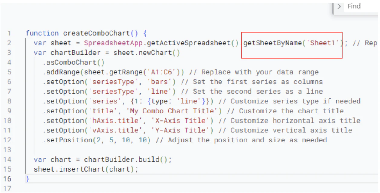
In the Apps Script editor, paste the script below:
function createComboChart() { var sheet = SpreadsheetApp.getActiveSpreadsheet().getSheetByName('Sheet1'); // Replace 'Sheet1' with your sheet name var chartBuilder = sheet.newChart() .asComboChart() .addRange(sheet.getRange('A1:C6')) // Replace with your data range .setOption('series', {0: {type: 'bars'}, 1: {type: 'line'}}) // Set series types .setOption('title', 'My Combo Chart Title') // Customize the chart title .setOption('hAxis.title', 'X-Axis Title') // Customize horizontal axis title .setOption('vAxis.title', 'Y-Axis Title') // Customize vertical axis title .setPosition(2, 5, 10, 10); // Adjust the position and size as needed var chart = chartBuilder.build(); sheet.insertChart(chart);}
Step 3: Customize the script
You can adapt the script above to fit your own data and design preferences.
Step 3.1: Customize chart type
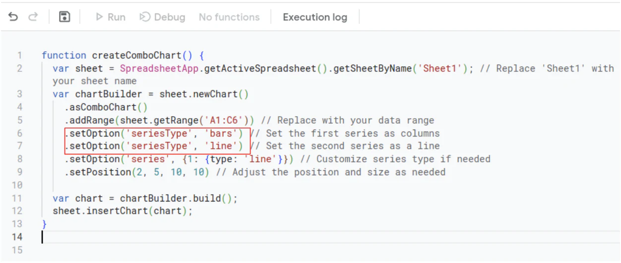
Customize each series' chart type by editing the series option. For example, you can set the first series as columns and the second as a line.
Common values for series type include:
linerenders the series as a line chart.barsrenders the series as a column (bar) chart.arearenders the series as an area chart.scatterrenders the series as a scatter plot.
Step 3.2: Adjust the position and size of the combo chart
You can adjust the position and size of your chart with .setPosition(x, y, width, height). This determines where the chart appears in your Google Sheet. Here's what each variable means:
- X: the horizontal position of the chart, measured in pixels from the left edge of the spreadsheet.
- Y: the vertical position of the chart, measured in pixels from the top edge of the spreadsheet.
- Width: how wide the chart will be, in pixels.
- Height: how tall the chart will be, in pixels.

Step 3.3: Customize your data range
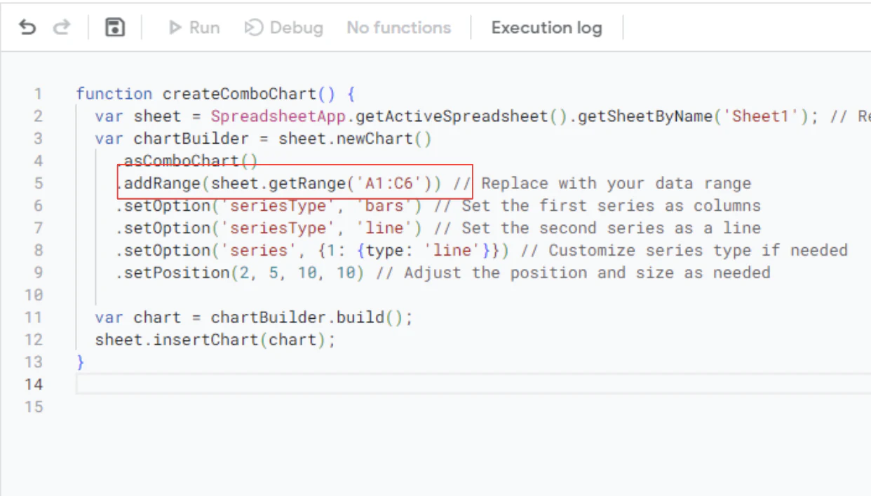
To change your data range, update .addRange() to include the data you want reflected in your chart.
Step 3.4: Customize the axis and titles
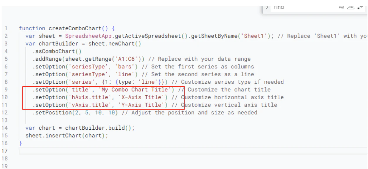
Customize your axis labels and chart title by editing the title, hAxis, and vAxis options with the names you want.
Step 3.5: Add the name of your sheet
Replace 'Sheet1' with the name of your actual sheet, so the script knows where to find the data and create the combo chart.
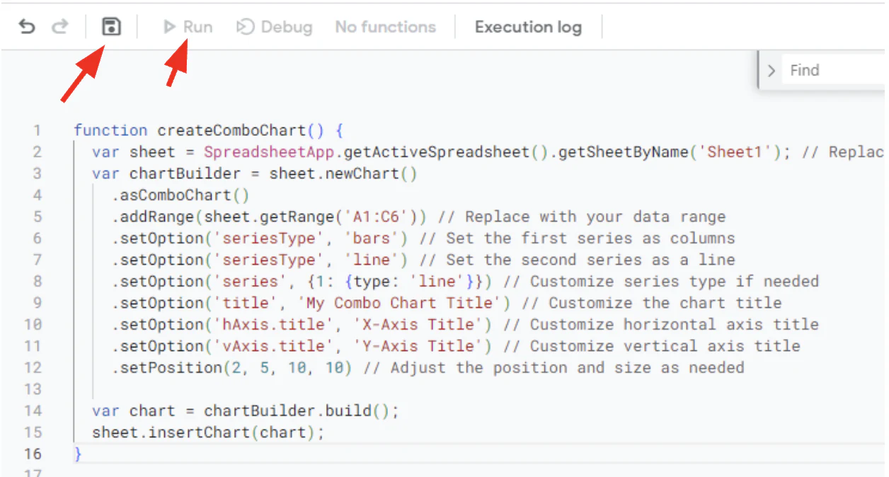
Step 4: Run the script
To run the script, save it by clicking the save button, then click the play button in the Apps Script editor.
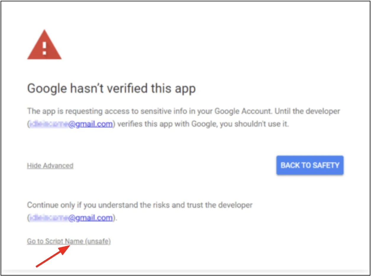
Step 4.1: Grant Google access
Google will ask for permission to access and change your spreadsheet the first time you run the script. Click Advanced to grant access.

Step 4.2: Proceed to use the script
Click Go to [Script Name] (unsafe) to let the script execute.
Step 5: Insert the combo chart
Once the script runs successfully, the execution log will show that it completed.

Step 6: You've created a combo chart, using Apps Script
After the script runs, the combo chart is inserted automatically into your sheet.

Keep in mind that this chart won't refresh itself. If your underlying data changes, you'll need to rerun the script, or set up a trigger (like an "on edit" trigger) so it regenerates automatically.
When a combo chart in Google Sheets isn't enough
A combo chart is great for a one-off report or a quick visual you drop into a meeting deck. It gets harder to rely on once more than one person needs to look at it regularly. Filters and sort order are shared across the whole sheet, so if a teammate resorts a column or hides rows to build their own view, everyone else's chart shifts too. There's also no way to give a client or vendor a filtered, read-only version without sharing the entire spreadsheet.
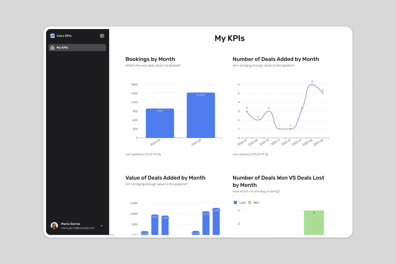
This is usually the point where teams look at building a proper dashboard on top of their Google Sheets data instead of managing individual charts by hand. With Softr, you connect your Google Sheet (or migrate to a Softr Database for better performance and scale), and use the chart block to build combo-style visualizations that update automatically as your data changes. You can add filters for each viewer, set up user groups and permissions so clients only see their own data, and give teammates their own view without touching anyone else's.
If you'd rather describe what you want than configure it manually, the AI Co-Builder in the interface builder can generate the dashboard layout and charts for you directly from your data, no need to become a Google Sheets or Apps Script expert to get there.
Build once, keep it accurate
Combo charts are a good way to communicate a specific insight from your data, but a chart built manually in Google Sheets stays accurate only as long as someone remembers to update it. If that chart is feeding a recurring report, a client update, or a team standup, it's worth checking whether a connected dashboard, one that pulls straight from your data and refreshes on its own, would save you the recurring rebuild.
Frequently asked questions
What is a combo chart in Google Sheets?
Can I make a combo chart with more than two series in Google Sheets?
Why is my combo chart only showing bars, not a line?
Does the Apps Script method update automatically when my data changes?
What's the easiest way to turn a Google Sheets combo chart into a live dashboard?