Transcript
In the last lesson, we started to build our dashboard page and got through our static header, static quick links, container, and our first table dynamic block. Now let's continue with our sales and reporting and then configure this for each user group. We want to make sure that the appropriate logged in user can only see and access the data that they are supposed to see.
From here, I have this table pre-built and I actually want to bring it over here. I am going to select duplicate and then move this inside the container. I am going to move it inside the sales container, which is a quick way to get a head start.
Now that we have that head start, we do need to switch the data for this because it is inventory and we want sales. Let's go over to our source and go to sales orders. Once we are in sales orders, it is going to attempt to remap as much as possible for us.
[.blog-callout]
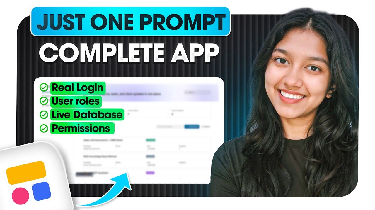
While setting up these tables manually is great for granular control, you can also use the AI co-builder to instantly generate App templates with pre-configured databases and pages based on a single prompt.
[.blog-callout]
I need to configure the content. First, I will go to text and set this as our customer, removing the icons. Then we are going to use a tag field type for our status. After that, we will add the order amounts and order date fields.
In my sales table, I now have my customers, status, order amount, and due date. This is looking pretty good. Now we have our table here for sales and our table for inventory, both with custom styling.
Let's head over to reporting and start to create our three graphs. You will notice we have graphs side by side here. We managed to get graphs side by side by using our container block.
Containers are not only tabs; they also offer column containers. While tabs show you content one by one, column containers allow you to stack blocks side by side. I am going to use a two-column container to have a graph on each side.
[.blog-callout]
If you find yourself needing a highly specific chart or visualization not found in the standard list, you can use the Vibe-Coding block to prompt for the exact custom component you need, and it will connect it to your Softr Databases automatically.
[.blog-callout]
The first graph is going to be total revenue. We will select a chart block and choose the column graph. We will map it to our sales orders and set the title to total revenue by customer.
For the data mapping, we want the order amount aggregated by the sum and grouped by the customer. Now we can see each customer and the order amount they have. You can customize this further by turning off labels or tooltips.
The next graph will be for products because we want to see the inventory level. We will use our column chart again and map it to products. We will set the title to inventory levels and the aggregation to the sum of units available.
It is okay for both sales managers and warehouse managers to see these two graphs. Sales managers should see which customers are driving revenue and maintain a good understanding of the inventory in the warehouse.
[.blog-callout]
To ensure your reporting data is always accurate and fast, consider using Softr Databases. It allows you to manage your application data natively without the sync latency sometimes found with external spreadsheets.
[.blog-callout]
The last graph is one that only the warehouse manager or admin should see. We will add another chart block to show revenue by sales rep. This will map to sales orders and display the order amount grouped by the related sales person.
Now I want to go into visibility rules. I will set this block to logged in users and then specify the warehouse manager user group. This means only warehouse managers can see this specific graph.
[.blog-callout]
Granular visibility rules are essential for security. If you are building an AI CRM template or a client portal, you can ensure that users only see records relevant to their specific user groups.
[.blog-callout]
Let's preview the application to make sure the user groups are taking effect. When running as Ethan, the warehouse manager, we can see inventory, sales, and all three reporting graphs as expected.
Now let's load it as a sales manager. We can still see the sales and inventory data, but in reporting, that bottom graph is hidden. We have successfully built a personalized dashboard for different team roles.
We are making great progress and have more pages to build to complete this experience. See you in the next lesson where we will build our next page together.