


Build your own data visualization dashboard
Track key metrics, explore insights, and share reports in an AI-powered system built with AI you customize to fit your team's workflow.


Tailor your dashboard to your needs
Customize your setup with the exact charts and filters your team needs. Add features like real-time tracking as your data workflows evolve.
Interactive metric reporting
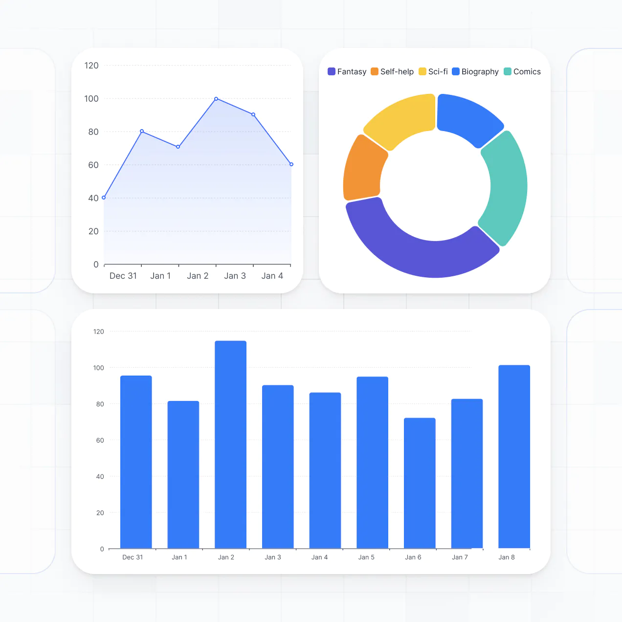
Natural language data queries
Granular user permissions
Real-time status tracking
Document and report sharing
Automated insight notifications

Unify your workflow data in real time
Connect spreadsheets, CRMs, and external databases with real-time sync—or manage metrics in Softr Databases. Create a single source of truth for your business analytics.


Custom access for every team and role.
Give each teammate the right tools and access. Set up secure logins, user groups, and granular permissions—no IT support or dev work needed.

Advanced permissions
Give different team members tailored access and custom dashboards, so managers see high-level trends while analysts see raw data.

User groups
Give different team members tailored access and custom dashboards, so managers see high-level trends while analysts see raw data.

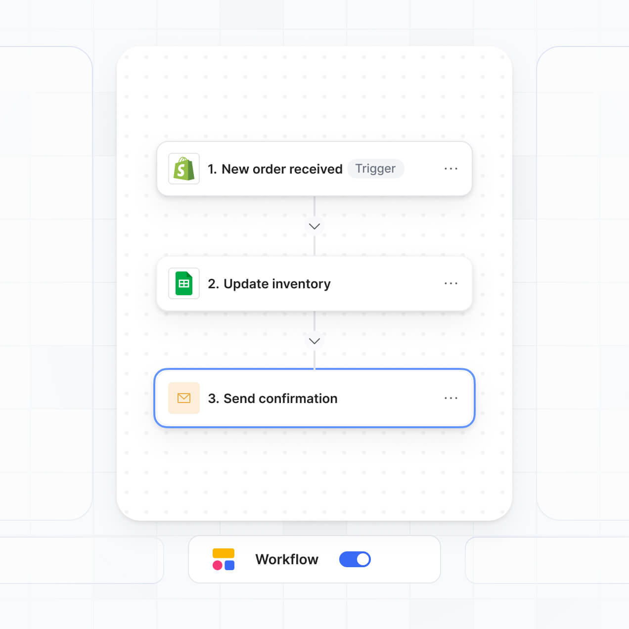
Automations
Streamline your reporting with Softr Workflows. Trigger native notifications or status updates based on data changes to keep your operations running smoothly.

Works on any device
Access and update your visualization tools on the go. All dashboards are mobile-ready out of the box for quick checking of metrics from anywhere.

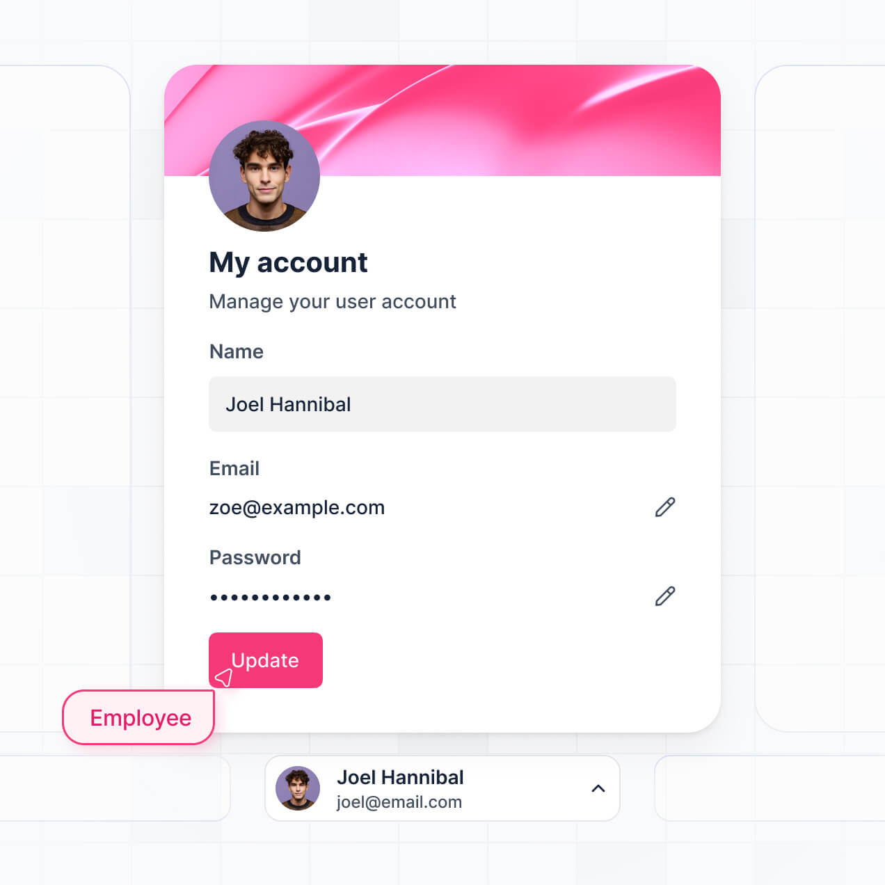
Easy, secure logins
Use Google, email, or SSO logins to give your team fast, secure access to your internal data visualizations—no IT tickets needed.

Security
Keep internal data safe with SOC2 and GDPR compliance, plus fine-tuned access control to ensure only authorized users view your charts.

Why Softr vs other software
No more one-size-fits-all tools or costly custom builds. Softr is easy to use and fully customizable, so you can launch faster, adapt as you grow, and skip the complexity of traditional software.

Easy, fast setup
Build your data visualization dashboard in minutes with AI—no manual setup or complex configurations needed.

Consolidate your stack
Add features like automated insights, sharing rules, or natural language queries as your analytics needs grow.

Flexible as you grow
Start with a dashboard, then add client portals, internal tools, or lead trackers—all in one place.
Generate a custom data visualization dashboard with AI
Co-build with AI
Simply describe what you need. Let Softr handle everything - Interface, database, workflows.
Iterate with AI or visually
Control most critical parts of your app yourself - roles, permissions, security.
Ship the same day
Invite team members or external clients and partners right away. No developer handover.

The go-to platform for business operations
Use drag-and-drop blocks to build a portal that looks sleek and modern out of the box. Add only the features you need, and iterate as your workflows evolve.


Minerva Network increased athlete registrations by 50% with a custom CRM and portal

Celonis built a GTM knowledge base for 1,500+ team members
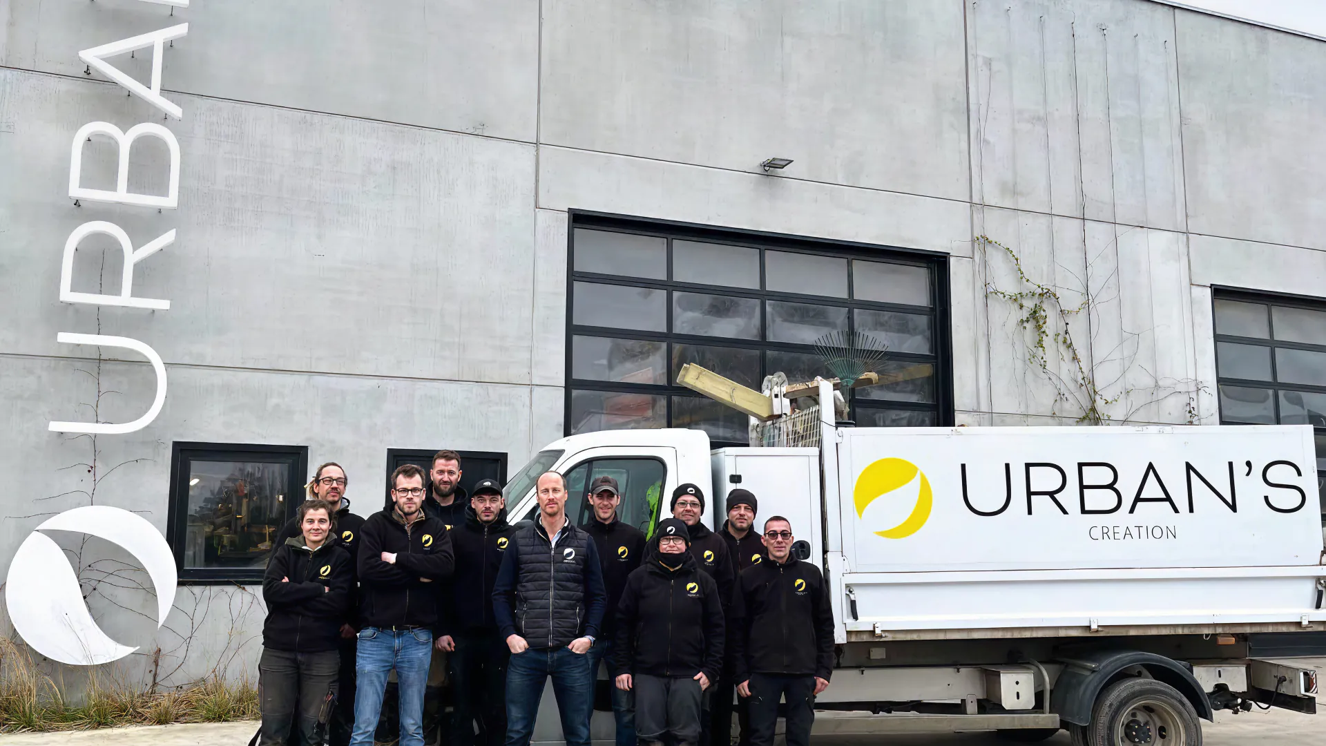
Urban's Group increased productivity by 25% with a custom ERP system
Frequently asked questions
Build your data visualization dashboard
Go from idea to live dashboard in under an hour. Build and customize your reporting tools without code today.