How to use SQL to analyze content performance & drive conversions


[.blog-callout]
✨ TL;DR:
- Content data chaos: Most teams publish fast but struggle to track what's working.
- SQL fixes this: Turns scattered analytics into clear, queryable insights you can actually act on.
- Why it matters: A handful of SQL snippets reveal what drives clicks, conversions, and engagement, without a dedicated data team.
- Top metrics to track: Conversion rate, organic traffic, backlinks, CTR, dwell time, and SERP rankings.
- Segmentation adds clarity: Slice data by channel, region, or device to personalize content and target high-value audiences.
- Softr + SQL = a power combo: Connect your SQL database, or your Softr Database, directly to Softr for real-time dashboards, custom views, and secure access for every stakeholder.
[.blog-callout]
Content teams move fast, publishing articles, testing emails, launching landing pages. But tracking what's actually working is where things get messy.
Most platforms collect plenty of data (clicks, scrolls, sign-ups), but making sense of it is another story.
This is where SQL (Structured Query Language) comes in. As a simple language, it's designed to help marketers work with data stored in content databases. It enables tracking and boosting content performance, simplifies content data analysis, and drives conversions.
In this quick guide, you'll find ready-to-run SQL queries that turn scattered click logs into clear, conversion-driving insights.
The importance of monitoring content performance
Once your content piece goes live, you have two options: publish and walk away, or publish and watch. The first costs nothing now but sacrifices growth opportunities.
The second turns feedback into an advantage, transforming each click into clear guidance and actionable results.
Every scroll, click, and sign-up tells a story. The teams that know how to track and learn from that data are the ones that keep improving, while the ones that don't fall behind competitors who do.

What to focus on when monitoring content performance
Keep your eyes on the seven essential markers that prove readers stick, share, and eventually buy:
- Conversion rate: assessing if content drives business goals
- Organic traffic growth: more visits signal rising interest in your pages
- Traffic sources mix: know which channels deliver readers, not just numbers
- Backlinks earned: external votes that nudge Google and expand reach
- Average time on site: longer stays hint that the content matches visitor intent
- Click-through rate: compelling calls persuade readers to take the next step
- SERP ranking lift: higher positions capture attention before clicks even happen
Track these seven and you'll spot quick wins, like updating headlines that stall or doubling down on topics fans devour.
Finally, remember that data alone won't rewrite copy; people will. Review numbers as a team, debate the "why," and let each new post borrow the lessons from the previous one.
Why SQL still works for content performance analysis
SQL plugs straight into your data so you get answers fast, without waiting on developers.
Structured Query Language, better known as SQL, was first sketched at IBM in the early 1970s and published formally in 1974. Half a century later, its syntax remains almost unchanged, which is exactly why it endures.
SQL is declarative: you declare what you want, not how to get it. This declarative style makes SQL marketing analytics both powerful and approachable for busy teams. It keeps queries readable, e.g. "show me page views this week, grouped by URL," and shareable among teammates who have never written a line of code elsewhere.
Here's what makes SQL the best friend for marketers slicing through content metrics:
- Quickly combines data from different marketing tables
- Enables data filtering using commands that feel close to natural language
- Effortlessly calculates summaries (e.g., totals, averages, conversions, or counts) for key performance indicators (KPIs)
- Compatible with all major data storage systems used in marketing and analytics
- Free to learn, no license required
The format grows with you, too. When your content appears on a broader set of blogs, or you ramp up your guest posting strategy, you can pull each domain's data into one SQL query for side-by-side evaluation and comparison in like-for-like.
Crucially, the language doesn't lock you into a single vendor. Whether your data lives in BigQuery, Snowflake, or a scrappy MySQL box, the same SQL command (called a SELECT statement, used to pull specific data from a database) travels with you, along with insights on views, conversions, and leads.
So, while many shiny modern tools promise one-click magic, SQL still wins on clarity, portability, and time-tested effectiveness. Master a handful of common SQL structures (called patterns) now, and every future analytics tool or data platform will feel familiar.
Basic SQL queries for non-technical teams
Not everyone wants to live in a command-line window, but a few short SQL snippets (small, ready-to-paste blocks of full SQL queries) will save you hours of spreadsheet work. Copy, paste, and watch the numbers appear.
The examples below assume a simple page_views table logging one row per page view, with columns for the page URL, a visitor ID, a timestamp, how long the visit lasted, and where the traffic came from. Swap in your own table and column names.
1. Page-views leaderboard
To instantly spot your top traffic drivers, paste this page-views leaderboard snippet:
SELECT page_url, COUNT(*) AS viewsFROM page_viewsGROUP BY page_urlORDER BY views DESC;This snippet returns one row for each unique page on your site, with a views column that counts exactly how many times that page was viewed. Sorting with ORDER BY views DESC instantly surfaces your highest-traffic pages at the top of the list, with no duplicate URLs cluttering the results.
2. Unique visitors per article
To see how many individual readers each article attracts, run the unique visitors per article query:
SELECT page_url, COUNT(DISTINCT visitor_id) AS unique_visitorsFROM page_viewsGROUP BY page_urlORDER BY unique_visitors DESC;This metric filters out repeated visits and shows you the real size of your audience for each piece.
3. Average time on page
Run this query to find out exactly how long, on average, users stick around each page:
SELECT page_url, AVG(duration_seconds) AS avg_time_on_page_secondsFROM page_viewsGROUP BY page_urlORDER BY avg_time_on_page_seconds DESC;Even a rough time-on-page metric tells you which pieces hold attention.
Run these three snippets each week, drop the results into a simple chart, and you'll know exactly where to double down, where to cut, or what to update.
How to segment and personalize insights with SQL
SQL's possibilities for analyzing content performance stretch far beyond basic engagement metrics. This chapter explains how to segment performance data by channel, industry, location, or device using basic filters and joins.
1. Segmenting by traffic source
Knowing the source of the traffic your content generates is the first step to understanding why visitors land on your pages at all.
Organic, paid, and referral channels each signal different user intent: searchers arrive with questions, ad-clickers arrive with expectations, and referral readers arrive with borrowed trust. Splitting them apart lets you tailor messages instead of lumping every session into a single bucket.
One quick way to see the spread is to run:
SELECT traffic_source, COUNT(*) AS sessionsFROM page_viewsGROUP BY traffic_sourceORDER BY sessions DESC;That single query gives you a tidy count for each channel, so you can spot imbalances at a glance. Add WHERE page_url = '/your-landing-page' if you want to focus on one piece of content.
Next, go deeper with conversion data by joining in a conversions table (one row per completed sign-up or purchase):
SELECT pv.traffic_source, COUNT(DISTINCT pv.visitor_id) AS visitors, COUNT(DISTINCT c.visitor_id) AS conversions, ROUND(COUNT(DISTINCT c.visitor_id) * 100.0 / COUNT(DISTINCT pv.visitor_id), 2) AS conversion_rateFROM page_views pvLEFT JOIN conversions c ON pv.visitor_id = c.visitor_idGROUP BY pv.traffic_sourceORDER BY conversion_rate DESC;Now you'll see whether your ad budget really outperforms organic, or if referrals secretly win on loyalty. Armed with that intel, you can boost spend on channels that convert, tighten copy where engagement lags, or chase guest posts on sites already sending high-quality traffic.
Small SQL tweaks, big clarity. That's the essence of SQL marketing analytics: with the right queries, you can spot what's really working across your channels.
2. Segmenting by user type
Statistics without context are just tales; numbers alone don't tell the full story and can even mislead you if you don't understand what's behind them.
Context arrives when you tag sessions by the industry they belong to, the region they come from, and the device in the visitor's hand.
Industry velocity first:
SELECT industry, COUNT(*) AS sessionsFROM page_viewsGROUP BY industryORDER BY sessions DESC;A quick tip: industries requesting demos deserve dedicated case studies.
Now add regional reach:
SELECT country, COUNT(*) AS sessionsFROM page_viewsGROUP BY countryORDER BY sessions DESC;Plot this on an interactive map and you might discover untapped pockets of interest.
Make geographic segmentation of your audience a habit, and your outreach will feel less like guessing and more like aiming with a scope.
Device shift:
SELECT pv.device_type, COUNT(DISTINCT pv.visitor_id) AS visitors, COUNT(DISTINCT c.visitor_id) AS conversions, ROUND(COUNT(DISTINCT c.visitor_id) * 100.0 / COUNT(DISTINCT pv.visitor_id), 2) AS conversion_rateFROM page_views pvLEFT JOIN conversions c ON pv.visitor_id = c.visitor_idGROUP BY pv.device_typeORDER BY conversion_rate DESC;If you spot lower mobile conversion, consider re-evaluating checkout flow on small screens or optimizing your content for mobile in general.
Segmenting by user type isn't extra polish; it's the steering wheel for your roadmap.
How segmentation helps inform personalization or retargeting
Personalization and retargeting thrive on context. Segmentation hands you that context in tidy rows and columns.
Instead of treating every bounce as a lost sale, you can see whether the user bounced after reading FAQs or after hitting the pricing page.

Suppose you see that manufacturing executives from Germany often browse your ROI calculators at 8 a.m. their time. Armed with that intel, you can schedule LinkedIn ads promoting a German-language calculator white paper right before breakfast.
Meanwhile, U.S. freelancers who binge on your "getting started" content on mobile might receive a simplified onboarding email instead of a dense PDF guide.
Here's how segmented data powers personal touches:
- Schedule ads when users browse your pages.
- Tailor CTAs to device context (e.g., shorter and sharper CTAs on mobile).
- Show currency based on the user's current location.
- Highlight features by industry pain (e.g., in healthcare, users look for safety testing and adherence to regulations).
- Adjust the tone for new visitors, who need to be engaged first.
These tweaks feel small, yet they add up to highly personalized user experiences. That's the difference between an ignored impression and a remembered brand, and when a matching retargeting ad reinforces those tailored touches, it draws hesitant prospects back to complete the journey.
Analyzing content conversion performance
Clicks and page views are nice, but conversions pay the bills. This chapter shows how a few targeted SQL queries pinpoint which articles drive sign-ups, and which merely rack up impressions.
Using SQL to identify high-converting content pages
A page that converts at 3% is worth more than one that converts at 0.3%, even if the latter brings twice the traffic. SQL helps quantify that truth.
Combine views and conversion events:
SELECT pv.page_url, COUNT(DISTINCT pv.visitor_id) AS visitors, COUNT(DISTINCT c.visitor_id) AS signups, ROUND(COUNT(DISTINCT c.visitor_id) * 100.0 / COUNT(DISTINCT pv.visitor_id), 2) AS signup_rateFROM page_views pvLEFT JOIN conversions c ON pv.visitor_id = c.visitor_id AND pv.page_url = c.page_urlGROUP BY pv.page_urlORDER BY signup_rate DESC;Pages with stellar signup rates become templates for future content. That's the kind of insight you only get from SQL in marketing, where data illuminates creative wins.
Analyze their structure, CTA placement, and reading level, and do the same for your competitors' pages. Interactive lead generation tools, like pricing estimators, often double form submissions.
For laggards, try testing new button colors, shorter forms, or stronger social proof. Repeat monthly and watch the lagging pages climb.
Using SQL to optimize lead-generating CTAs
Most marketers judge a CTA by gut feeling: red button, blue button, who knows?
SQL replaces hunches with proof. By pairing click events with the pages that host them, you can see which words, colors, or positions actually persuade.
Start with a simple count, assuming a cta_clicks table logging one row per click:
SELECT cta_id, page_url, COUNT(*) AS clicksFROM cta_clicksGROUP BY cta_id, page_urlORDER BY clicks DESC;That's useful, but if you only look at total clicks on each CTA, the busiest pages will naturally rack up more clicks simply because more people saw them, not necessarily because their CTAs are more effective.
Normalize by impressions instead, i.e. adjust raw click totals based on how many times the CTA was seen, so you get a true effectiveness rate rather than just a popularity count:
SELECT im.cta_id, im.page_url, COUNT(cl.id) AS clicks, COUNT(im.id) AS impressions, ROUND(COUNT(cl.id) * 100.0 / COUNT(im.id), 2) AS click_rateFROM cta_impressions imLEFT JOIN cta_clicks cl ON im.cta_id = cl.cta_id AND im.page_url = cl.page_urlGROUP BY im.cta_id, im.page_urlORDER BY click_rate DESC;CTAs with a high click rate but modest impressions are low-hanging fruit: place them higher on the page or reuse them elsewhere. CTAs with plenty of traffic but no clicks need copy tweaks, or maybe a color, shape, or size change.
Using SQL to find underperforming content
Big traffic is flattering, but it can hide ineffective or low-quality content. Your goal is to pinpoint pages that attract visitors yet fail to keep them reading, clicking, or converting.
SQL offers a quick, repeatable way to surface those problems so you can fix them before Google demotes them and readers bounce for good.
Start by pairing page views with average time on page:
SELECT page_url, COUNT(*) AS views, AVG(duration_seconds) AS avg_time_on_page_secondsFROM page_viewsGROUP BY page_urlHAVING COUNT(*) > 500 AND AVG(duration_seconds) < 30ORDER BY views DESC;Pages with more than 500 views and less than 30 seconds of average dwell time top the priority fix list. Maybe the introduction makes big claims but the rest feels disappointing, or large images push your key text too far down.
Check formatting, tighten the lead, or add a clearer CTA.
Next, layer in conversions to spot high-traffic, low-yield pages:
SELECT pv.page_url, COUNT(DISTINCT pv.visitor_id) AS visitors, COUNT(DISTINCT c.visitor_id) AS conversions, ROUND(COUNT(DISTINCT c.visitor_id) * 100.0 / COUNT(DISTINCT pv.visitor_id), 2) AS conversion_rateFROM page_views pvLEFT JOIN conversions c ON pv.visitor_id = c.visitor_id AND pv.page_url = c.page_urlGROUP BY pv.page_urlHAVING COUNT(DISTINCT pv.visitor_id) > 500ORDER BY conversion_rate ASC;If a page converts under 0.5%, try shorter forms, clearer headlines, or extra social proof nearby. Running these queries regularly turns guesswork into a clear improvement list, saving time and protecting your ROI.
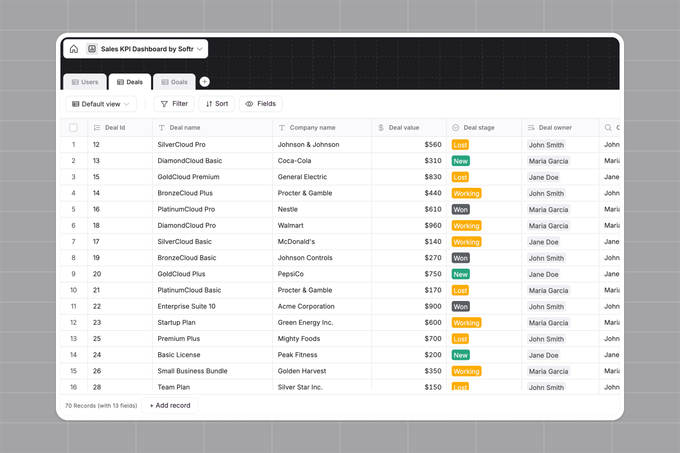
How to turn SQL insights into client-ready content dashboards with secure access
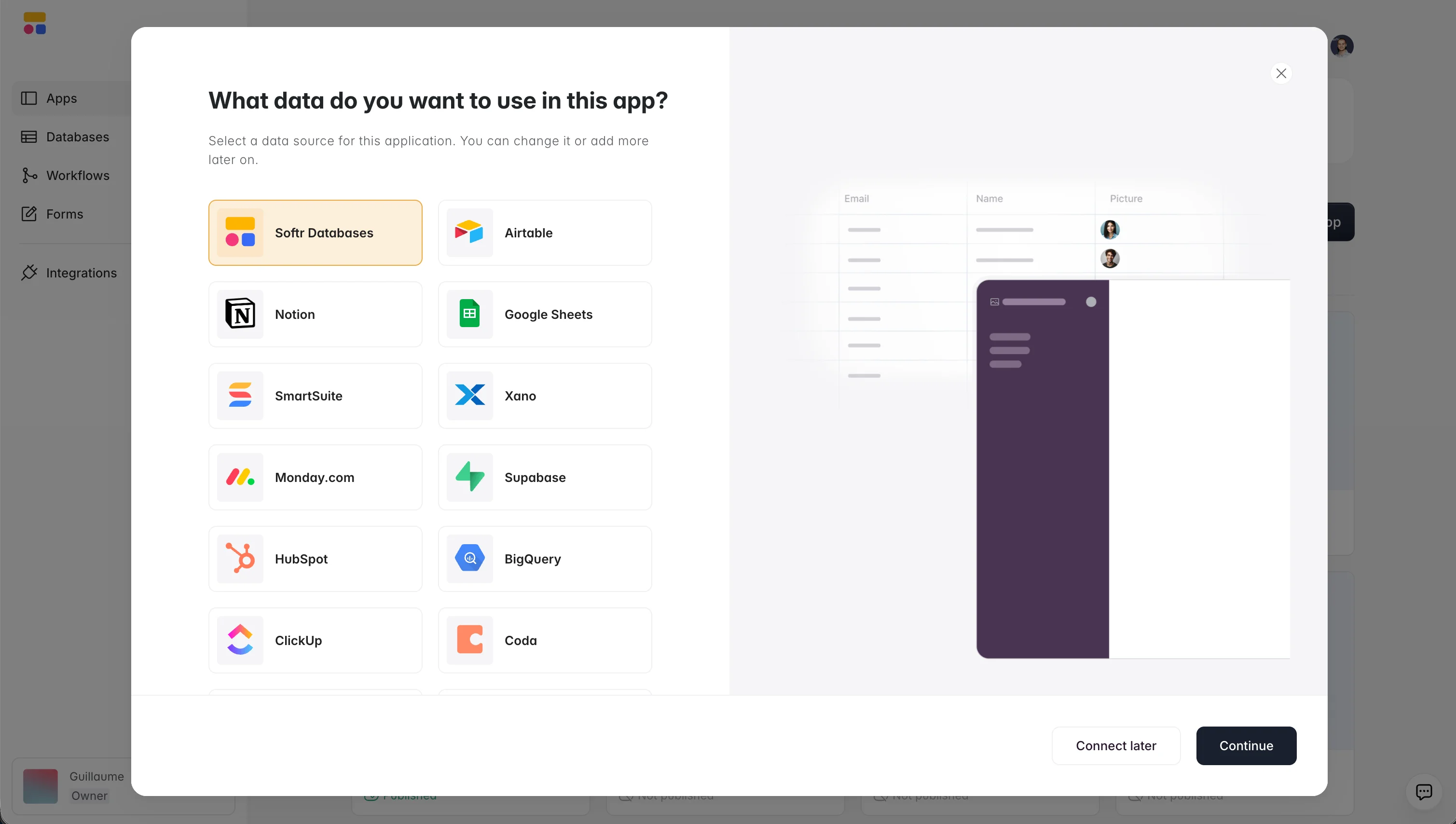
Your content performance data might already live in a native app database like Softr Databases, or in an external SQL database such as PostgreSQL, MySQL, SQL Server, or MariaDB. Either way, connecting it to Softr makes that data far easier to use and show to stakeholders, which matters most for non-technical teams needing fast answers instead of raw tables.
Softr connects directly to your data and gives you a clean, visual interface to segment and share insights without writing additional code or relying on developers. If your metrics already live in a Softr Database, you can skip writing raw SQL entirely for routine reporting: describe the rollup, filter, or view you want to the Database AI Co-Builder in plain language, and it builds the underlying fields and query logic for you.
Why it works for measuring content performance:
- Fast and easy to set up: Pre-built templates and a drag-and-drop builder let you launch in minutes, ideal for small teams that don't want a complex setup process.
- Real-time deep sync: Connect your data directly to Softr with real-time, two-way sync, no CSV exports or manual updates. Changes made in your Softr app update your SQL database and vice versa.
- Custom views for every stakeholder: Build tailored dashboards for marketing, sales, or clients, each with different filters, layouts, and permissions. Everyone sees what matters to them in real time, without duplicate work.
- Secure data handling: Control access with custom user groups and granular permissions, ensuring sensitive data is only visible to the right users.
- Segment SQL data for end users: Use dropdown filters and visual toggles to show performance by source, device, industry, or campaign.
Supported external SQL databases include:
Teams already use this pattern for reporting beyond content. FUGA, a music distribution marketing agency, replaced static PDF reports with live Softr dashboards pulling from BigQuery and Airtable, and now lets each client see only their own numbers:
"We really appreciate how we can set user-specific visibility. Clients see only what they need to see, nothing more." - FUGA, via Softr customer story
Strupek, a marketing agency, saw a similar shift after moving client reporting into a Softr dashboard: 8 hours to 10 hours a week previously spent building reports were redirected to strategic work, and operational costs dropped by 58%.
See how Make built a Softr app on top of MySQL data.

Why SQL is your simplest next step
The main takeaway: data can feel heavy, but SQL keeps it simple, helping you analyze what's working and stay focused on what matters.
From spotting top-performing pages to diagnosing leaks in your conversion flow, a handful of clear queries delivers answers faster than any one-click dashboard.
Just by running your queries weekly and letting the numbers steer, you can:
- Track the core engagement metrics.
- Rank pages by conversion rate before traffic.
- Normalize CTA clicks by views.
- Slice results by channel, device, and region.
- Promote high-rate pages and revive low-dwell pieces.
- Turn every insight into one next action.
SQL's portability means you can lift the core queries in this article into any future warehouse without rewriting a line.
Want to turn those SQL insights into something your whole team (or client) can actually use? Softr lets you build custom content dashboards on top of your SQL data, or your Softr Database, with no code and no delays.
Connect your database, add filters, and share live insights in minutes.
👉 Try Softr for free and start building content dashboards your whole team can use, no code required.
Frequently asked questions
- Do I need to know how to code to use SQL for content analytics?
- What data do I need before I can run these SQL queries?
- Can SQL replace tools like Google Analytics or HubSpot reporting?
- How do I share SQL query results with non-technical teammates or clients?
- How often should I re-run content performance queries?