Web design has come a long way since the early days of the Internet. As web application design continues to change with new trends and updates, staying current means constantly seeking fresh inspiration.
This post showcases 12 examples of web application design you can use as inspo for your own projects. But while aesthetics are important, these sites don't just look pretty; they're also highly functional and user-friendly.
What is a web application?
Since you're using the internet to read this, you've definitely used a web application before. Popular examples include Airbnb, Spotify, HubSpot, DoorDash, and Canva.
A web application (or web app) is interactive software that runs on a web server and is accessed through a web browser. Unlike traditional desktop applications that run locally on your device, web apps rely on a network connection to process data and deliver functionality. Many modern web apps also use a mix of server-side and client-side processing to improve speed and responsiveness.
Everyday activities like checking email, shopping online, or managing your bank account typically involve web applications.
What is web app design?
Web app design is the process of shaping both the user interface (UI) and user experience (UX) of a web application to make it intuitive, efficient, and visually clear. It focuses on how a product looks, feels, and works from the user’s perspective, balancing usability and overall performance.
Web app design is closely related but distinct from software development. Design centers on structure, interaction, and visual presentation, whereas development involves building and maintaining the underlying code that makes the app function.
Before we jump into the design examples, let's break down the core differences between UI and UX.
User interface (UI)
The user interface (UI) is the visual layout of a web app — the parts users see and interact with directly. This includes elements like color schemes, typography, buttons, icons, and imagery. Effective UI design ensures these elements are consistent, on-brand, and work together cohesively both visually and functionally.
A key goal of UI designers is to create interfaces that are not only visually appealing but also clear, accessible, and easy to navigate. To do this, teams use design systems, prototyping tools, and modern front-end technologies to build interfaces that support a smooth and engaging user experience.
User experience (UX)
UX design focuses on how a web app feels to use. It’s about creating products and services that are intuitive, efficient, and satisfying for users. A strong user experience is seamless, allowing users to accomplish their goals without confusion or unnecessary friction.
Ultimately, the simplicity and clarity of the interface, along with how well it supports user needs, determine the overall user experience.
Why is web app design important?
A well-designed web application will help you make a solid first impression on potential customers. Great web application design also assists you in nurturing leads and increasing conversions. Even more significantly, it makes navigating and using your web app easier for your users (which goes a long way towards keeping them happy long term).
12 web app design examples
1. Softr
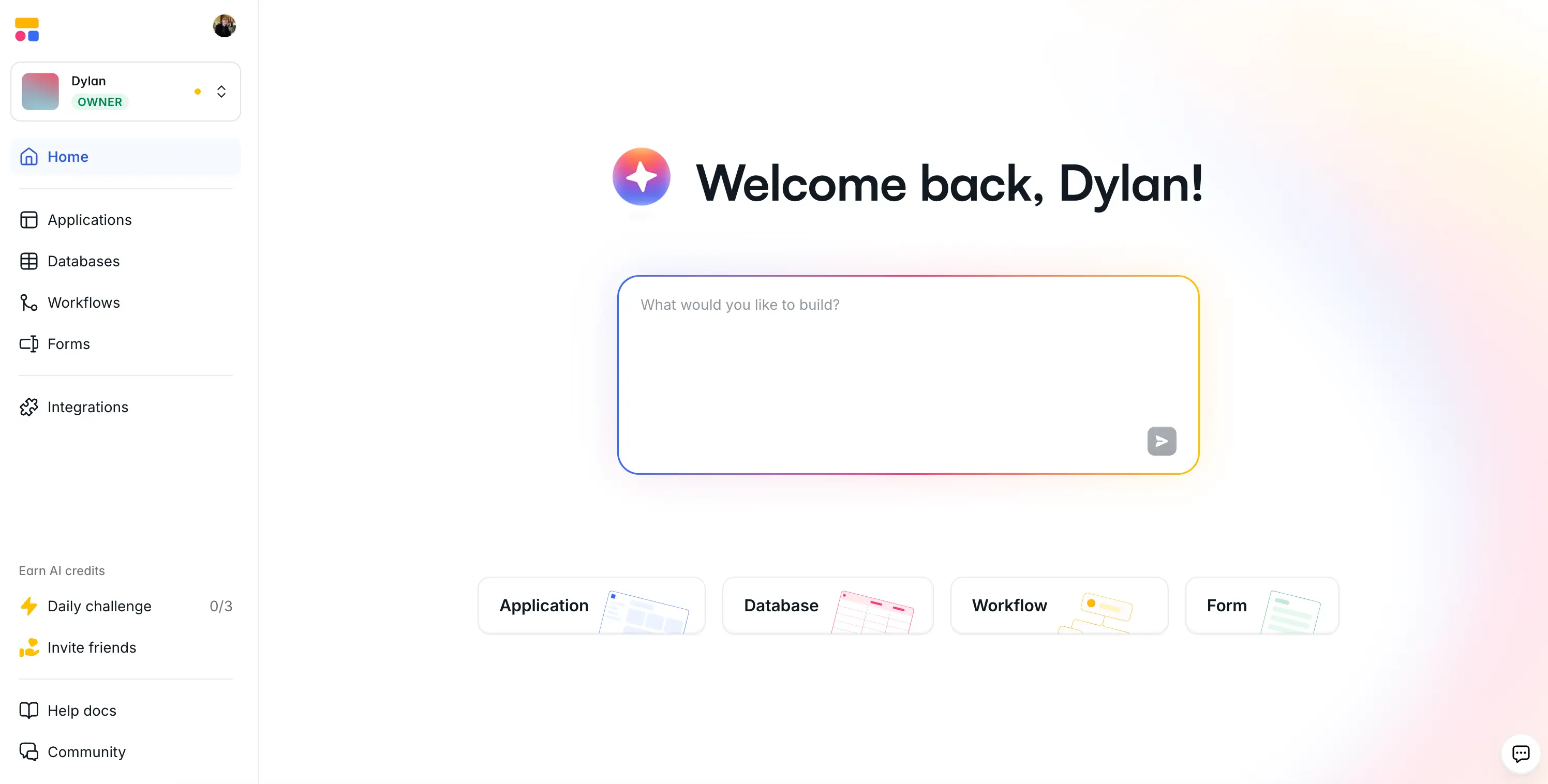
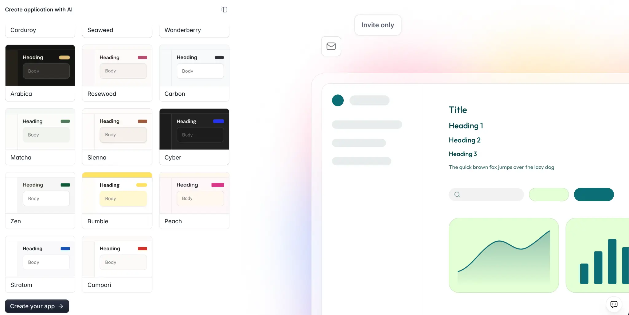
Not to toot our own horn, but Softr's web app is a great example of an interface that blends deep functionality with exceptional clarity. It's an app building platform that lets non-technical users create secure, functional business software in minute using the AI Co-Builder.
Even though Softr includes a wide range of features—apps, databases, workflows, and forms—they're nested in sleek, color-coded tabs (and also distinguished with icons on the sidebar). The centerpiece of the interface is the AI prompt box, which is surrounded by tasteful white space and outlined with a soft color gradient. Fonts are punchy and legible, and you aren't being assailed by large amounts of text, icon overload, or an excessive number of buttons.
The end result is an app that's jam-packed with functionality but without feeling like it's too much to keep track of. Everything has its place, and the learning curve stays gentle even as you dig into more advanced features, which is exactly what a web app built for non-technical users should deliver.
2. Slack
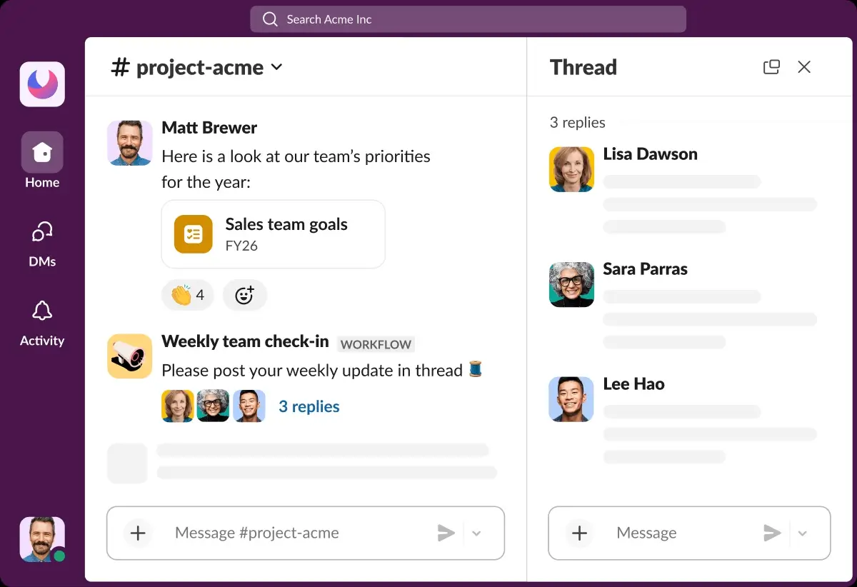
Slack stands out with a clean, minimalist UI that makes it easy to stay organized without feeling overwhelmed. The layout is intuitive and scannable, with a customizable color palette available in both light and dark themes that feels soft yet engaging. Fonts are clear and legible, contributing to an overall sense of calm even when conversations are busy.
The UX goes beyond aesthetics: thoughtful design choices make navigation effortless, and features like custom emojis and reactions add personality without cluttering the interface. It strikes a rare balance between professional functionality and an experience that's actually enjoyable to use day to day.
3. Blinkist
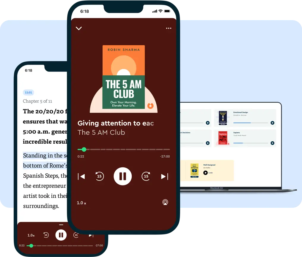
Blinkist is a subscription service that condenses books, podcasts, and expert talks into short, digestible summaries. The design reflects the use case perfectly, packing a lot of content into the interface without ever feeling overwhelming. Brand colors are used creatively across web and mobile, giving it a distinct charm that sets it apart from other learning-oriented apps.
The layout is sleek and minimalist, keeping the focus squarely on the content. Navigation is stripped back and purposeful, guiding users to what they need without unnecessary steps. Responsive and accessible across devices, it's built for busy people who want to jump in and find something worth reading in under a minute.
4. Dribbble
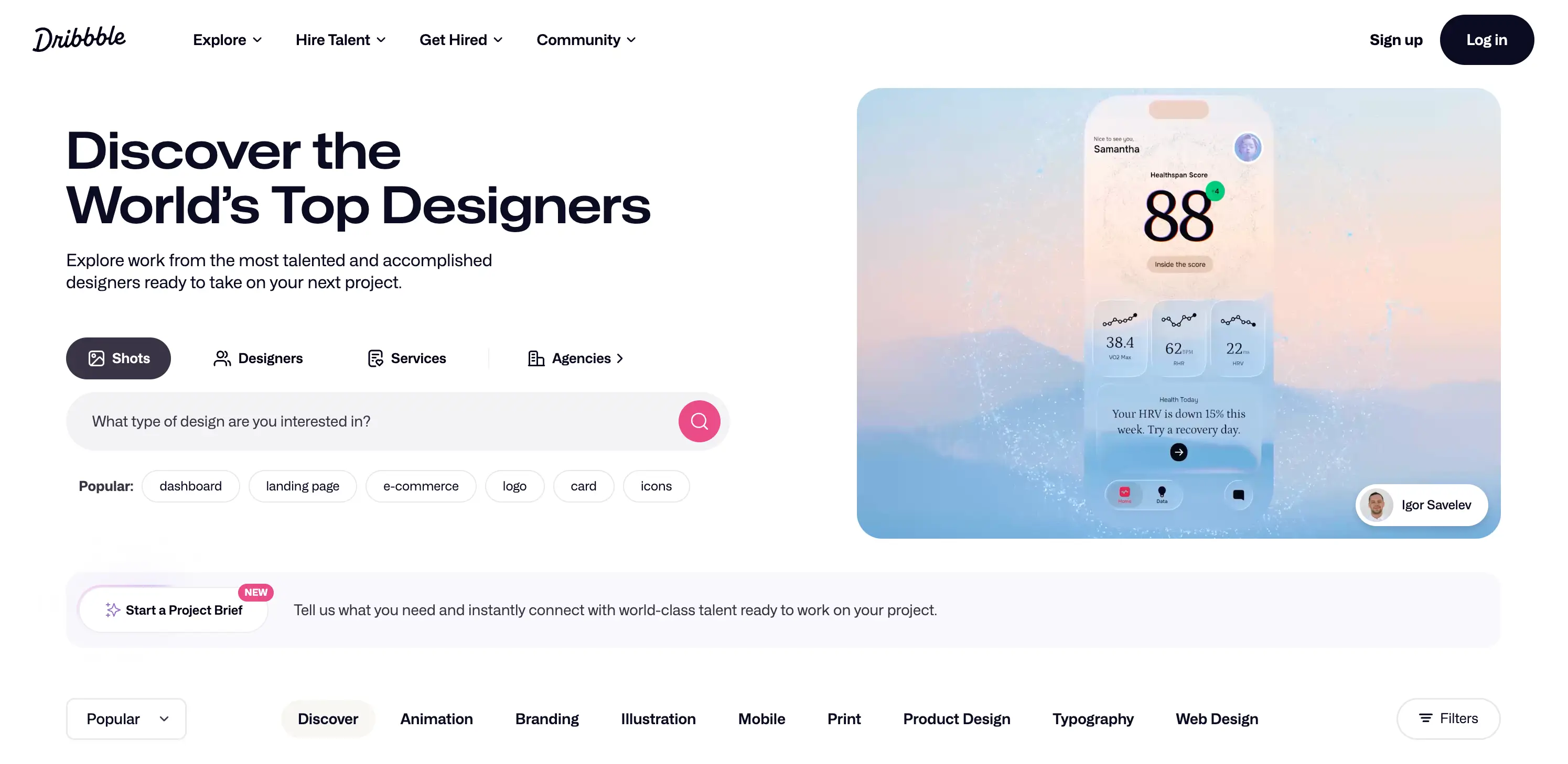
Dribbble is a web app for showcasing the interfaces of other web apps (so, app-ception), but it's also a super well-designed platform in its own right. It functions as a creative community where designers share their work, discover inspiration, and connect with potential clients or collaborators. You can think of it as a portfolio platform meets design social network.
The interface is sleek and visually driven, letting the community's designs take center stage. A neutral color palette keeps the UI from competing with the colorful, creative work being displayed, while the layout makes it easy to browse, filter, and dive into specific project types. Navigation feels natural and unforced, which matters on a platform where users often arrive just to browse.
5. LinkedIn
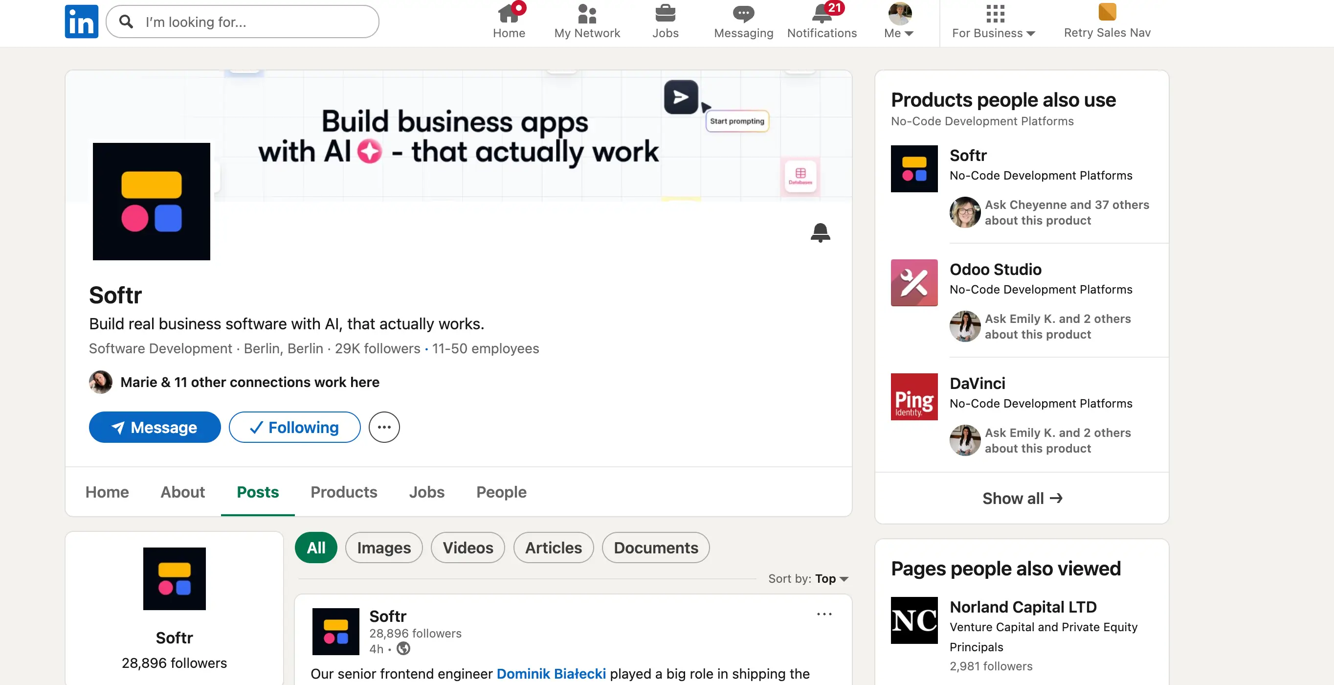
I'll be honest, I never thought I'd be including LinkedIn in a list like this. And yet its interface and user experience have gotten so good that it would feel wrong not to mention it. While there are few too many elements competing for your attention at any given time, it's remarkable how closely LinkedIn resembles the experience of non-workplace social media platforms like Facebook or X.
The feed, notifications, and messaging sidebar all follows patterns that feel immediately familiar, which lowers the barrier to entry for a platform that could otherwise feel stuffy or corporate. The UI has been refined over the years into something genuinely clean, with a consistent color palette and typography that strikes a professional tone without feeling cold. For a platform covering such a vast amount of content—job listings, posts, profiles, ads, and messages—it all holds together quite well.
6. Pexels
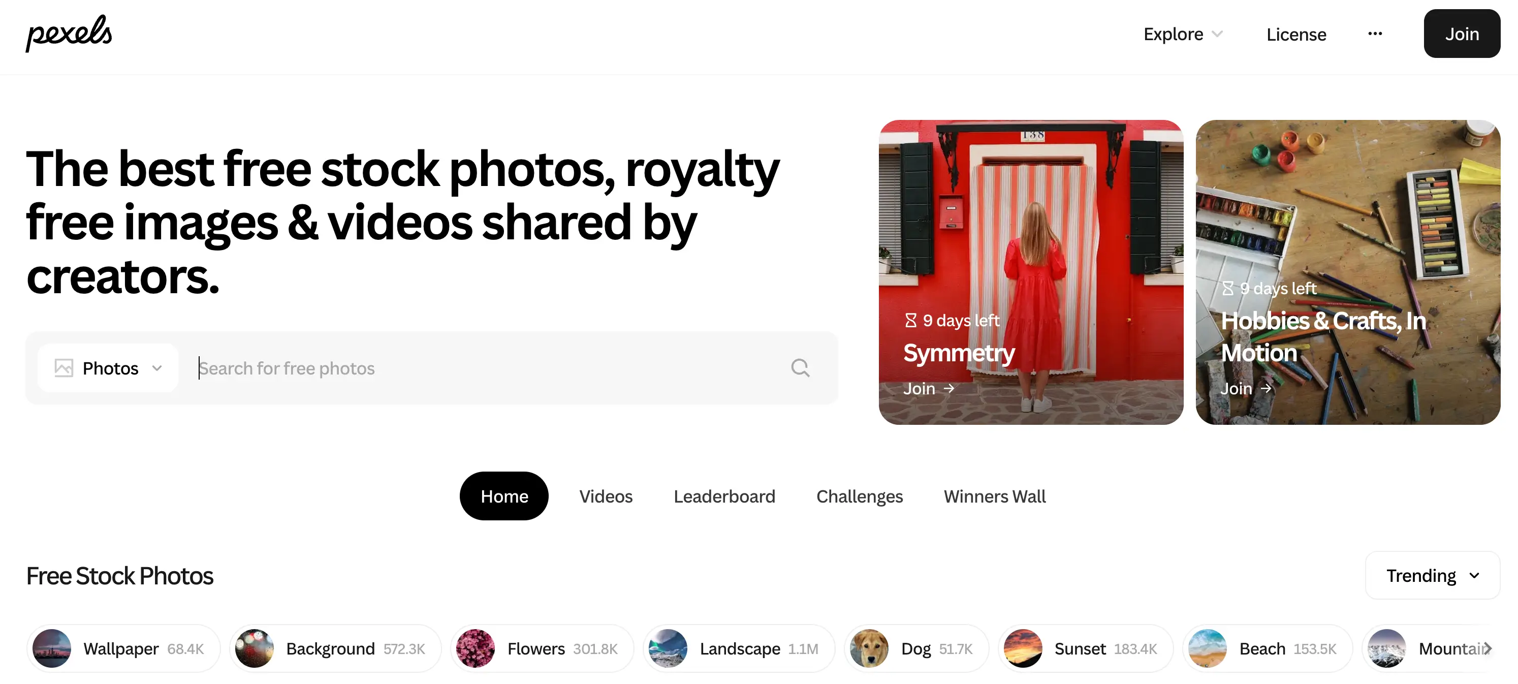
Pexels handles visual content exceptionally well, which is exactly what you'd expect from a platform built around photography and video. The design is rich and image-forward, but white space is used smartly to prevent it from ever feeling chaotic. Categories are clearly divided, and navigation stays simple and responsive throughout.
What makes the design particularly effective is how well it gets out of its own way. The interface exists to showcase the content, not compete with it. As a result, browsing feels intuituve and enjoyable, which ought to keep users coming back.
7. Behance
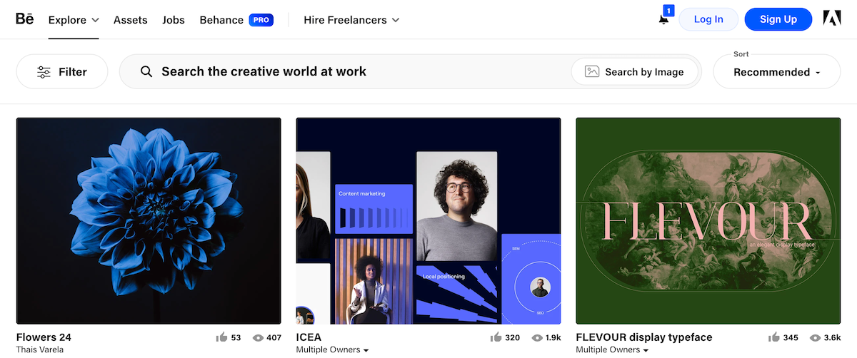
Behance takes a deliberate, restrained approach to design that works brilliantly for its purpose. The monochromatic interface puts the spotlight squarely on the creative work being showcased, removing any visual competition that might distract from a portfolio piece. Navigation is intuitive, and the overall aesthetic feels sleek without being cold.
The layout does a great job of organizing a massive volume of projects in a way that still feels curated and professional. Much like Pexels, it understands that the best design for a creative platform is one that elevates the content rather than overshadowing it.
8. Canva

Canva is a masterclass in making a complex, feature-rich product feel genuinely simple. The use of color, typography, and imagery throughout the interface is expressive and on-brand, giving the platform an energy that feels creative and inviting. Every design choice reinforces what Canva is: a tool that makes design accessible to everyone.
Despite offering an enormous library of templates and features, navigation rarely feels overwhelming. The UX is structured so that users can find what they need quickly, get to work, and focus on creating. And that's exactly what a design tool should accomplish.
9. GetYourGuide

GetYourGuide uses a clean, minimalist layout to keep users focused on the experiences and destinations on offer. The design leans on strong photography with a bold text overlay, letting the visuals do the selling while the interface stays out of the way.
The modular design is where the UX really delivers. It allows users to quickly compare services and destinations side by side, taking in information at a glance without needing to scroll through walls of text. It's a smart approach for a platform where browsing and decision-making go hand in hand.
10. Omio

Omio's design is calm, clean, and easy on the eyes. A subdued pastel color palette sets a relaxed tone, while simple illustrations help users understand and scan through content without any visual noise. The layout is highly legible, highlighting the most important elements and keeping navigation smooth and uncluttered.
The accessibility and responsiveness of the app are other standout qualities. Whether users are booking on desktop or mobile, the experience holds up. It's a well-executed design that makes a fairly functional, task-driven transportation booking app feel pleasant to use.
11. Airbnb

Airbnb's web app design is refined and purposeful. The interface is consistent throughout, with a color palette and typography that feel distinctly on-brand while drawing the eye to the right places (i.e., the properties). Despite hosting thousands of listings, the design maintains clarity with its smart use of white space and modular layouts that keep everything organized and easy to browse.
Load speed was clearly a priority in the design process, which pays off in a lower bounce rate and a smoother overall experience. The result is a platform where users can jump straight into searching, filtering, and exploring stays without unnecessary friction.
12. Spotify

Spotify's dark-themed UI is instantly recognizable and deceptively well-crafted. The contrast between the dark background and vibrant accent colors creates a strong visual hierarchy that guides users naturally toward what to listen to next. Typography and layout work together to make a huge library of content feel manageable and simple to navigate.
What makes Spotify's design particularly effective is its responsiveness and clarity. The interface scales well across devices, and the UX is built around reducing the time between opening the app and playing a song you love. It's a great example of design that serves the product's core purpose without overcomplicating the streaming experience.
Can I build my own web app?
If you're inspired by the examples above but don't know how to code, Softr is the place to start. It's an AI platform that lets users build custom, functional web apps (portals, internal tools, and operational systems) without writing a single line of code or hiring developers. Describe what you need and the AI Co-Builder creates the database, app interface, and business logic: already connected, secure, and ready for real users.
There's also a wide library of pre-built templates to choose from if you'd rather not start from a prompt. And you can always switch to the visual editor to add, remove, or customize app elements without using AI credits.
Build web apps that actually work with Softr
The examples above stand out because they nail the balance between looking great and actually working well. Good web app design is about creating an experience that feels effortless and keeps users coming back. And unlike off-the-shelf software that never quite fits, or vibe coding tools that fall apart the moment real users show up, Softr lets you create apps that work (and work well) from day one.
Whether you're starting from scratch or replacing a tangle of spreadsheets and disconnected tools, Softr gives you everything you need to build something you're genuinely proud of. Try Softr free and turn your ideas into beautifully designed, fully functional web applications — no coding required.
This article was originally published in April 2025. The most recent update, with contributions by Dylan Reber, was in April 2026.
Frequently asked questions
- How do I design a UI for a web application?
- What's the difference between web design and a web application?
- How much does it cost to build a web app?