[.blog-callout]
TL;DR
- A waterfall chart shows how a starting value moves to a final total through a series of gains and losses, which makes it ideal for breaking down revenue, costs, and profit.
- Google Sheets gives you three ways to build one: the built-in chart editor, a third-party add-on, or a short Apps Script.
- A chart inside a spreadsheet is great for a one-off analysis, but it lives in a file only editors can touch, and shared filters quickly collide.
- For a live report your whole team uses, build a dashboard app with Softr: connect your data, drop chart blocks on top, and publish it with role-based access. You can build it manually or with the AI Co-Builder. [.blog-callout]
A waterfall chart in Google Sheets is a handy way to visualize how various factors contribute to a final total. It gets its name from the way each column connects and flows into the next, creating a visual effect similar to a cascading waterfall. This format is especially useful for illustrating how different elements, such as revenues and expenses, build up to the overall result, which is why finance and operations teams reach for it during monthly reporting.
In this guide on Google Sheets, we'll teach you how to:
- Create a waterfall chart in Google Sheets, using its chart editor
- Create a waterfall chart in Google Sheets, using add-ons
- Create a waterfall chart in Google Sheets, using Apps Script
We'll also show you when a static spreadsheet chart starts to hold you back, and how to turn the same data into a live dashboard your team can actually use.
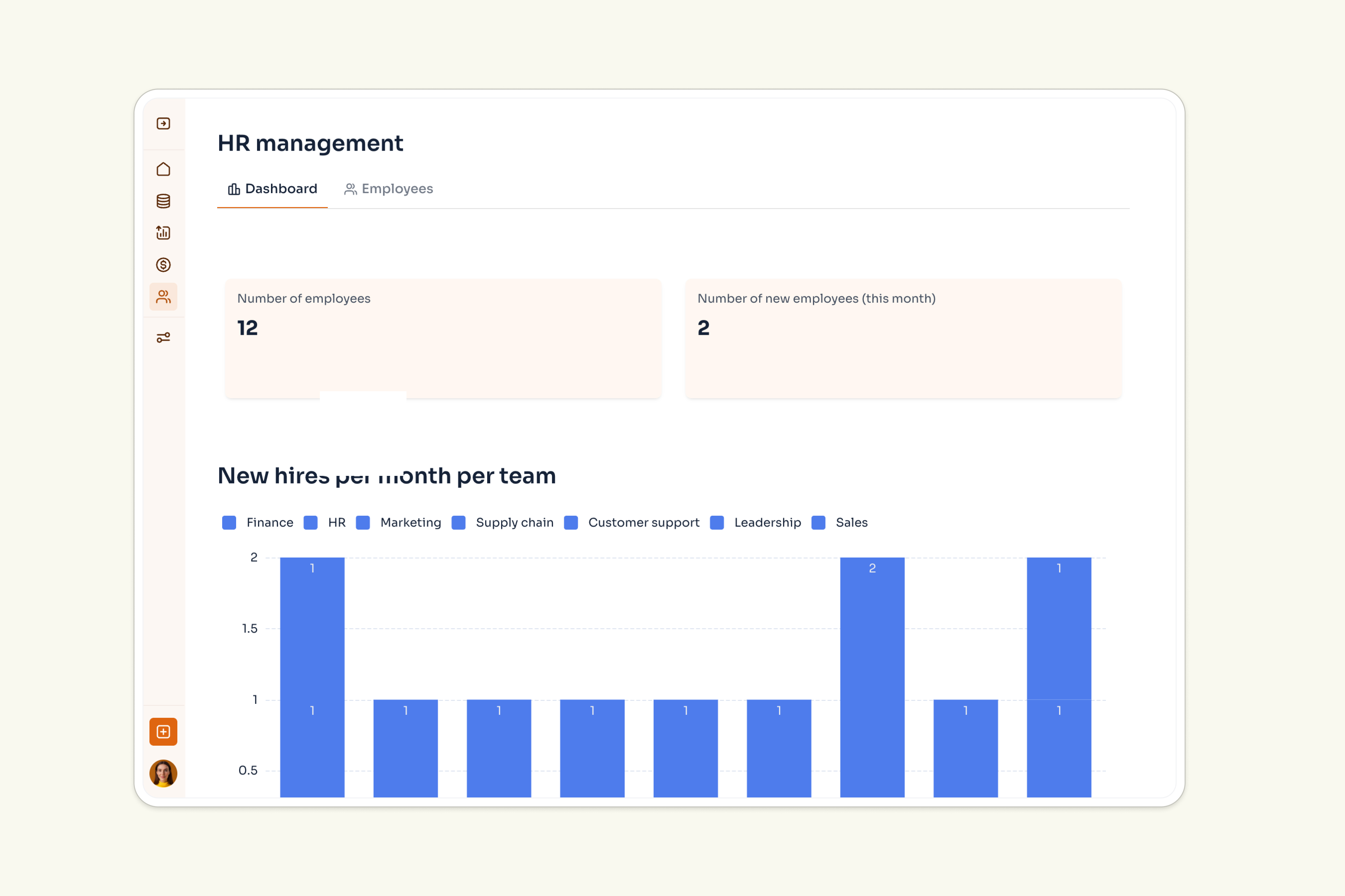
Spreadsheets are a great starting point, but they have a ceiling once a report becomes a shared, recurring thing.
"Using related fields is the way to make your data structure as robust and scalable as possible. It is way better, way more organized and structured than Excel." - Guillaume Duvernay, Builder at Softr
Creating a waterfall chart in Google Sheets, using the chart editor
Cost: $0
Time: 5 minutes
You can use Google Sheets’ built-in chart editor to create various charts, including a waterfall chart. This method provides a wide range of customization options so that you can make your waterfall chart look exactly as you want it to.
Step 1: Select the dataset
Access your spreadsheet in Google Sheets, and highlight the data you want to use to create your waterfall chart.

Step 2: Open the chart editor
Go to the top menu and click on “Insert,” and then select “Chart.” The Chart editor will open on the right-hand side of the Google Sheet window.

Step 3. Select the chart
In the chart editor panel, under Chart type, click on the dropdown menu. Then scroll to the Other section, and click on the waterfall chart.

Step 4: Set up the chart
Again on the chart editor, in the Setup tab and under the heading “Stacking,” click on the dropdown arrow to select the type of stacking you want from the two options available:
- Sequential: Choose this option if you only have one data series. It will result in the data being displayed sequentially, with each data point represented by a bar that starts at the previous data point and ends at the next data point;
- Stacked: If you have multiple data series, choose this option. It will result in the data being displayed as stacked bars, with each data point represented by a segment of a bar that will be colored.

Step 5. Customize the chart
There are a variety of ways you can optimize a waterfall chart, from changing its title and font to its axis and gridlines.
To customize your chart, double-click on your waterfall chart to open the chart editor. Then click on the "Customize" tab.

Step 5.1: Customize Connector size and Color
Select “Chart style” and choose your preferred background color, font and cart Border color. You can also customize the line color and thickness and line dash type by clicking on the drop-down arrows. If you wish to display the connector lines, tick the check-box under “Show connector lines”.

Step 5.2: Customize your waterfall chart’s titles
You can also customize your waterfall chart’s title and subtitle, as well as its axis titles. To do so, in the Customize tab of the chart editor, click on “Chart & axis titles.” There, select which title you want to change.
You will then be given the option to change the words in any of the titles, as well as the font, size, and color.

Step 5.3: Customize your waterfall chart’s series
Next, you can choose to customize your waterfall chart series. In the chart editor, click on “Series.” There, you will have the option to change the colors, opacity, thickness, and more.

Step 5.4: Customize your waterfall chart’s legend
Under the "Legend" section in the chart editor, you can change which position you want the waterfall chart’s legend to appear in, as well as its font, format, size, and color.

Step 5.5: Customize your waterfall chart’s axis
In the chart editor, select which axis you want to customize: “Horizontal axis” or “Vertical axis.” Once there, you will be able to change the axis’ font, size, format, and color. You can also click on the “Reverse axis order” checkbox to reverse the order in which the data is displayed in the axis. Lastly, you have the option to slant this data by changing the angle under “Slant labels.”

Step 6: Save your waterfall chart
Click on the three dots that appear on the top right corner of the chart. In the menu that appears, you’ll have access to several ways to save your chart.

How to create a waterfall chart in Google Sheets using add-ons
Cost: $0
Time: 3 minutes
Add-ons in Google Sheets provide additional customization and functionality options that may not be available in the chart editor. They also offer a more user-friendly and intuitive interface that saves time and effort. If you find yourself comparing several add-ons for ongoing reporting, it's often a sign you've outgrown a single spreadsheet chart and would be better served by a dedicated dashboard builder.
Step 1: Open Google Workplace Marketplace
In the top menu of Google Sheets, click on “Extensions,” followed by “Add-ons,” and then select “Get add-ons.”

Step 2: Search for an add-on
Go to the search bar and type in “Waterfall chart.” From the options provided, choose a suitable add-on. We recommend Charts, Graphs & Visualizations by ChartExpo.

Step 3: Install the add-on
Once you’ve selected an add-on, click on “Install” to start the installation process.

Step 4: Choose a Google account
Choose the Google account you’ll use to create the waterfall chart in Google Sheets.

Step 5: Grant permissions
Grant to the creator of the add-on the required permissions, by clicking on “Allow.”

Step 6: Open the add-on
Back to your spreadsheet in Google Sheets, go to the Extensions menu and choose your newly installed add-on.

Step 7: Create a waterfall chart
If you installed the add-on by ChartExpo, click on “Add new” and in the search bar type in “waterfall” to find the option to create a waterfall chart. Once you do, click on it.

Step 8: Set up the chart
Set up your chart by selecting the parameters of the data you want to appear in it as per the guidelines in the image below.

Step 9: You’ve created a waterfall chart
Once you are satisfied with the Waterfall chart you have created, you can add it to your spreadsheet in Google Sheets, by clicking on “Create chart.”

How to create a waterfall chart in Google Sheets using Apps Script
Cost: $0
Time: 5 minutes
You can also create a waterfall chart in Google Sheets, using Apps Script. However, this method involves writing a script to generate the chart.
Step 1: Open your Google Sheet
Open your spreadsheet in Google Sheets, and select the data you want to use to create a waterfall chart.

Step 2: Open the Apps Script editor
Open the Extensions menu, then click on “Apps Script” to open the Apps Script editor.

Step 3: Write the script
After clicking on "Apps Script," a script editor will open in a new tab. Copy the following script to paste it there:
function createWaterfallChart() { // Get the active sheet var sheet = SpreadsheetApp.getActiveSheet(); // Get the data range var dataRange = sheet.getDataRange(); // Create a new chart var chart = sheet.newChart() .setChartType(Charts.ChartType.WATERFALL) .addRange(dataRange) .setPosition(1, dataRange.getNumColumns() + 1, 0, 0) .build(); // Insert the chart sheet.insertChart(chart);}Step 4: Customize the script
Now, you need to adjust the script so that it works with your dataset. Specifically, you need to adjust the index columns, which are columns on the spreadsheet. For example, the first column is marked with a [0], the second column with a [1], and so on.
In our example, we want to create a Waterfall chart using data from columns A and B. Here is what the modified script looks like:

Step 5: Run the script
To execute the script, save the script by clicking the save button and then click the play button in the editor.

Step 5.1: Give Google Access
After running the script, Google will ask you for permission to access and change your spreadsheet. Click on “Advanced.”

Step 5.2: Click to proceed
To proceed with the execution of the script to create a waterfall chart in Google Sheets, click on “Go to Script Name (unsafe).”

Step 6: You have created a waterfall chart!
You’ve now created a waterfall in Google Sheets, using Apps Script.

When a spreadsheet chart isn't enough
The three methods above are perfect for a one-off analysis. The trouble starts when that chart becomes something people check every week. A chart inside a Google Sheet lives in a file that only editors can open, and the moment two people start sorting or filtering, they overwrite each other's view. There's no clean way to show one stakeholder their numbers and hide everyone else's.
"In a spreadsheet, filters, sorting, and hidden columns are global, so users constantly overwrite each other's views. A database-driven app separates the interface from the underlying data, giving each user independent filters and role-specific landing pages with no collisions."
This is the point where a recurring report is better off as an app. A useful heuristic: if a spreadsheet is the weekly operational backbone for two or more people, it's worth turning into a dashboard. The teams that make this jump tend to get real time back. The music distribution agency FUGA, for example, replaced manual reporting exports with live Softr dashboards and now saves more than five hours a week while serving over 800 users.
Build a live dashboard on top of your data with Softr
Instead of a static chart stuck in a file, you can build a full dashboard app where charts read live from your data, each person sees only what they should, and you publish it with one click. Softr is a full-stack platform for exactly this: it gives you the interface builder, native Softr Databases, and Softr Workflows in one place, so you're not stitching together a frontend and a backend yourself.
The fastest way to start is to describe what you want and let the AI Co-Builder assemble it for you. Tell it "build a finance dashboard with a waterfall chart of revenue and costs," and it generates the pages, layout, and chart blocks as a starting point you can refine. If you prefer, you can also start from a template or build on a blank canvas.

Step 1: Connect your data
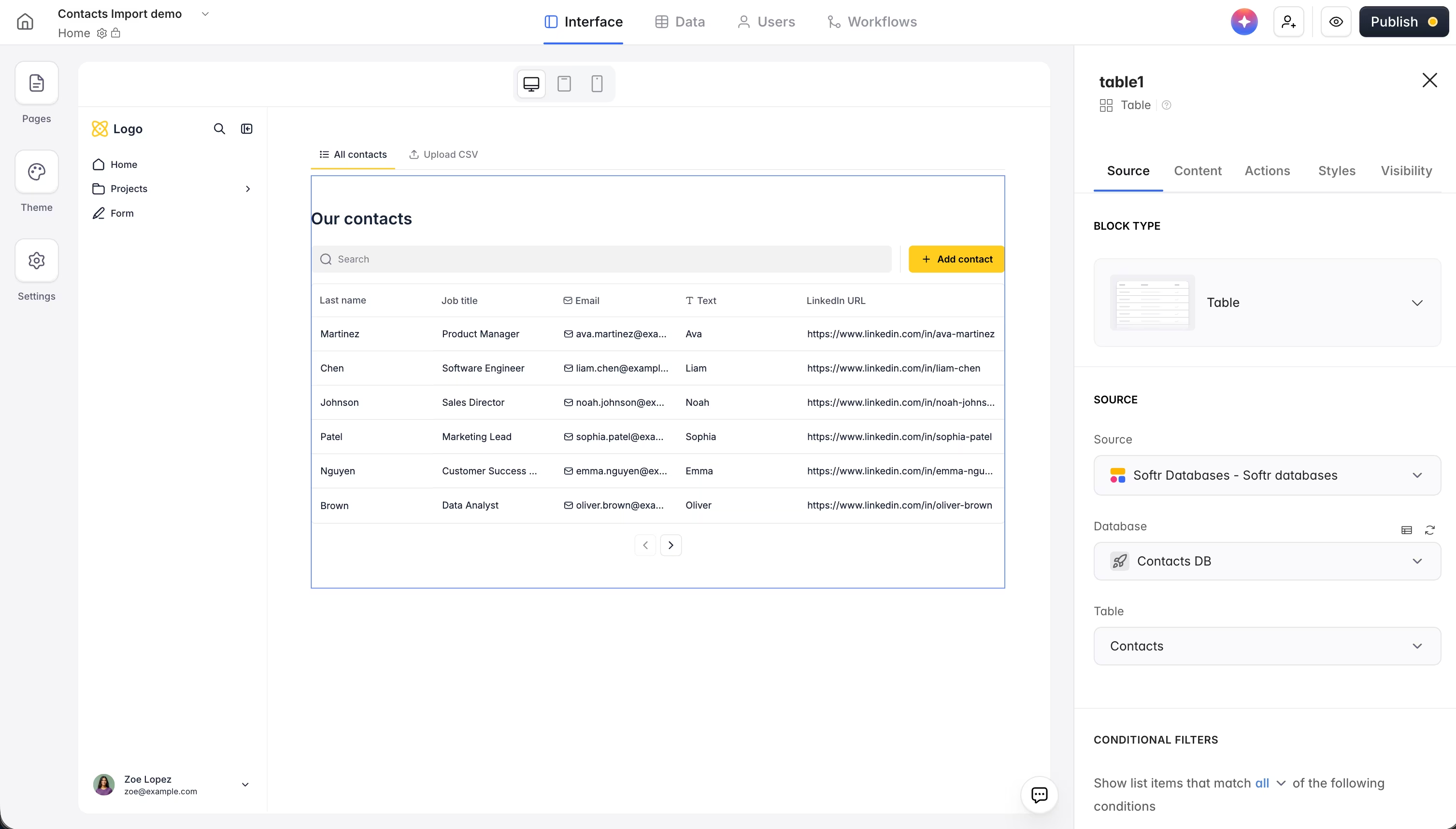
Every good dashboard starts with a solid data structure, not the charts. You can use Softr Databases, the built-in native database, or connect to Airtable, Google Sheets, and 17+ other data sources, including a REST API connector and SQL databases. If you already have your waterfall data in a Google Sheet, you can keep it there and connect it directly.
You can build or adjust your tables and fields by hand in the database editor, or describe the structure you want to the Database AI Co-Builder and have it create the tables, fields, and relationships for you.
Step 2: Add chart blocks on top
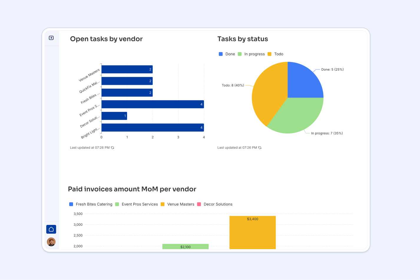
In the Softr studio, you add a chart block to any page and point it at your connected data. You can pick the chart type, choose the fields for each axis, and style it to match your brand. Add as many charts, tables, and metric blocks as you need on a single page to build a complete report.
You can configure each block manually, or ask the AI Co-Builder to add and set up the charts by describing what you want to display. For more on what's possible visually, see how Softr charts have been revamped.
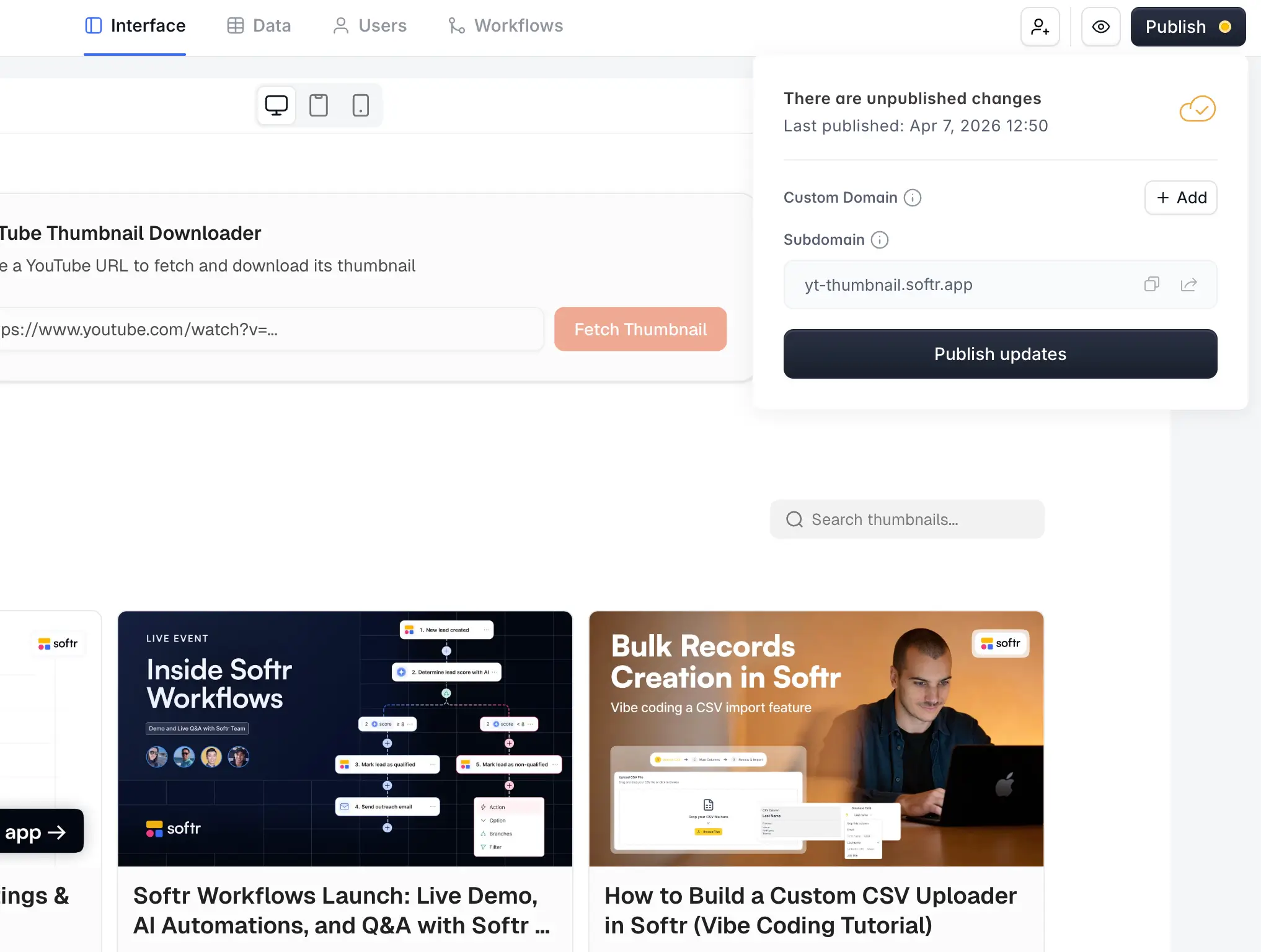
Step 3: Set permissions and publish
Because the interface is separate from the data, you can give each user their own filtered view and role-based access, so a manager sees the full picture while a client sees only their own numbers. When you're ready, publish the whole app with a single click, and everyone gets the live version without ever touching the source data.
Move from one-off charts to living dashboards
A waterfall chart in Google Sheets is the right call when you just need to explain a number once. The moment that explanation becomes a weekly ritual for your team, give your data a real home. Connect it to Softr, drop your charts on top, and publish a dashboard everyone can read without breaking each other's views. You can start building for free and have a working version live the same afternoon.
Frequently asked questions
What is a waterfall chart used for?
Does Google Sheets have a built-in waterfall chart?
How do I make a waterfall chart update automatically?
Can I build a live dashboard instead of a single waterfall chart?
What's the difference between a waterfall chart and a stacked bar chart?