[.blog-callout]
TL;DR
- Softr's charts block has been rebuilt so you no longer need to pre-aggregate your data before building a chart.
- New aggregation functions (sum, average, min, max, count distinct, count records) run natively on top of your raw data, whether it lives in Softr Databases, Airtable, Google Sheets, or another connected source.
- You can cap and sort categories (top 5 sales reps, top 10 features), segment charts by an extra field, and control how empty values are handled.
- You can configure all of this manually, or describe the chart you want to the AI Co-Builder and let it set up the aggregation for you. [.blog-callout]
Hi, everyone. This week we have another highly-anticipated Softr launch. This time it's about our revamped Charts.
Why revamp charts?
We launched the first version of our charts block almost 1.5 years ago. In the previous version, our charts require app builders to aggregate their data before it can be set up in Softr.
To explain it visually, the setup was like this:

However, not everyone can figure out how to perform this "pre-aggregation" (especially in Airtable). It is also impractical if you want to dynamically filter your data (e.g. create a personal dashboard for each logged-in user).
For this reason, we decided to completely rebuild our charts. The new block works the same way regardless of where your data lives, whether that's a native Softr Database, Airtable, Google Sheets, or any other connected data source: raw data goes straight into the chart block, and Softr handles the aggregation for you.
Introducing the revamped charts
Here are all the new things that come with our revamped charts:

Aggregation
You can now select the field you'd like to group your raw data by, then apply one of the following aggregate functions to create your charts:
- Sum
- Average
- Min
- Max
- Count distinct values
- Count the number of records
You can set this up manually in the chart block's settings panel, or describe the chart you want to the AI Co-Builder (for example, "show total revenue by month") and let it configure the aggregation for you.

Max categories & sorting
You can even specify the number of categories to display on a chart (up to a maximum of 20), plus how to sort them. This is useful if you have lots of data but only need to show the first N categories. Example:
- Top 5 best-performing sales rep
- Top 10 most-requested features

Segment by
In bar, line, area, stacked, and scatter charts, you can further break down your data in each category by an additional field. For example:
- Revenue per region, segmented by product type
- Number of signups per channel, segmented by device

Empty value handling
Sometimes you may not be able to store data in an ideal format, or you may not know which format is needed upfront. With this new feature, you can control how Softr handles empty cells. You can either treat them as 0 or ignore them altogether.
Here's an example chart
Same look, but different logic under the hood.

📝 Because the underlying logic has changed entirely, you will have to add a new block to use the new features.
Real dashboards built with charts
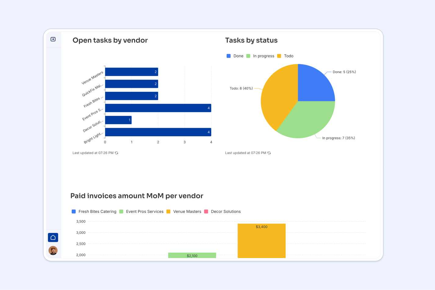
Teams are already using the revamped charts block to replace static reports with live, self-serve dashboards. FUGA, a music distribution and marketing agency, replaced manual PDF exports with live Softr dashboards for over 800 client users, saving more than 5 hours a week that used to go into stock reporting alone.
"We really appreciate how we can set user-specific visibility, clients see only what they need to see, nothing more." - FUGA, Customer Case Study

Marketing agency Strupek built a similar setup for client reporting, combining chart blocks with rollups to cut operational costs by 58% and save 8 to 10 hours a week previously spent generating reports by hand.
So...can I place charts side by side yet?
Not yet, but we are working on it!
We are aware that this is a highly requested feature, which is why we are exploring solutions that will work for every block in Softr.
What is next for charts?
Here are a few more improvements that will be coming to charts in the near future:
- Group by any time period: When grouping data by a date or timestamp field, you can choose from various calendar periods, such as days, weeks, months, quarters, or years, without formatting the dates in your data source first.
- Improved chart design: A more modern look and feel for our charts and more customization options.
- Custom colors: Apply custom colors to your charts.
- Accessibility mode: Make your charts more friendly to visually-impaired users.
As usual, if you have any questions, run into any bugs, or have any suggestions, feel free to let us know!
Frequently asked questions
Do I need to pre-aggregate my data before building a chart in Softr?
What chart types does Softr support?
Can I show different charts to different logged-in users?
Can the AI Co-Builder set up charts and dashboards for me?
Can I place multiple charts side by side on the same page?